There’s been so many new micro brands popping out of the woodwork within this last year. The vast majority have been crowd funded through the likes of Kickstarter campaigns.
One of the brands who have utilised this modern wave is Melbourne Watch Company. If you want to learn a bit more about them, check out our interview with Sujain, the owner.
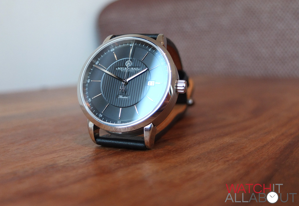
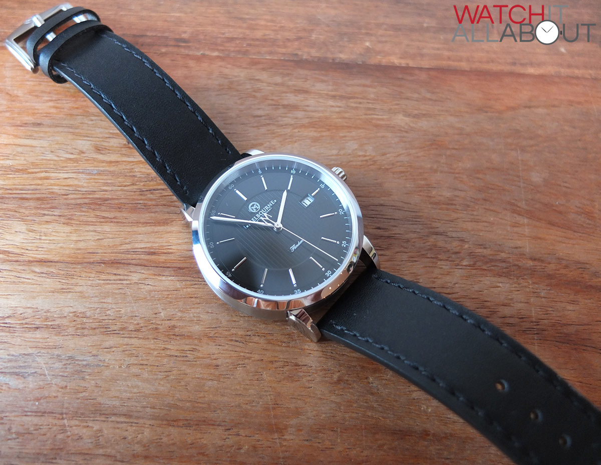
Their introductory model, the Flinders, is named after the iconic train station in Melbourne and will set you back £285. What it offers is right up our street – a small manufacturer offering high specs, high quality build and great customer service at a reasonable price. Let’s take a look to see if this is the case.
The case
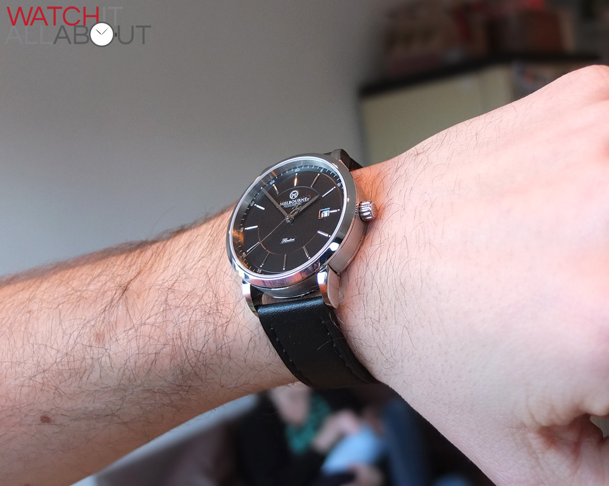
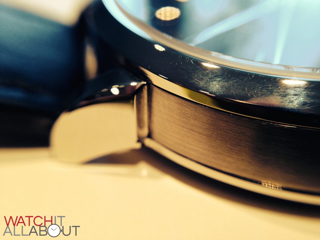
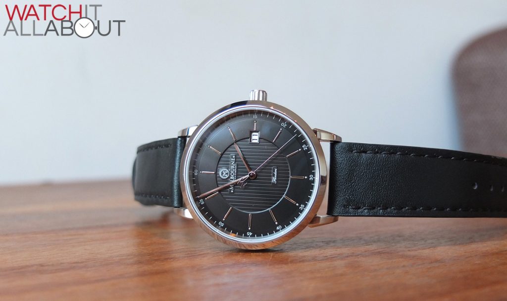
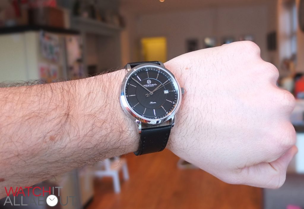
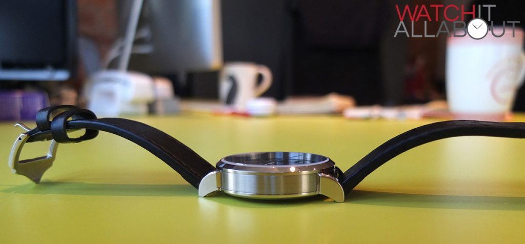
The case is a very comfortable size, measuring in with a diameter of 40mm and a lug to lug length of 47mm. This is a sensible choice as it offers good wrist presence for a dress watch, and is a size that will suit the vast majority of watch wearers. It is also 10.5mm tall, which means it’s pretty slimline for an automatic watch, and will slip under a cuff nicely.
The general finishing and machining on the Flinders is remarkable, you can just tell it’s a good quality watch by the way it looks and feels.
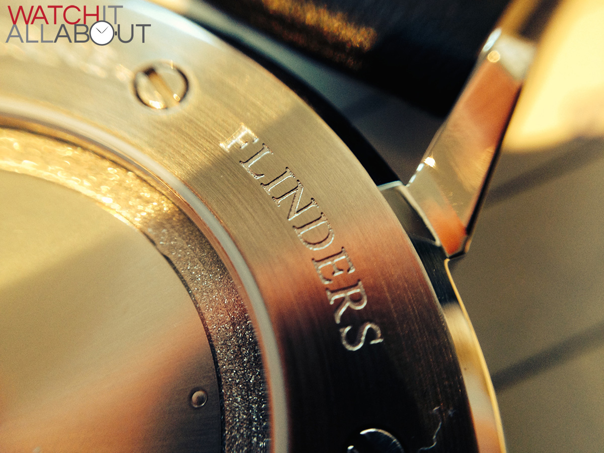
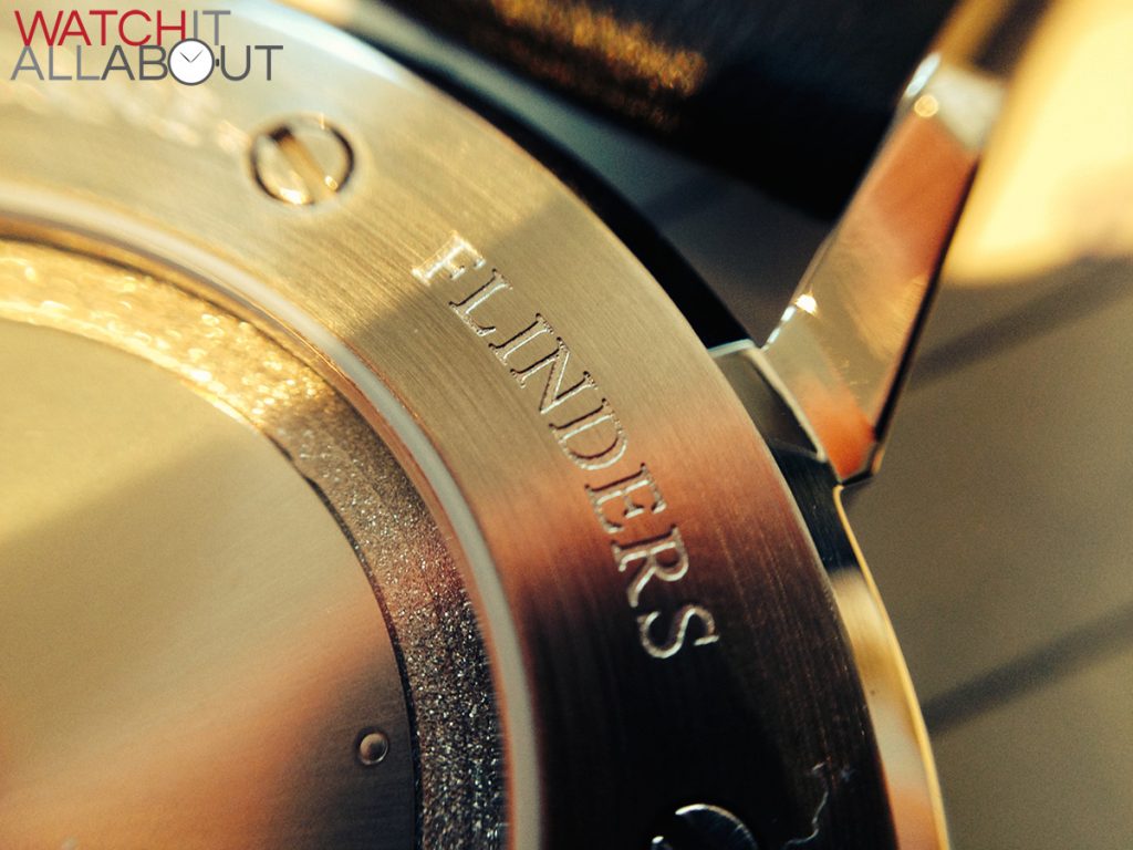
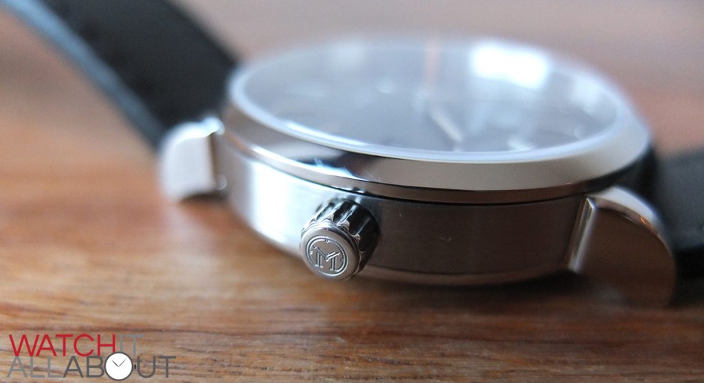
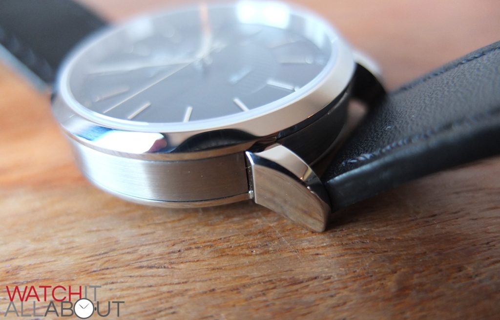
The case constriction is a little different to the usual way of doing things – usually you’d have the top bezel, mid case and lugs, and caseback. The Flinders, however mixes this up a bit by having the lugs attached to the caseback and completely separate from the mid section. Why go to all that bother? Having the case constructed this way means that there is a definite separation between the main case section and the lugs, so having different finishes on these parts is easy and definite. For instance, if you look at the watch side on, you’ll see that the side of the main case is brushed steel, and the lugs are polished. Usually you wouldn’t be able to have these two finishes on the same side of the watch. But this way it is possible, and boy does it make a difference.

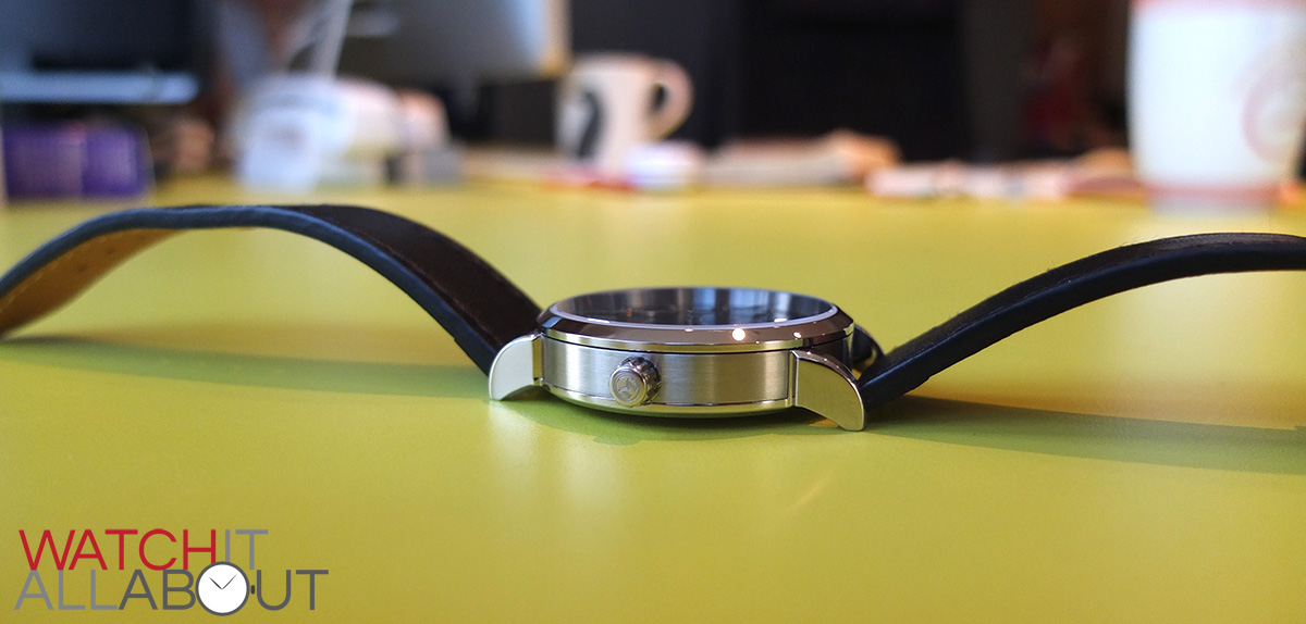
In addition to the lugs, the bezel and caseback is also polished. The finishing across the watch is perfect, as mentioned before.
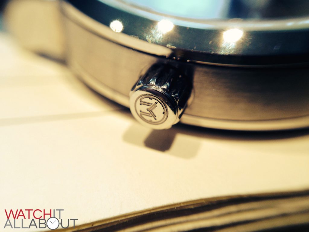
The push-pull crown, in my opinion, is a little out of proportion with the rest of the case. I think it’s slightly too much on the small side. This also makes it difficult to pull out sometimes. However, like the rest if the case, it is very well machined. The grip is thick and deep, and the Melbourne Watch Co’s logo is deeply etched into the end. It is completely polished, which looks good and sets it apart from the brushed edge of the case.

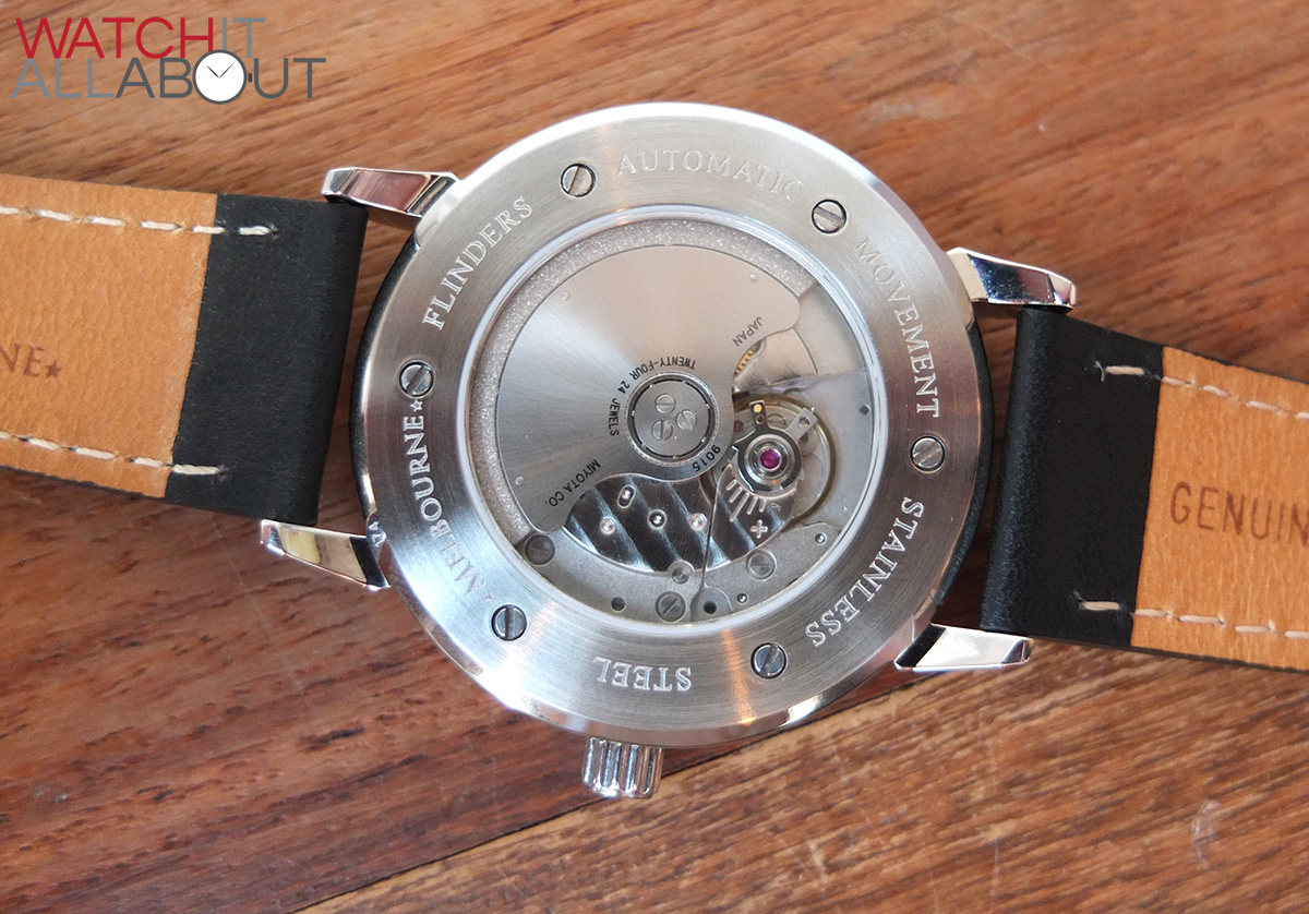
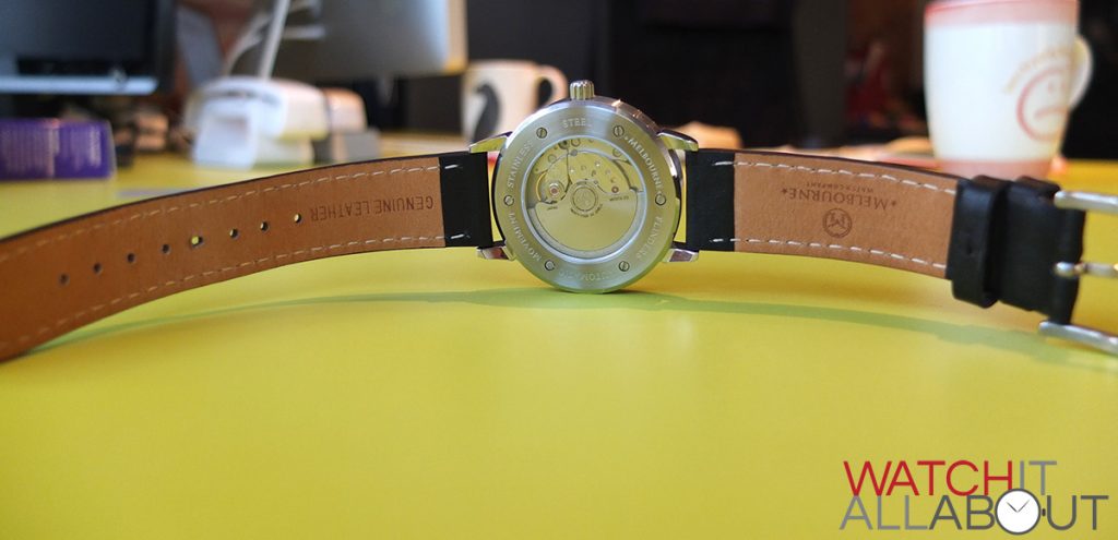
The caseback is secured into place by 6 small screws. This is very well finished like the rest of the case. I particularly like the way that the main back is brushed, and the outside edges are polished. It’s not too easy getting two different finishes to meet perfectly side by side, but it’s done well on the Flinders. The crystal used for the exhibition window is sapphire, which is impressive as this is usually where manufacturers would cheap our and just put a mineral crystal there instead. Sujain said that he wanted the watch to be as high quality as possible, so for him this was the only option. Good for him, that’s a great move. The details of the watch are deeply etched surrounding the exhibition window, which again feels high quality.
Sitting atop the case is a flat sapphire crystal with a layer of AR coating on the underside. The sapphire crystal looks pretty flawless, and well cut and fitted. The anti-reflective coating seems to do a reasonable job at reducing reflections and glare, and provides a nice hue when you catch the light right.
To conclude, the case is very simple but effective. It is clearly made with a lot of care, and gives the whole watch a high quality feel.
The dial
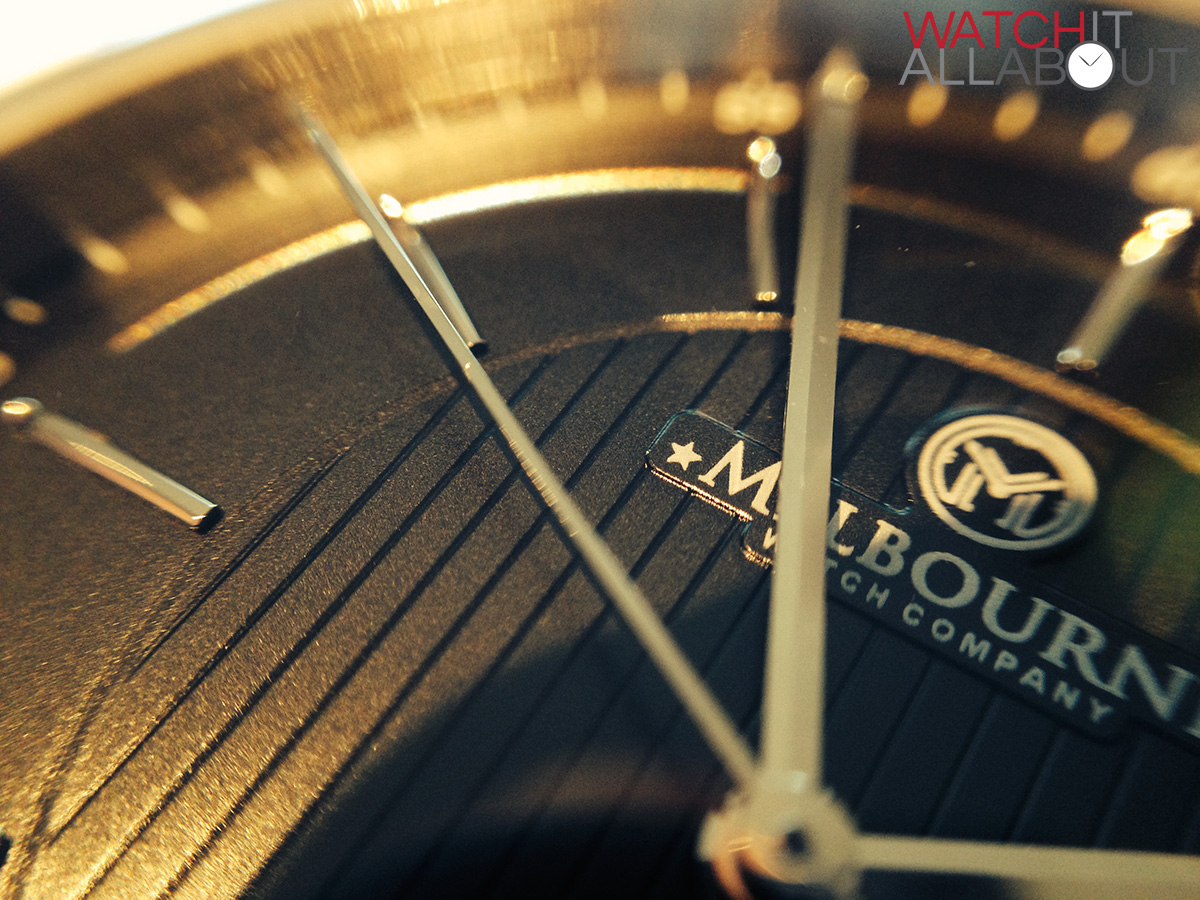
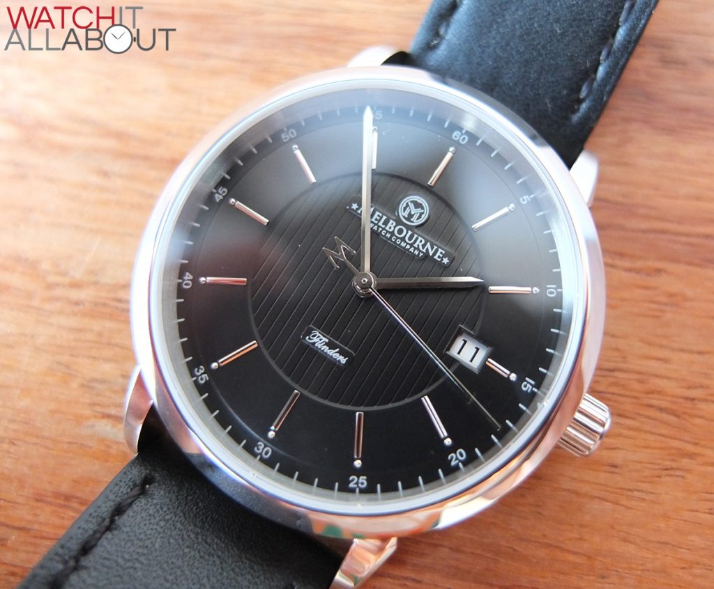
The dial is a deep matt black, with its main feature being the vertical lined pattern running in the central circle.

The ridges are deep and well executed. Within the central circle is two raised platforms for the Melbourne Watch Co’s logo in the top half and Flinders in the bottom half.
The logo design is good, a classic professional font is used and a clever M icon with watch hands within.
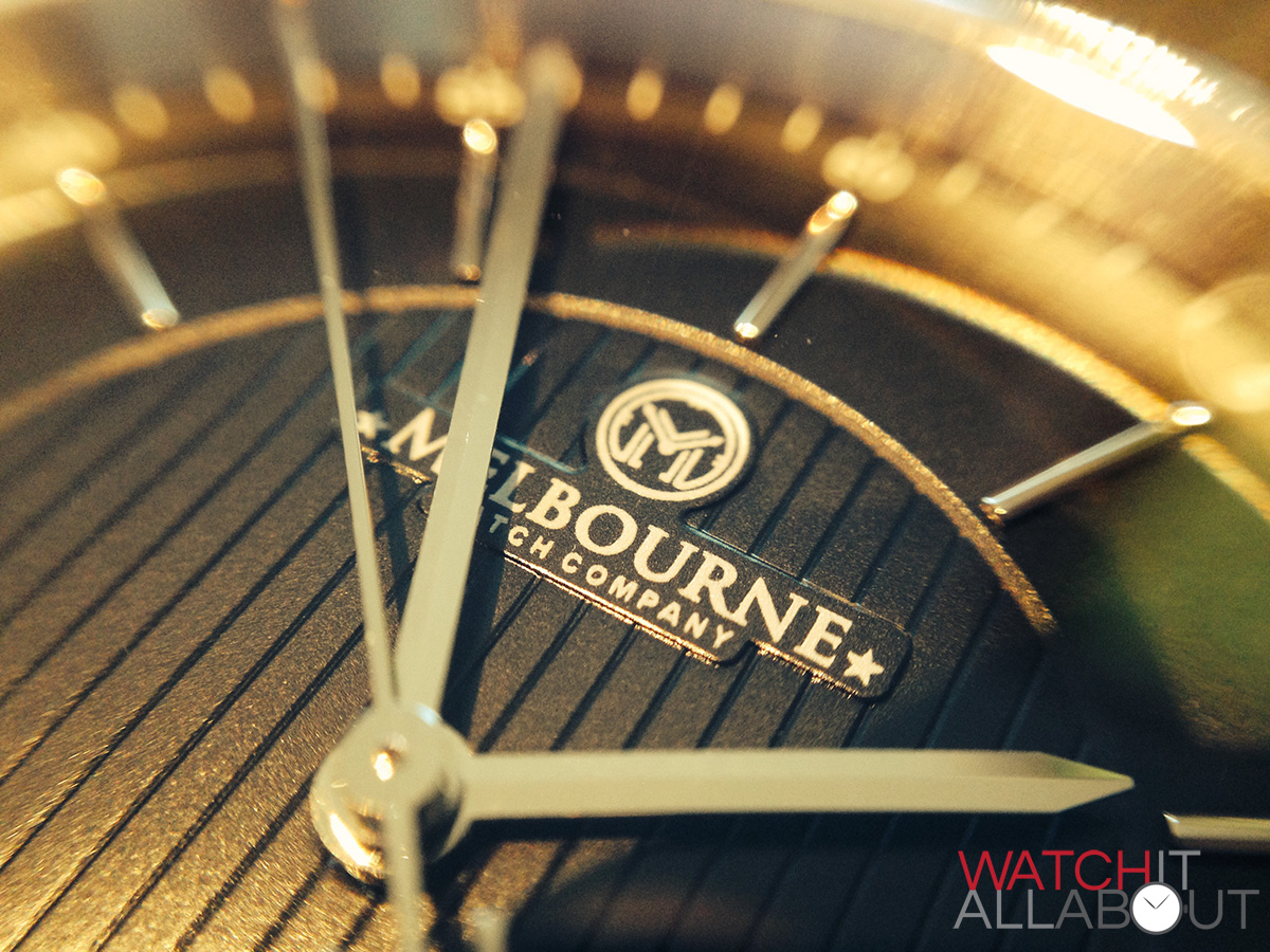
The printing on these two platforms, in my opinion, could be a little bit shaper, I think the font weight is a bit too heavy. My personal thoughts of course, but I think it would have made the dial look a little more refined if the printing was crisper.
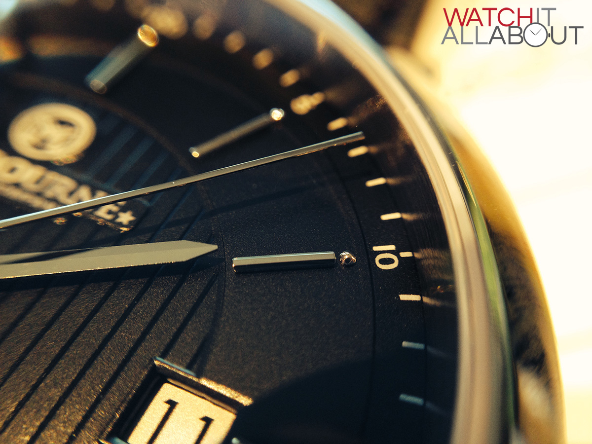
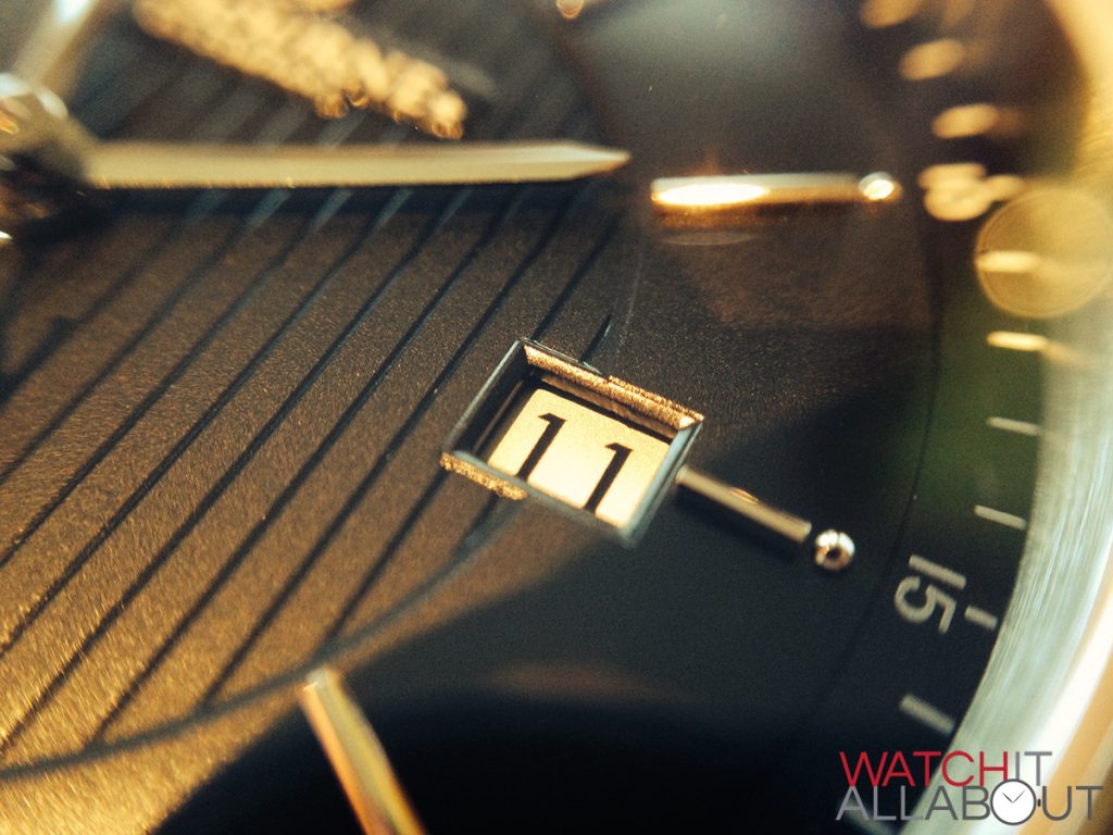
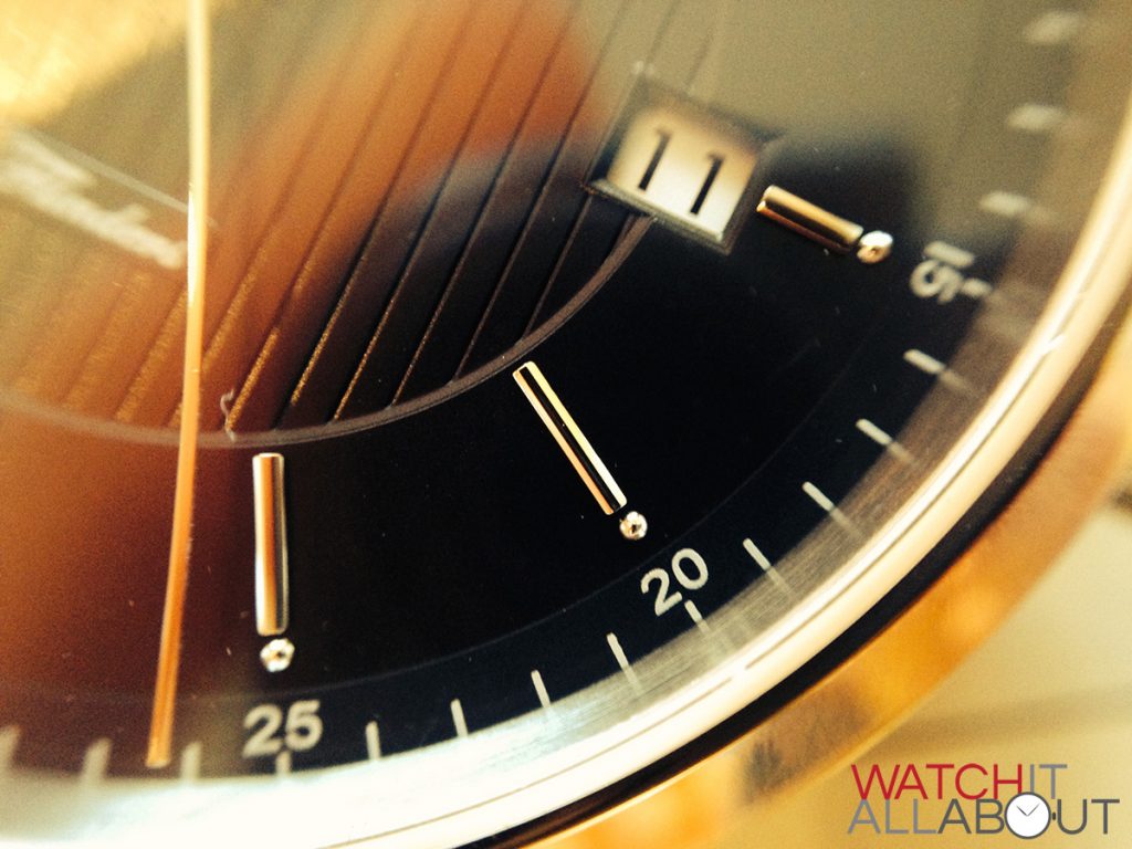
The date window has a thin edges border / frame to it, which again shows the high attention to detail on the Flinders. It’s well executed and makes the date seem more interesting instead of having a window plainly cut out of the dial.

The date wheel used is white with black text. I’m sure some would have preferred it the other way around, but this doesn’t bother me and I understand why Sujain kept it the way it is, so both watches are the same and to keep costs down.
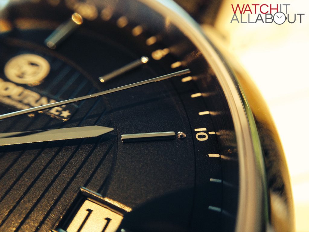
The outer ring housing the hour markers sits on a higher level to the central patterned area. This gives the dial some depth, which I love. In addition to this is a minute track around the very outer edge on a lower level. This is very subtle, and contributes to the overall pleasant design of the dial.
Another neat touch are the hour markers. They are polished steel batons but with the added feature of tiny balls located on the outer end. I didn’t notice them at first! These are nicely machined and reflect the light well when it hits the watch right.

The main hour and minute hands are simple and elegant, again being polished steel, so they also reflect the light well. The second hand is a feature of the watch with an “M” as counterweight. Some think this is upside down and get annoyed, saying it should be the correct way round when the hand is at 12. I’m not bothered but I thought it was worth mentioning.
The Flinders does a great job of concealing small details until you start looking for them. I like that in a watch. At first glance, the dial looks simple and elegant, perfect for a dress watch. But as you pay closer attention you start to notice the features which make it more interesting, which in my mind, makes it easier to wear as an everyday casual watch. Because of this – the way it adapts to casual and dress so easily – I think the Flinders is a very versatile watch.
The movement
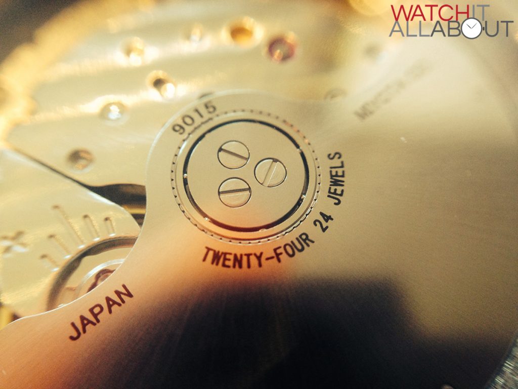
The movement in the Melbourne Watch Co’s Flinders is a Miyota 9015. This is becoming a very popular choice for the small boutique watch manufacturer as it acts as a direct competitor to the standard Swiss automatic movements such as the ETA 2824.
It offers the same things – smooth hight beat at 28.8k bph, hacking, hand winding, and approx 38-42 hours of power reserve at a much lower price. It has proved to be very accurate, keeping time to within +10 seconds a day. Whilst it only winds in the clockwise direction, you can be assured that it winds quickly as the motion of the rotor is very smooth.
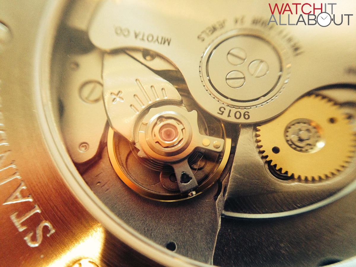
It’s also a very cool looking movement. Simple and industrial, I feel it matches the Flinders perfectly, and the exhibition caseback demonstrates it well.

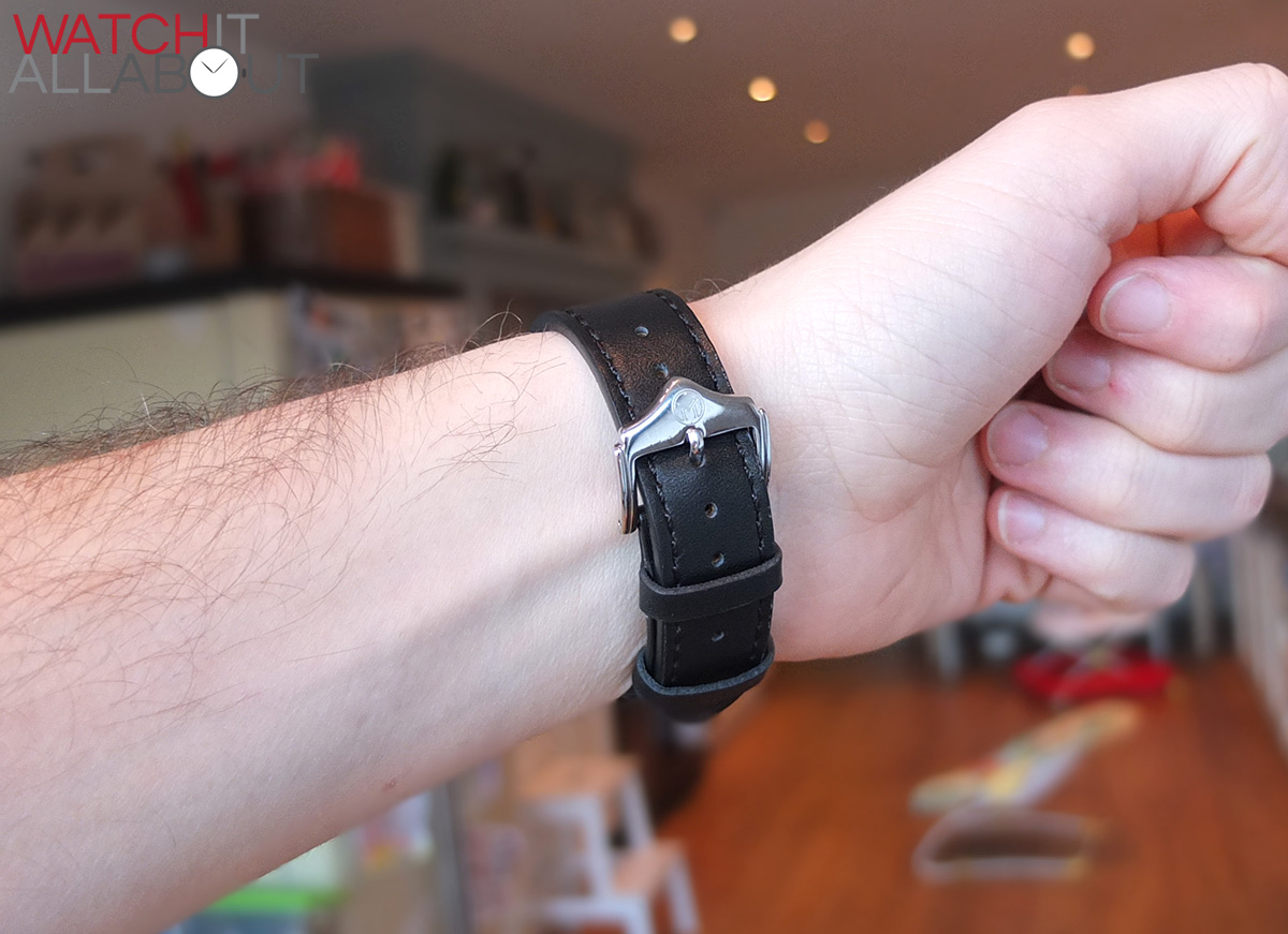
The strap
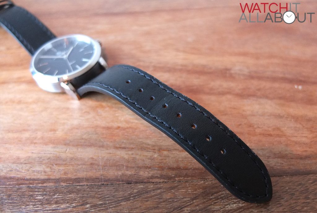
The strap is 20mm wide, and is the right size for the case. It is made of reasonable quality leather, I say “reasonable” because I think this is one of the only places the Flinders could have improved on. Yes it is reasonable thickness, and smells of leather (very important!) but it just doesn’t feel quite as high quality as similarly priced watches, which is a shame.
But, that’s not saying it’s a complete loser in the strap department. It’s still a good enough strap to wear, offering high levels of comfort and pleasing aesthetics which match the dial well.

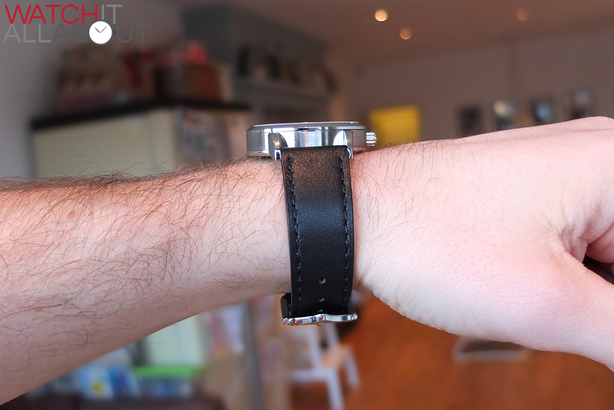
The feel is quite soft on both sides. The black topside of the strap matches the dial well creating a very classic look for the whole of the watch. The stitching on the top is also black so is well disguised. The underside is a tan colour with white stitching, and is comfortable on the wrist.
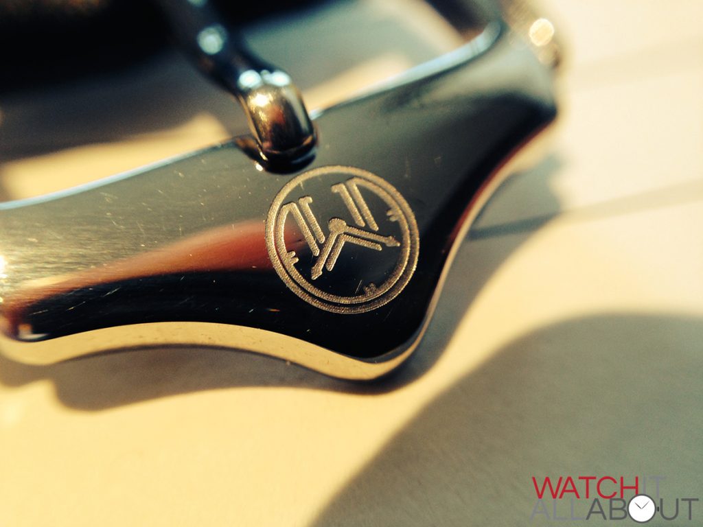
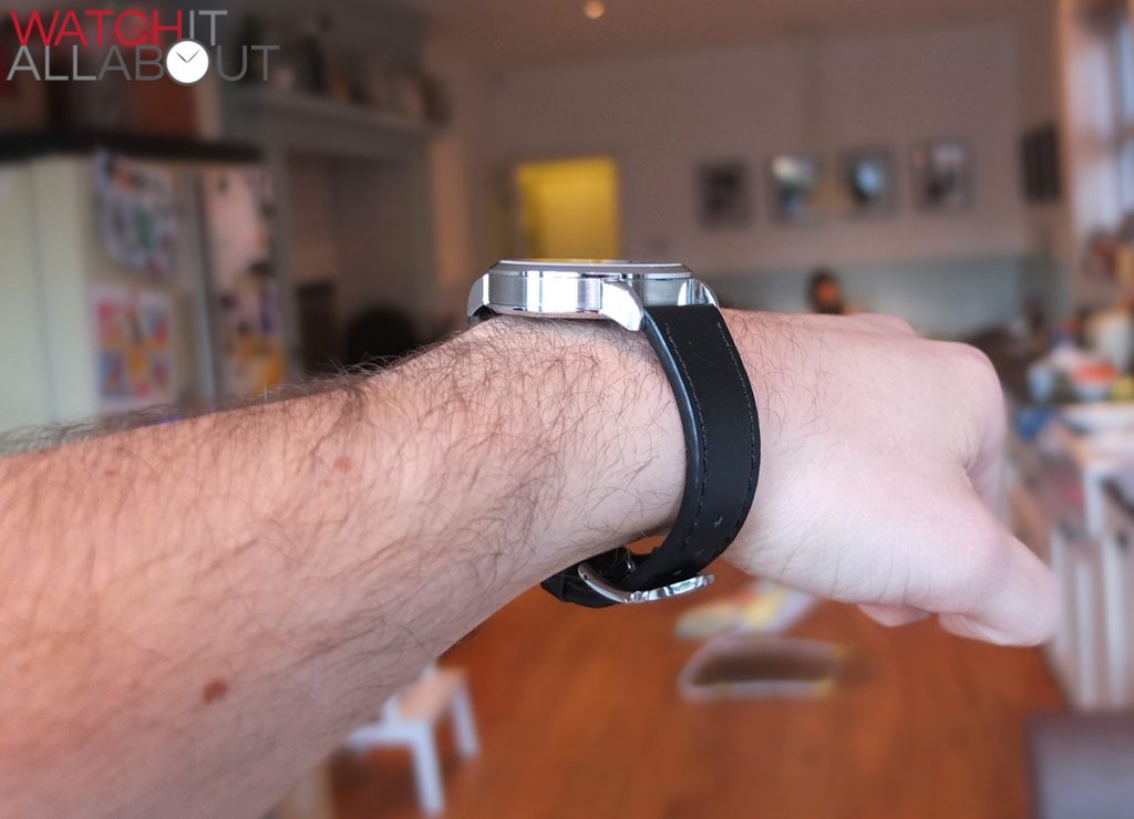
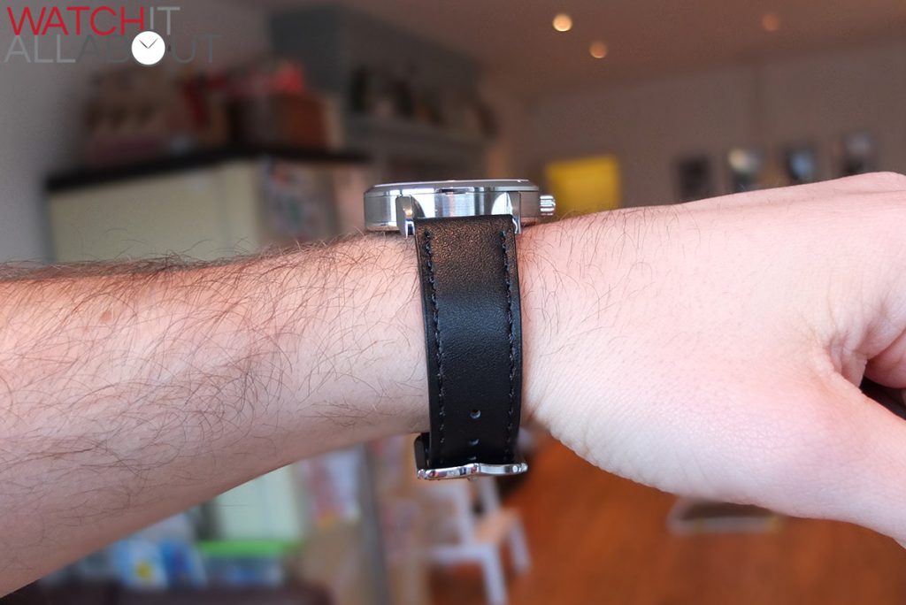
The buckle is of quite unusual design, shaped in a very unique way. The top edge protrudes out to house the round logo deeply etched. The finishing is of very high quality, and is completely polished. It is really well made and it’s unique design has impressed me.

Final comments
The Flinders has grown on me a massive amount. At first, I thought it was maybe a bit too plain. But the more I wore it the more I appreciated it’s simple elegance. I started to discover the little details and all of a sudden I realised the intelligence in its design. There’s actually a lot going on, yet they all work together to give the wearer a clear view of the time. When you look closer, the extra bits are there to see.
I also appreciate the quality of the case. It’s machined to perfection which is also a joy to wear.
So ultimately, I feel that Melbourne Watch Company’s introductory model, the Flinders is a success. As usual, much of it depends on personal taste and what you want in a watch. But if you’re looking for a well made, high specced casual dress watch then I wouldn’t hesitate to recommend this one.


The Melbourne Watch Company New Models and News Thread - Page 37
25 March, 2014 at 9:09 pm
[…] by UK affordable watch site WatchItAllAbout. Plenty of good detailed pics and a few vids too! Melbourne Watch Company Flinders Watch Review | Watch It All About Owner -Melbourne Watch Company. The Flinders Automatic is now available – For a limited […]