Christopher Ward’s ethos of providing the “cheapest, most expensive watches” is strengthened once more in the form of the C900 Worldtimer. Whilst it is still reasonably expensive, at £1575 (UPDATE: now £995), what you are getting that money is actually very reasonable. Firstly, just look at it. It’s quite a watch. The finishing and attention to detail on the dial is exquisite. The other thing going for it is it’s custom modified movement. Master Watchmaker Johannes Jahnke takes a base ETA movement, the 2893, and completely tears it down and fits a custom module on it so it has the functionality required for the C9 Worldtimer. Every one is hand made in his workshop in Switzerland. When you think about the time it has taken to develop and research this module, and the time it takes to build every single one, £1575 doesn’t sound so bad anymore.
Of course, let’s not get carried away. After all, £1575 is more than most of us can afford on a watch. Let’s take a closer look to see if it’s worth you handing over your hard earned dosh.
The case
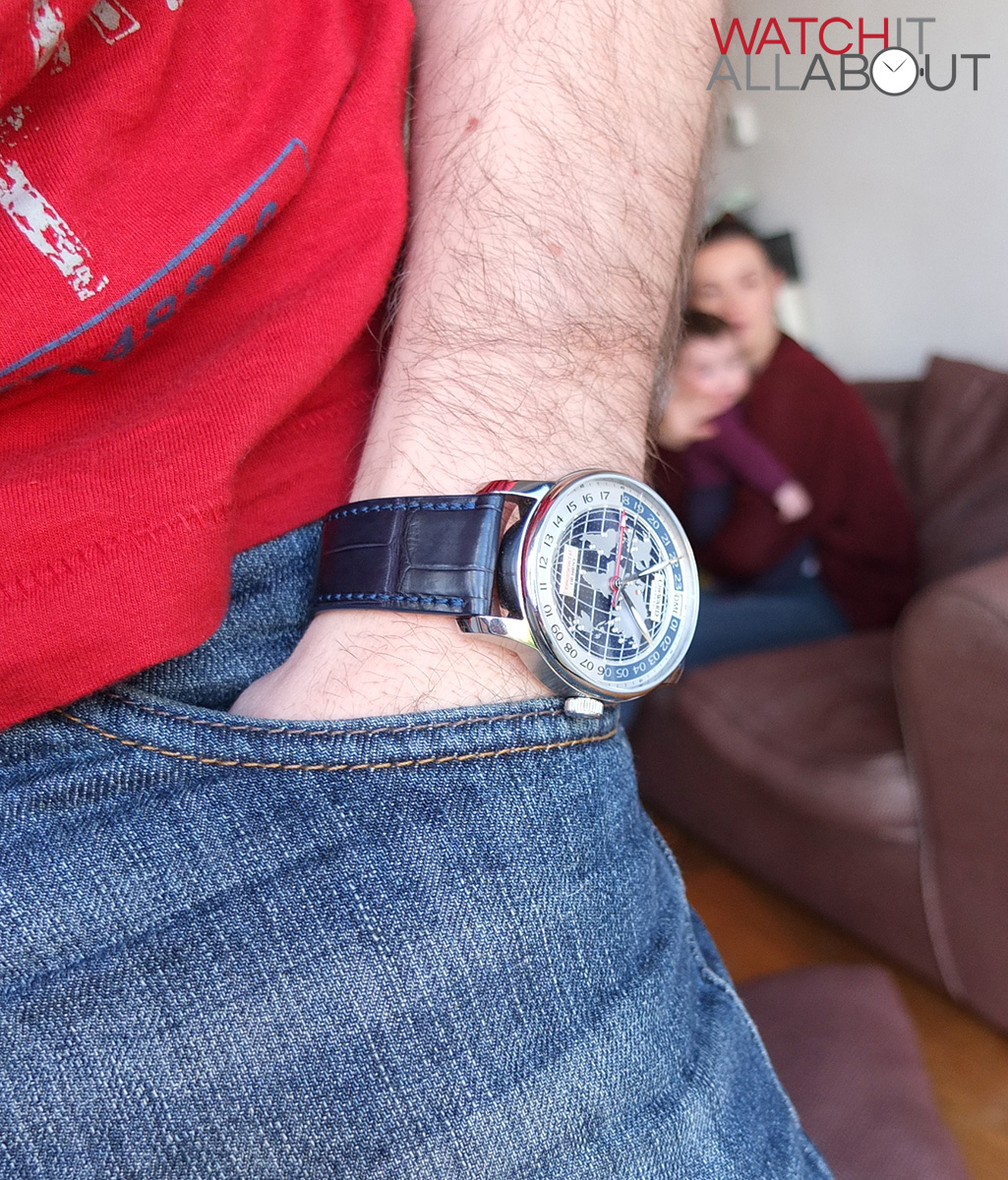
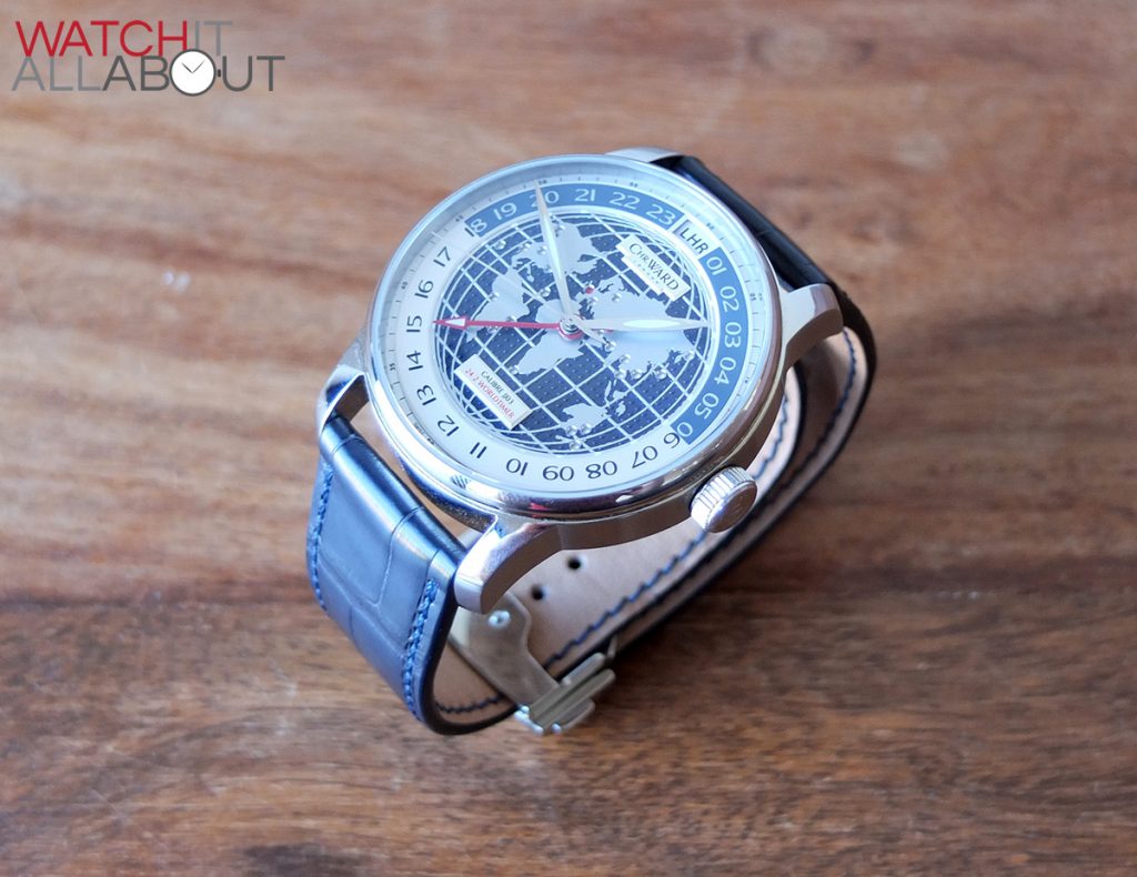
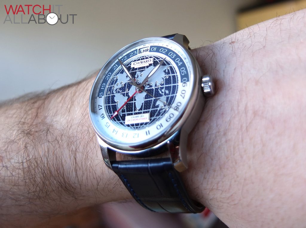
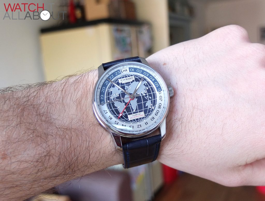
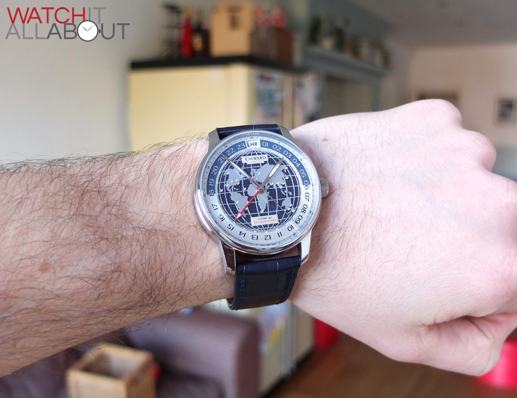
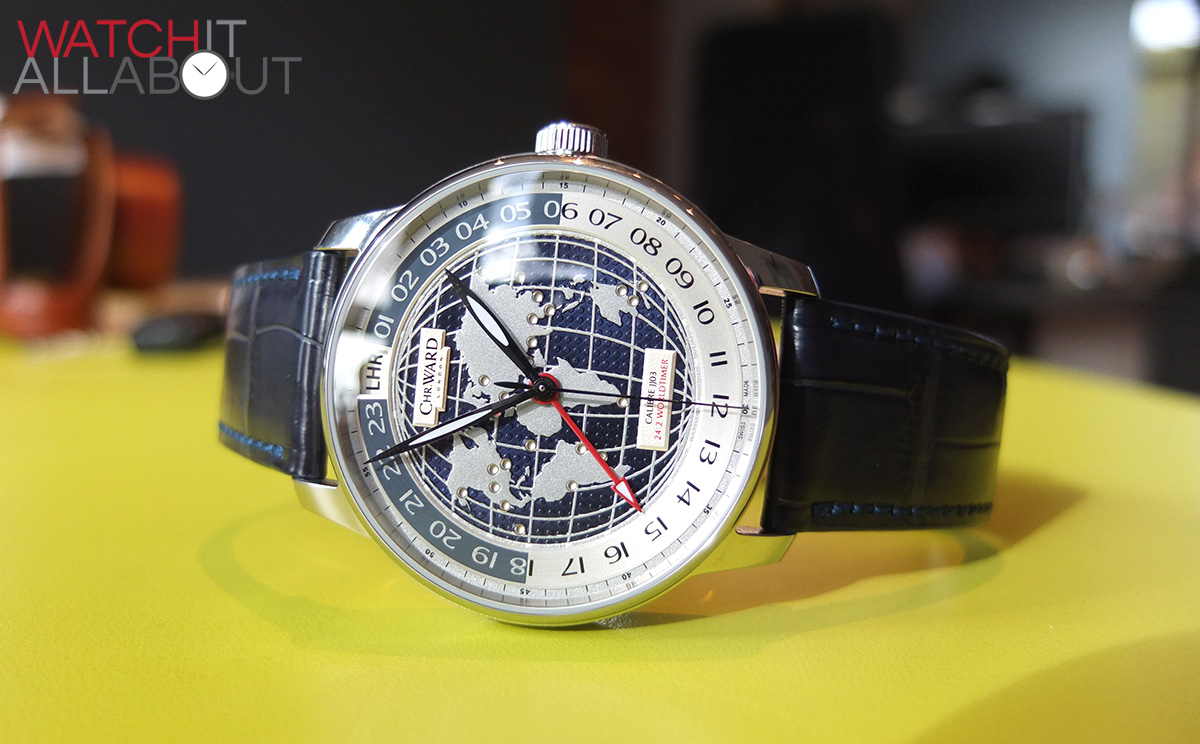
The case is rather large for a dress watch, being 43mm in diameter, 51mm lug to lug and 12.05mm tall.

Not only that, but due to the very thin bezel, the watch is pretty much all dial. This creates a very immersive experience of viewing the time.
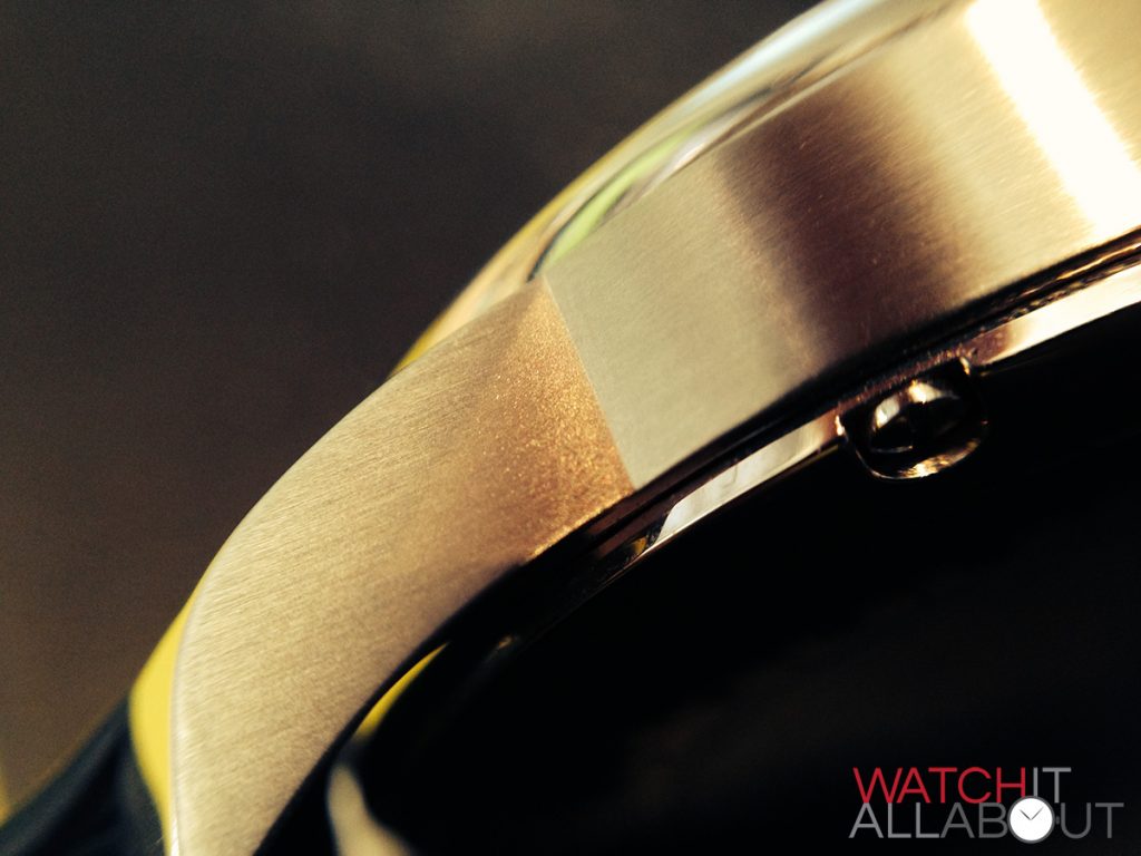
The finishing is varied throughout the case – it has a polished bezel, case back, and the top and bottom of the lugs are also polished. It is brushed on the sides of the case. As you’d expect, the finishing is very high quality, the polished finish is like a mirror and the brushed is uniform and clean. I like the variety of finishing next to each other, as it breaks up the different elements of the watch well, and is visually pleasing too.

The shape of the lugs are quite thin and elegant. They have a sharp angle down ensuring a comfortable fit even for such a large watch. This is good, as it means it fits those with smaller wrists well. The angle is also very pleasing to the eye when you view it side on.
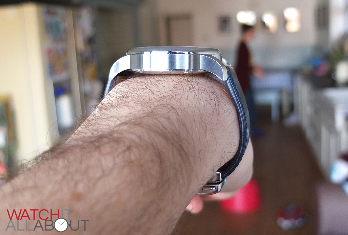
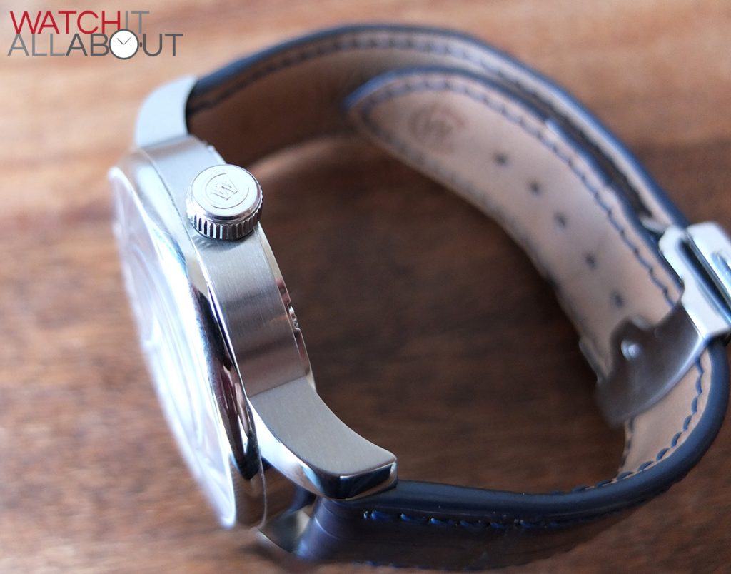
There are no crown guards, which keeps the simplicity and elegance of the case design. It just means you need to be careful you don’t whack the crown off!

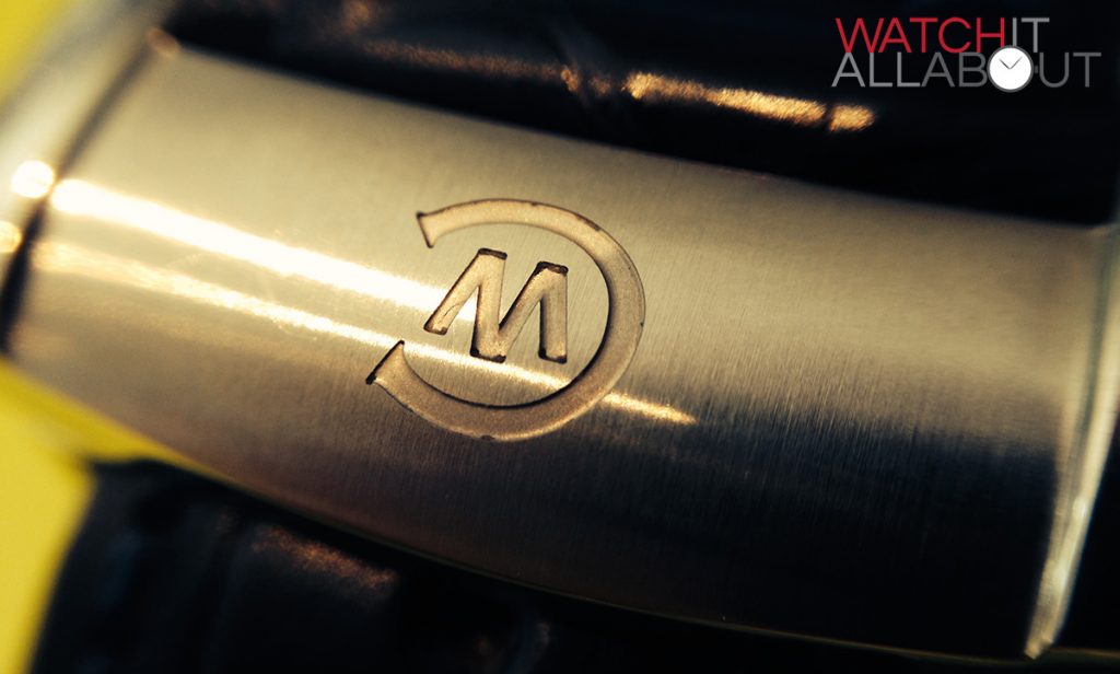
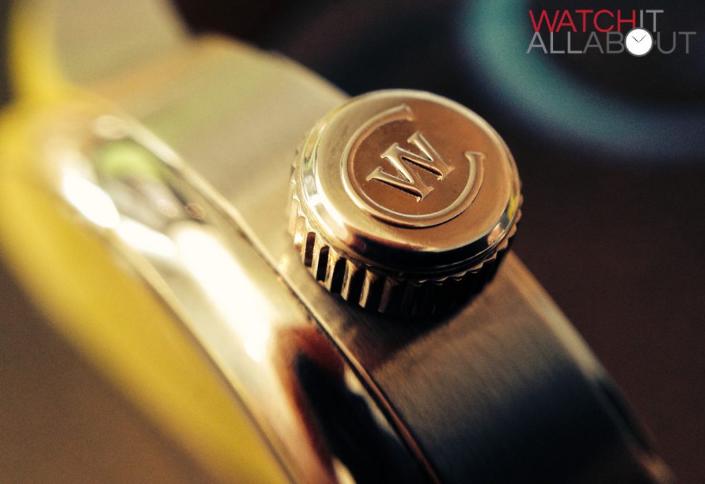
The push pull crown is polished with the CW logo embossed on the end. It has thin but very effective grip. It also has a tiny indent at the base, which is just enough to get your nails under to pull it out. Not sure if this is a feature or supposed to be like it, but it’s very handy and has meant that it is easy to pull it out when adjusting the times.
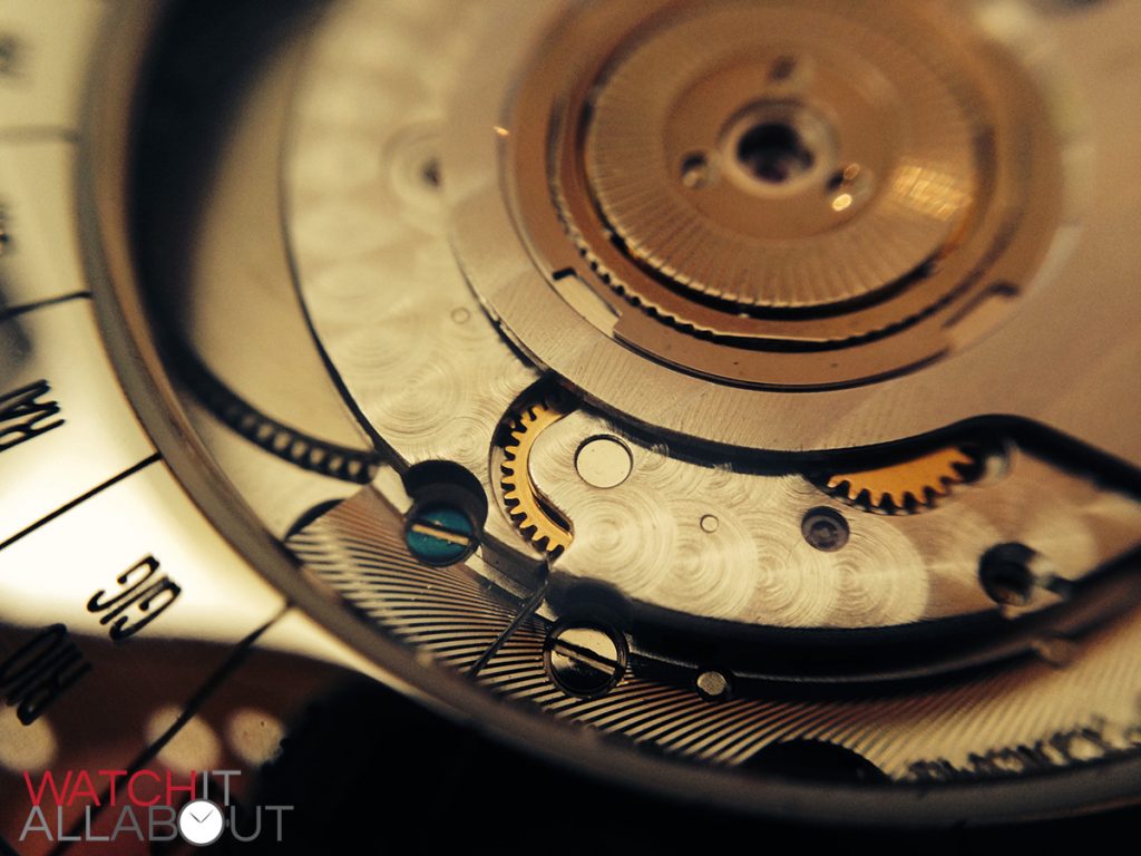
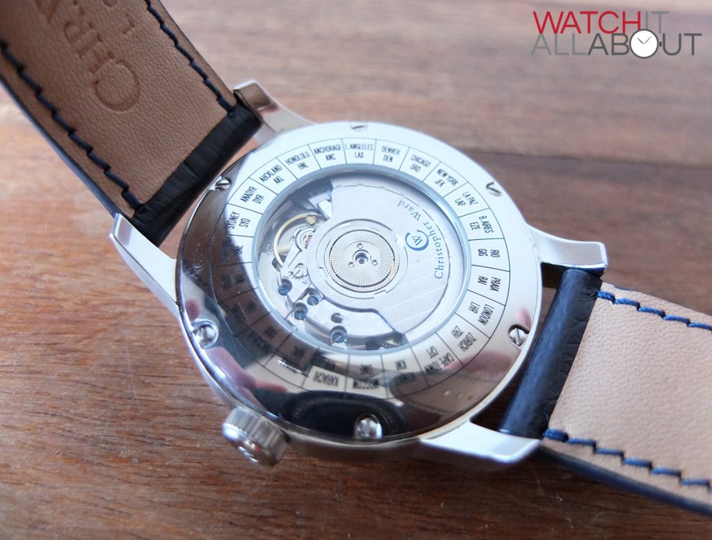
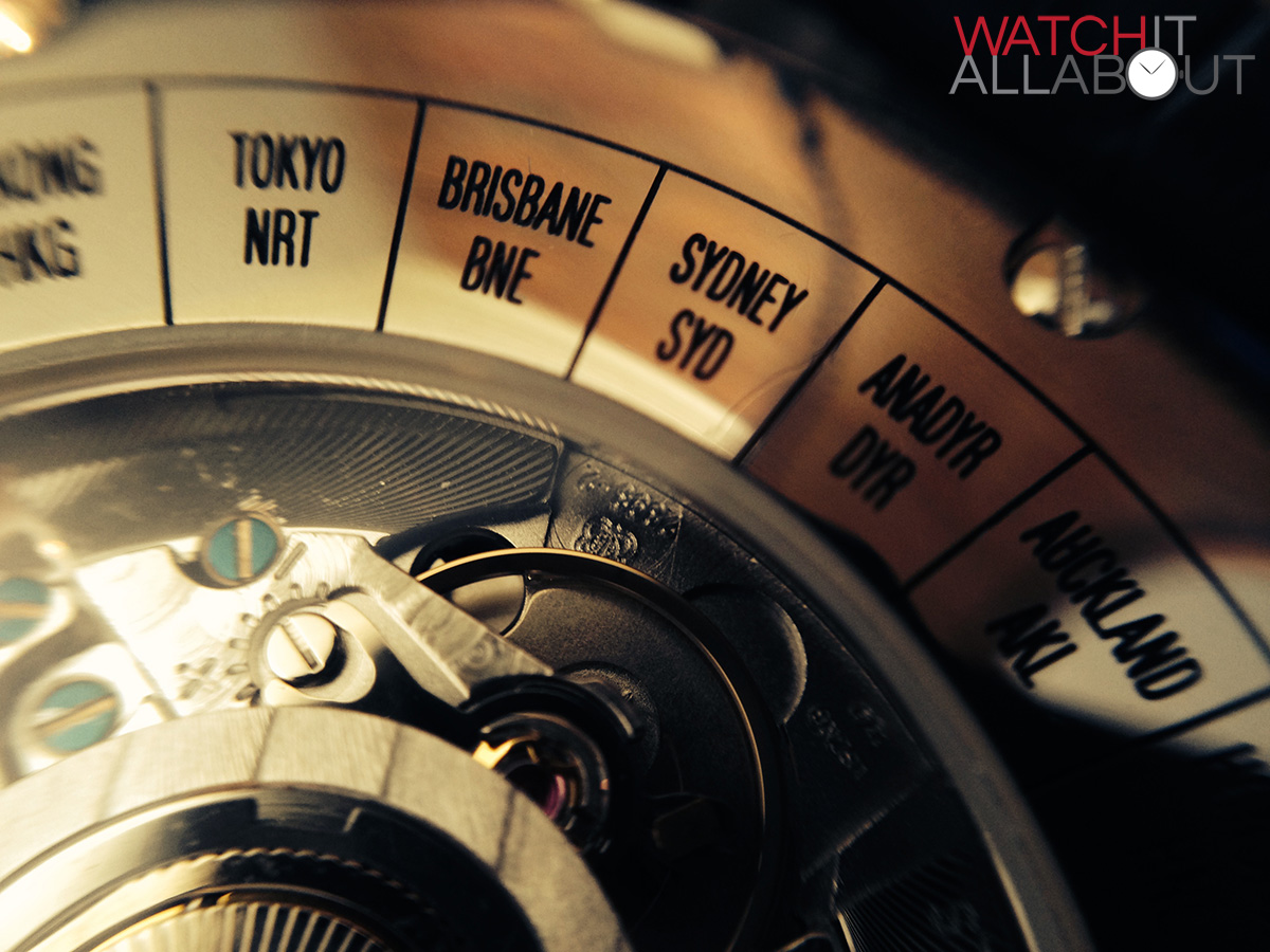
The caseback is not of the screw-in variety, but rather is fastened to the case by 6 small screws. It is an exhibition caseback, displaying the modified movement well, as it’s the size of the rotor, so you can see pretty much all of it. Around the movement window is all of the time zones available to use with the Worldtimer for quick reference. It would have been nice if they included the actual +/- GMT hours too, so you would know what time to set your second time zone to without having to figure it out elsewhere.
The highly domed sapphire crystal sitting atop the case is very large. When you view the dial at a steep angle, you can see quite a lot of distortion which is a result of the dome. It has a very good layer of anti-reflective coating on the underside which stop reflections very well. If you catch the light just right, you can see the blue hue from the AR coating which looks great.
The weight of whole thing is only 102g, so it’s pretty light on the wrist. Even though it’s a large watch it proves to fit well to the wrist and is a very comfortable wear.
The strap
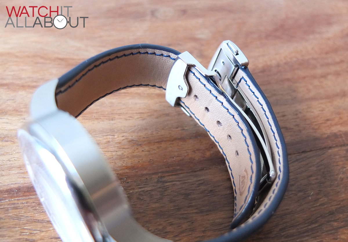
The strap measures 22mm wide at the lugs, which then reduces to 20mm wide at the Bader buckle (more on that later).
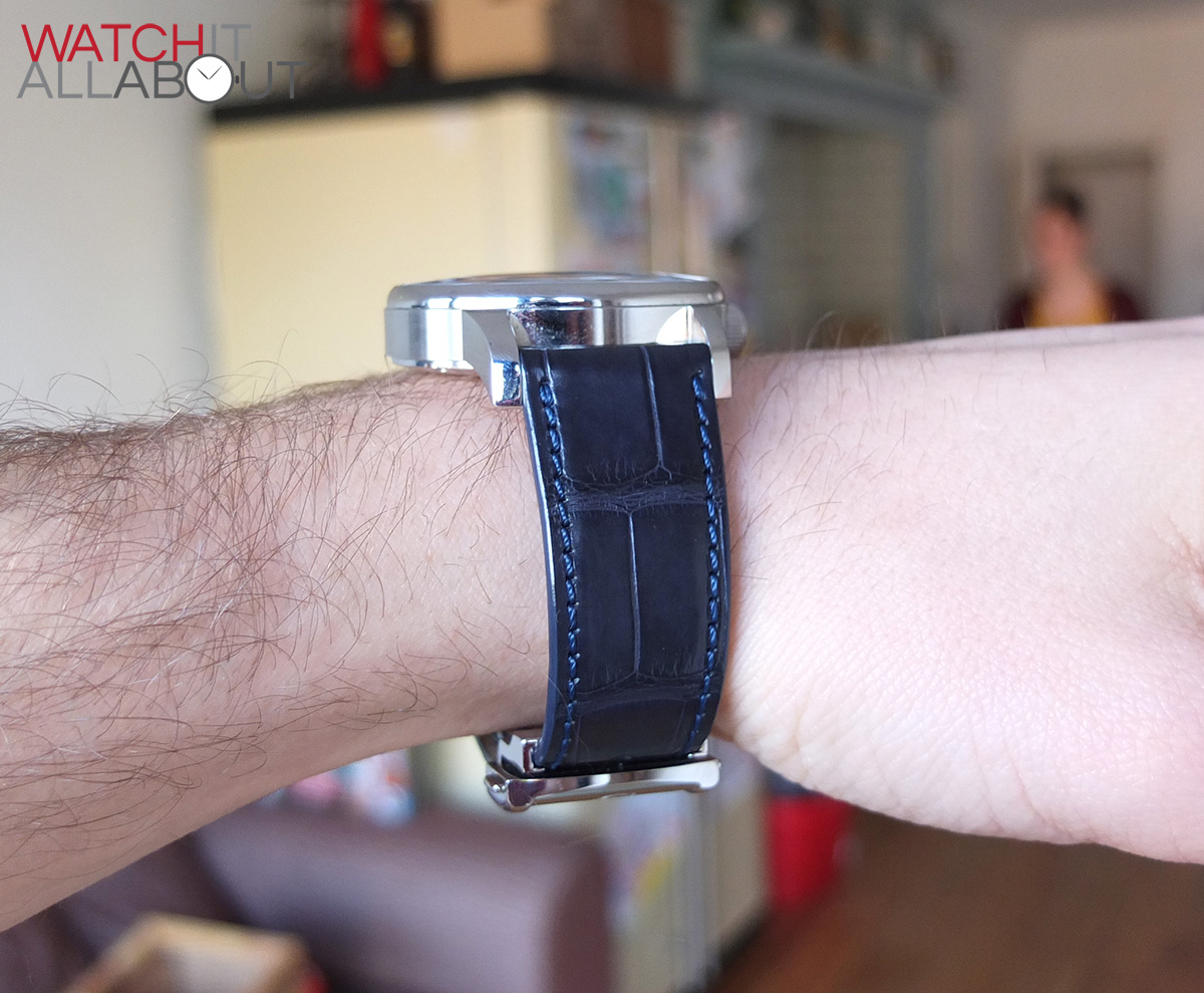
The strap leather is made of CITES certified premium Louisiana alligator. The feel of the leather is beautiful. It is extremely soft and comfortable, you can tell that this is a hundred or so pounds worth of strap (the cost of one new). The top side is so soft, softer than your normal leather strap.
The colour is a deep blue, matching the sea and blue features of the dial in a very complimentary fashion. It is unusual to see a colour like this for a strap, and it works in the Worldtimer’s favour. It looks a little less harsh than a pure black strap, but not too light blue to look tacky. Rather, it looks very classy and suits the overall appearance of the watch.
The stitching is also blue, but is very slightly lighter than the strap itself, this creates a slight contrast between the strap and stitching, which makes the strap even more interesting and pleasing to the eye.
It is also extremely comfortable on the wrist thanks to the equally soft underside, which is a light tan colour creating high colour difference between itself and the blue stitching.
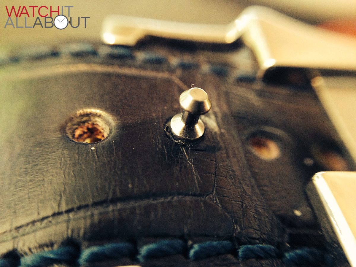
Like usual, it seems that Christopher Ward have catered for the large wristed rather than the small wristed – my wrist is 7.5″ and I have it on the second hole. Unfortunately, anyone with a wrist thinner than 7″ will need an extra hole punched in which is a bit annoying.
The buckle
The C900 Worldtimer features a patented new buckle by Bader. Here’s their blog post announcing it:
http://www.christopherward.co.uk/blog/the-bader-buckle/
Bader have patented this buckle as it is a new way of securing and closing a leather strap.
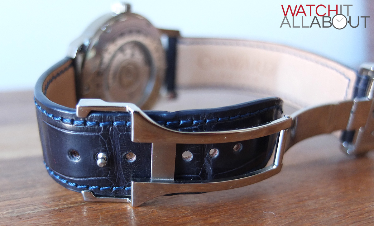
There are two excellent features of the Bader buckle which I love. Firstly, long end of the strap goes under the buckle, and onto your wrist, rather than above the strap itself. This means that strap loops and that annoying pointy end of the strap poking outwards is a thing of the past. Secondly, because the long end of the strap goes under the buckle, you get an absolute minimum amount of steel on your wrist, it’s pretty much all leather on the underside – which means for a very comfortable wear. You don’t really know that you’re wearing a deployant buckle at all.
It’s also worth noting that this buckle is exceptionally thin – it doesn’t bulk up the underside of your wrist at all. Although I do think the weight helps balance the large watch head well.
Another clever feature of this buckle is that the one nipple is used to both fasten the leather strap to the appropriate length and the fasten the closing of the deployant buckle. When looking at it, it’s so simple – which is why it took so long and one of the best buckle manufacturers to think it up.
The way the buckle is designed means that there is also a minimum amount of steel visible on the top side too. The buckle head fastens on to the nipple when the elbow is closed. It is released by the spring loaded buttons either side. The head is nicely designed, with a brushed centre section with the CW logo deeply machined into it, flanked by a polished edge either side. All machining on the buckle is spotless, and all mechanics of it are silky smooth and solid feeling.

There is just one minor downside to the buckle, which is that the strap can sometimes very slightly rotate on the nipple, as there are no loops fastening it in place. This means that sometimes the long end of the strap can poke out of either side of the buckle. A very minor issue, but something worth noting.
It has proved to be a very secure buckle, not threatening to pop open or feel loose at all. Let’s hope we see Christopher Ward use them more often in the future.
The movement
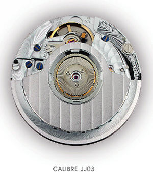
The movement within the C900 Worldtimer is the Calibre JJ03, which is a modified movement with a base ETA 2893. It runs at 28.8k bph, is automatic, has a hacking second hand and can be hand wound, so all the usual specs of a Swiss Made automatic. As you’d expect, the high beat running at 8 ticks per second is very smooth, with no stuttering at all.

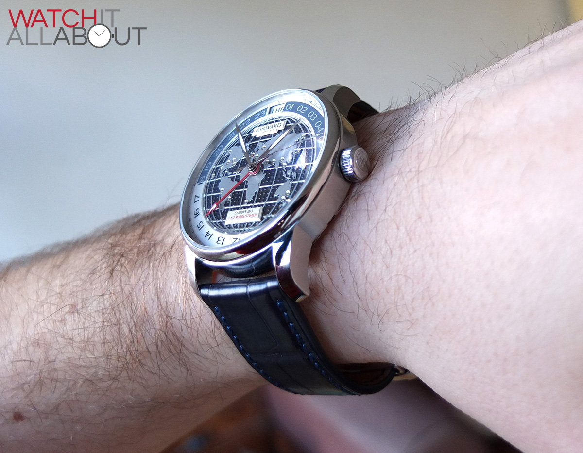
The main thing to note, and for some could be the main feature you need to realise, is that the C900 Worldtimer doesn’t show the time like a normal watch. The hour hand gearing has actually been altered, so for every rotation it makes around the dial equates to 24 hours rather than the usual 12. So it only rotates around the face once a day rather than twice.
This takes some getting used to, it means that it’s not simple to have a quick glance at the watch to see the time. Although it gets easier to read with time, you always have to refer to the hour that it’s pointing to in order to figure out the time.
Having all 24 hours on one dial is actually quite liberating. Seeing the whole day and where you are in it helps you see the bigger picture of the day you’re living in.
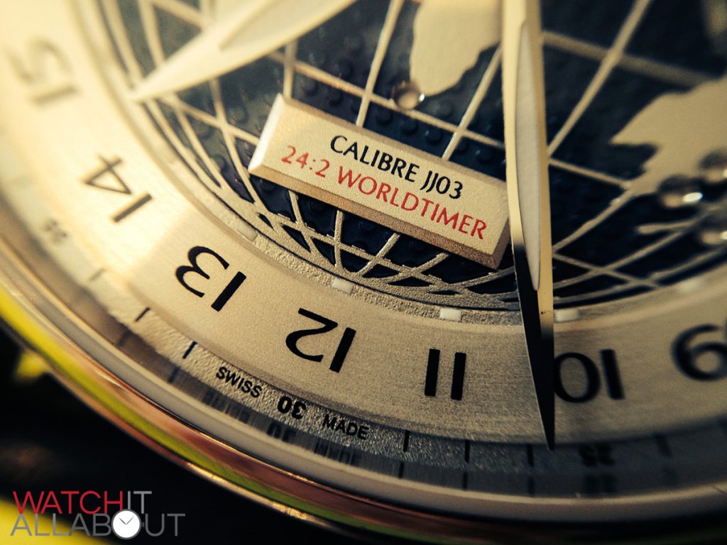
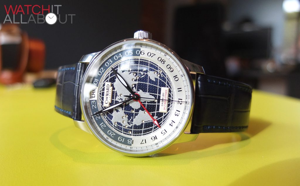
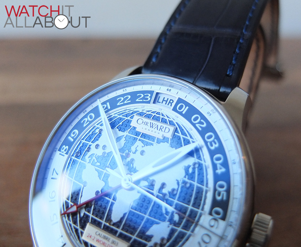
There is an aperture at 12 which shows the three letter airport code wheel for the time zone you have selected, such as LHR (London Heathrow). The font used is a subtle yet bold sans-serif. There is also a corresponding red dot on the world in the dial which moves as you change your indicated second time zone. Fitting all this in this movement is very impressive, as these are both individual wheels.
You use the watch the following way: You pull out the crown to the second position to change your local time in the normal fashion. The first position is where the magic happens. You rotate it clockwise to advance the second time zones hour hand, which flicks between the hours in the position relative to the minute hand. Turning it anti-clockwise will advance the time zone indicator. Both the dot on the world map and the airport code in the aperture at 12 change.
When you are adjusting the time or the time zone, the movement feels very solid and well built, which is reassuring. Sometimes a movement can feel a bit flimsy in the hand, which can suggest poor craftsmanship. This isn’t the case with the JJ03.
To top it all off, the only visible part of the movement, the rear, is well finished and features a custom rotor with the CW logo and name on. It certainly looks the part, and reminds you what you’re getting for £1575.
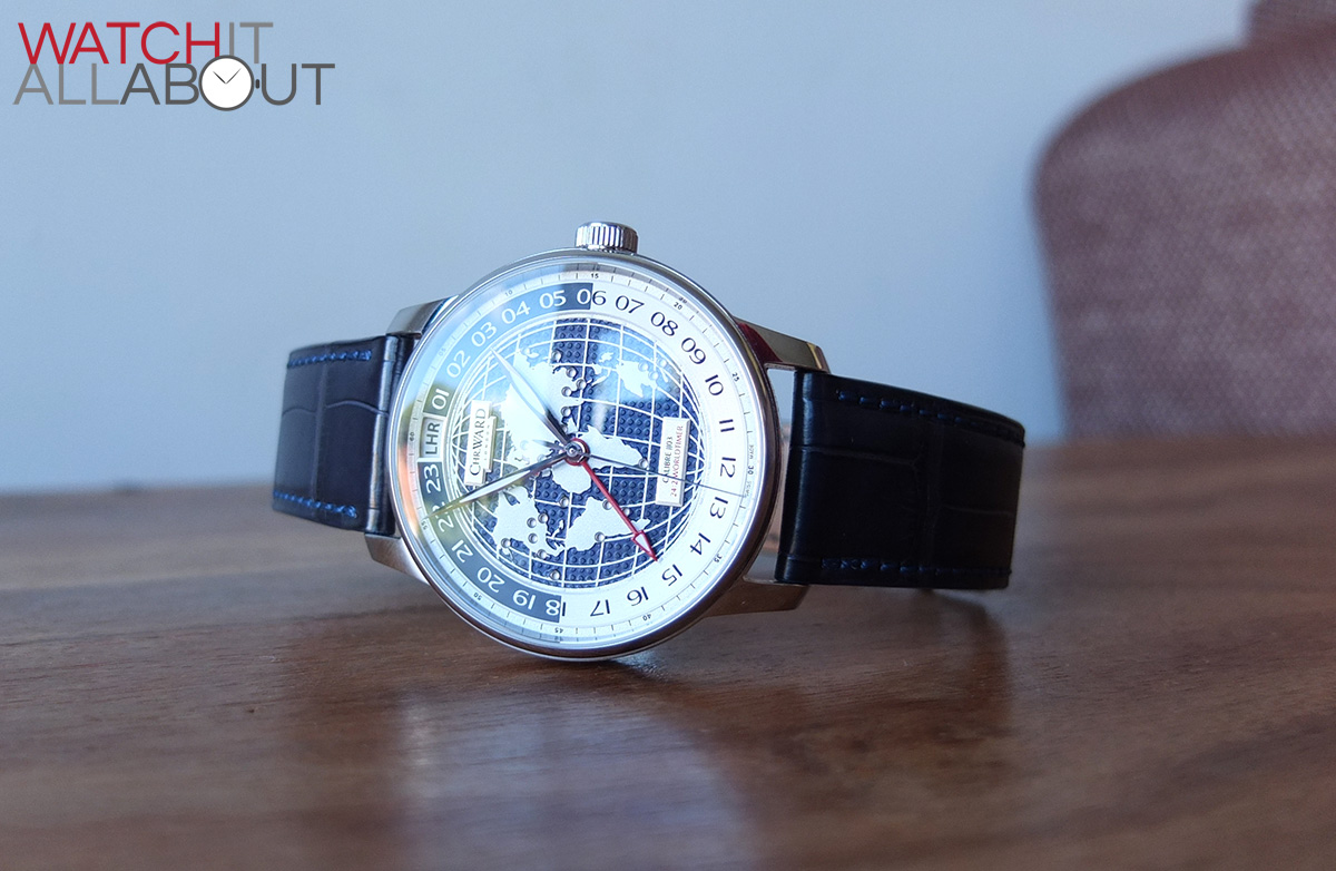
The dial
The dial is very intricate and complex, with incredible attention to detail. Where do I start?
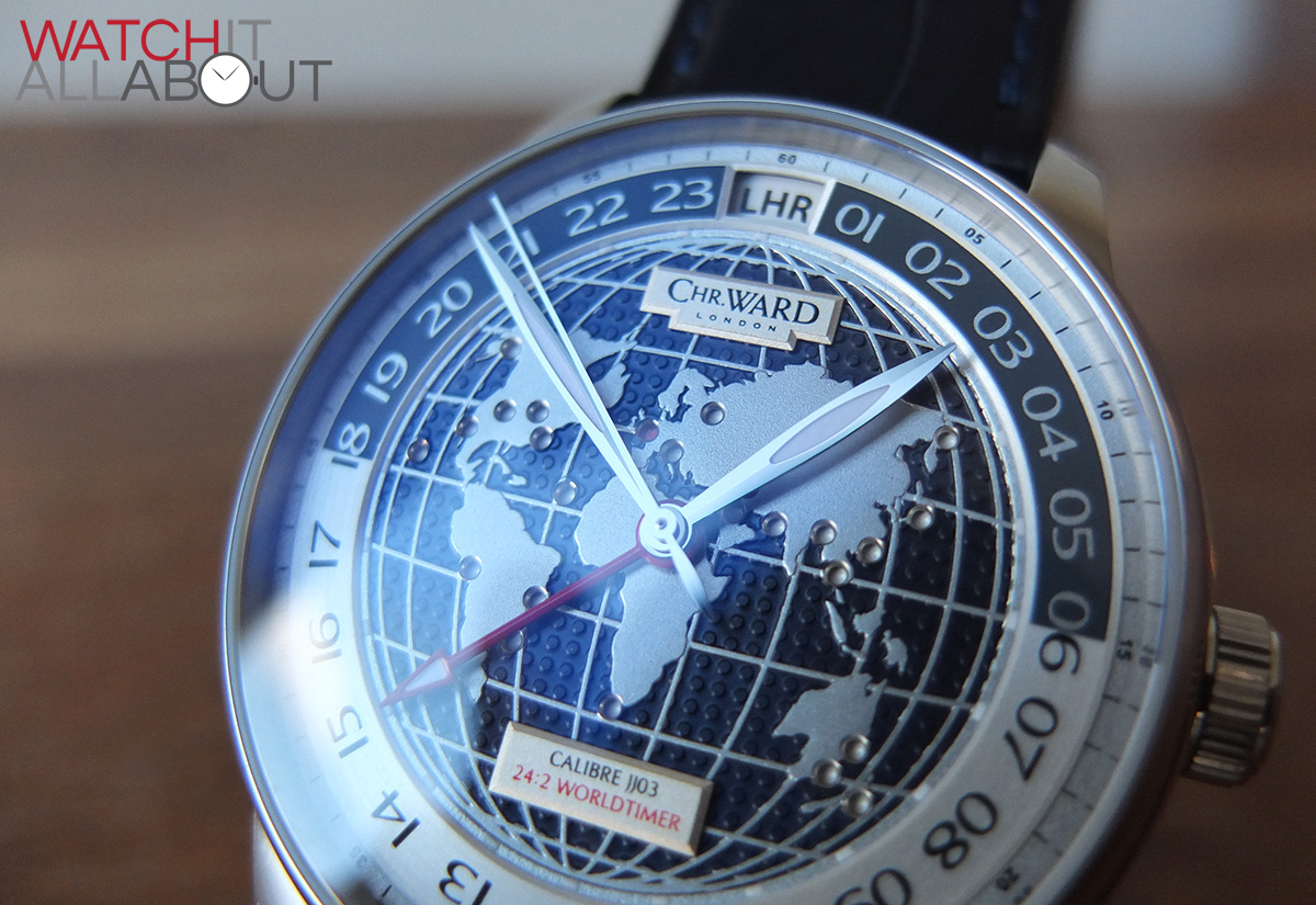
I think the standout element is the dimpled sea surrounding the land. This is a beautiful deep blue, and the texture finishing is highly impressive.

The land is raised from the sea, giving a multi layered aspect to the dial (one of many), and is once again exquisite in its execution. The shapes are so accurate, and the colour is a elegant silver, which compliments the surrounding sea well. In addition to the land, there is subtle thin longitude and latitude lines which are also raised.
Every time zone has it’s own location on the dial, where the main airport is. These holes are very cleanly drilled out with a polished angled edge. Another high quality of finish and level of detail.

The aperture at 12 also changes the name of the airport when you change your selected time zone. As is the rest of the dial, this is executed with great precision and looks perfect.

Another level of detail which adds to the depth of the dial is the two plaques with the watch specifics on them. The plaque in the top half of the dial displays the Christopher Ward logo, which is shaped to match, and the bottom plaque displays details of the watch and movement. Both plaques are made with great precision and applied perfectly. The printing is also precise, with no smudging and looks great even on the thinnest parts of the letters.
There is yet another bold feature of the C900 Worldtimer in form of the hour track. This circles the globe and is on a higher level. It is split into day and night, day being 06:00-18:00 and night bring 18:00-06:00. This is visually displayed as having opposing font and background colours. So day is a silver track with blue text, and night is a blue track with silver text. There is a slight amount of texture on the hour track, which is almost like a brushed stainless steel appearance. This adds to the high quality and expensive feeling this watch exudes.
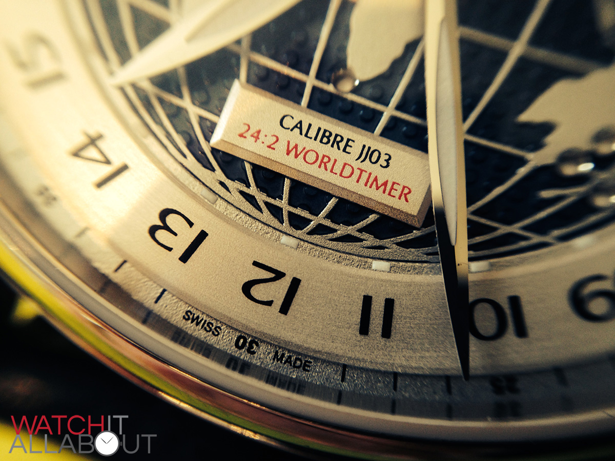
Surrounding the hour track is an outer minute track. This is on a lower level (there’s so many of them). It is quite thin and subtle, but it serves it’s purpose well and gives the dial extra depth. There are numeral indicators every five seconds and dashes in-between. All printing is accurate and flawless.
Next comes the hands. They are all extremely elegantly designed, being very thin and super long. The second hand in particular, which pretty much almost touches the outer edge of the dial. It is a very simple point, with a slightly bulbous counter weight. The minute hand reaches the outer edge of the hour track, and the hour hand reaches the inner edge of the hour track. These are both similar in appearance, bar the length and width, which is a very thin pointy oval, with a lumed centre. These hands are all made of polished stainless steel and are immaculately made.
There is also the bold red second time zone hand. This is the same length as the hour hand, reaching the inner edge of the hour track, which makes reading the second time zone easy. Whilst it is bold and easy to read, due to the fact that it is a thin shaft with an arrow point, it doesn’t demand too much attention at all. This arrow has a lumed centre, and the counter weight of this hand is a small subtle circle. The finish to this hand is a glossy red, which also shimmers in the light when it hits it right.
Although the hands are indeed all quite thin, elegant and subtle, it doesn’t mean that the C900 Worldtimer is hard to read. This is due to the blue of the dial, creating a high contrast between it and the hands. So legibility is surprisingly good.
The lumed parts of the C900 Worldtimer are the 3 main hands, and also lumed markers at every hour. These are very well disguised, located at every hour between the edges of the globe and the hour track. Have you seen them yet? How about now?
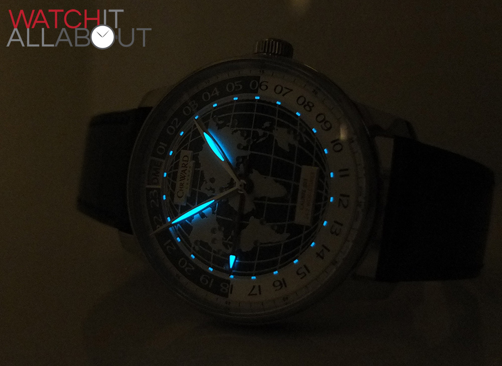
As usual, though, the lume strength isn’t the best sadly. Christopher Ward have yet to impress me with their lume, which is a real shame. Especially when you’re spending around £1500 on a watch. Let’s hope they turn their attention towards this in the near future.
So, there’s no doubt at all that the dial is the stand-out feature of the C900 Worldtimer. It’s so intricate, well designed and excellently executed that it seems like a 43mm wide masterpiece on your wrist. Yes, it’s that nice you can compare it to a fine work of art.
Final comments
Once more, Christopher Ward have made quite an impression in the watch market. Whilst this isn’t really an “affordable” watch at £1575, it still offers a staggering amount of watch for the money. Their relationship with Johannes Janke continues to grow and impress. This is the third watch in a row with one of his custom movements to be nominated in various watch awards. In addition to the movement and it’s unique functionality, you are getting truly exquisite and beautiful dial and a watch which is well refined all over.
The only chief matter you need to consider is the way it displays the time in 24 format. If you believe you can live with this, then I highly recommend the C900 Worldtimer. It’s a real delight to wear and look at.