I know what you’re thinking.
Where are the waves on the dial? Where are the onion hour hand and sword minute hand that is synonymous with the Trident?
I know, because I’ve thought the same. You see, Christopher Ward does not do things by half. When they decide to remake or redo something, they really go for it. Think of the new logo; which, in reality, was a complete overhaul of their branding – but also altered the entire aesthetics of their timepieces.
So now, with the latest iteration of the Trident – their most successful model – I’m not surprised that it is more or less a complete overhaul. What remains? In reality, the counterweight on the seconds hand: a cute Trident, and the deep-stamped caseback.
For some, this is an “end of an era” – and they’re right. I’ve owned and reviewed a number of the “classic” Tridents and loved each and every one. Will the Mk3 stand in such good stead? Time will tell, but first – let’s take a look at the watch itself.
There are 3 new models in the mk3 range; the standard “Pro”, starting at £695; the GMT which starts at £895, and this one: the C60 Trident Elite 1000 Limited Edition coming in at £1250. What’s more, they are available in 38mm and 42mm sizes; for many, a much more suitable size than the previous 43mm. There’s also a 40mm version only available in black dial and bezel configuration; which I’m sure will prove to be incredibly popular.
Let’s check out the Christopher Ward C60 Trident Mk3 Elite.
The video review
The specs
- Dimensions: 42mm diameter x 15mm height x 49mm lug to lug
- Weight: 104g
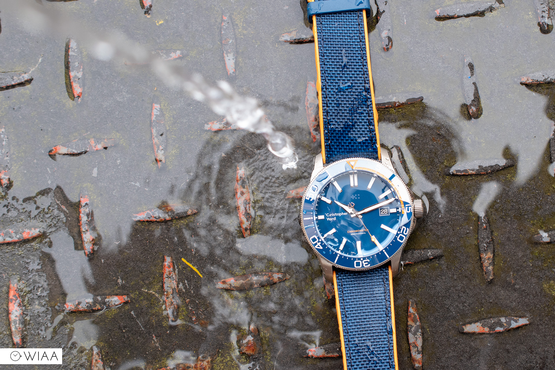
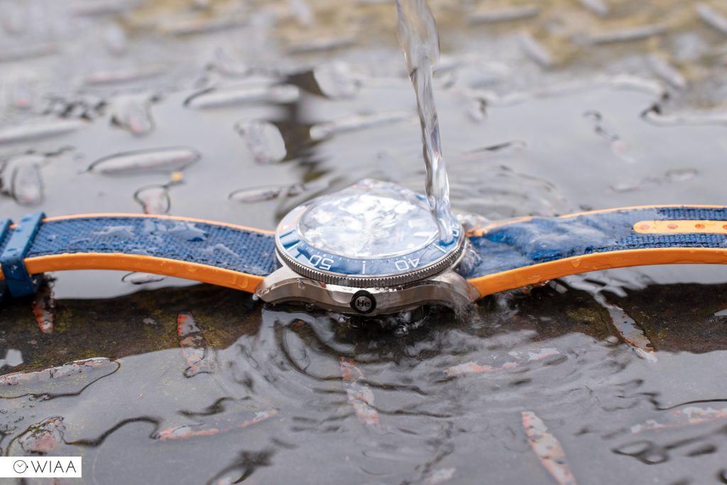
- Water resistance rating: 100ATM / 1000m
- Movement: Sellita SW200 (COSC)
- Accuracy: -19.5 sec/day
- Lug width: 22mm
- Warranty: 5 years
- Price: £1250, standard Tridents available from £695
- Available from: https://www.christopherward.co.uk/watches/dive/c60-trident-elite-1000-range
The case
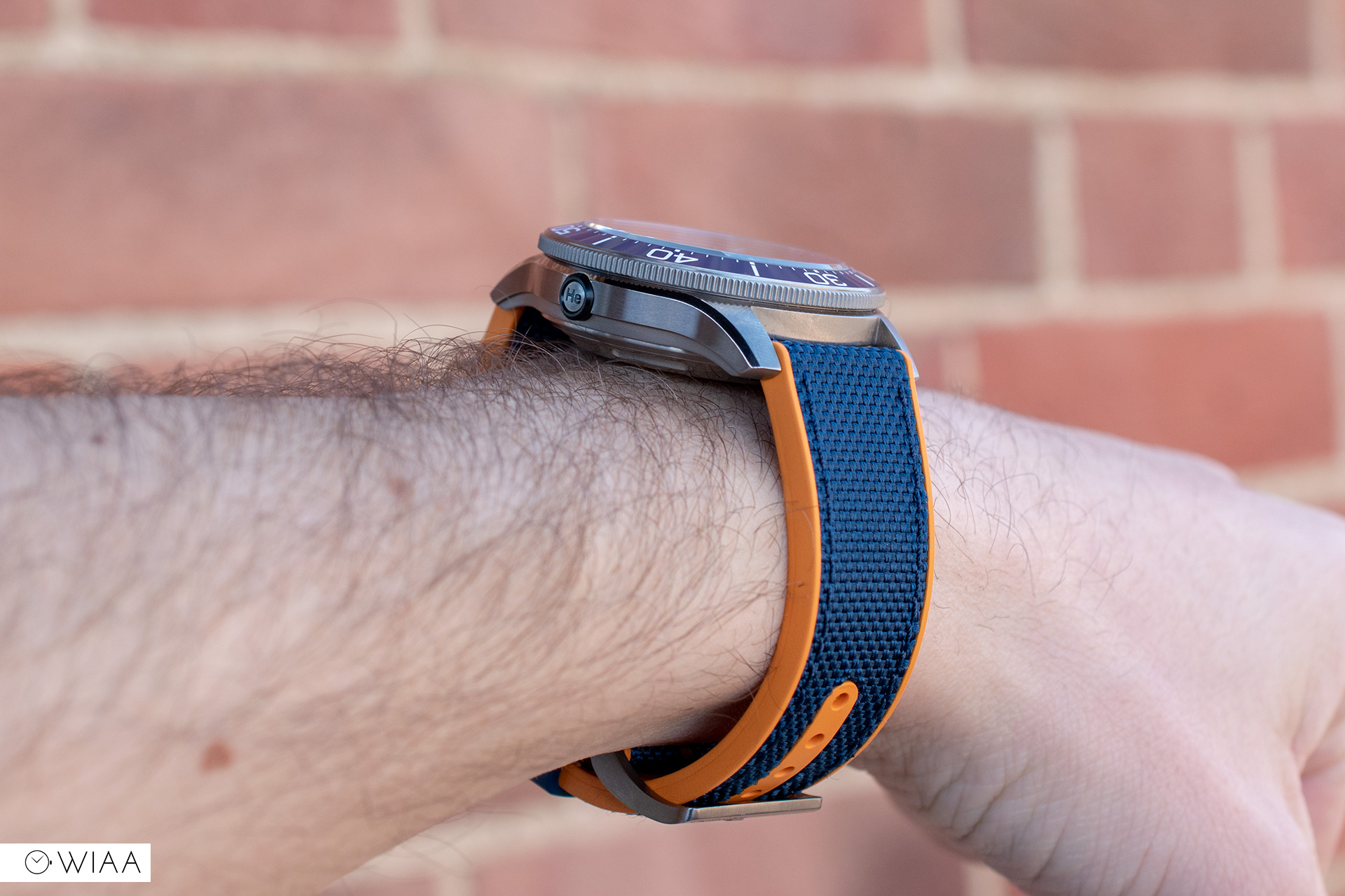
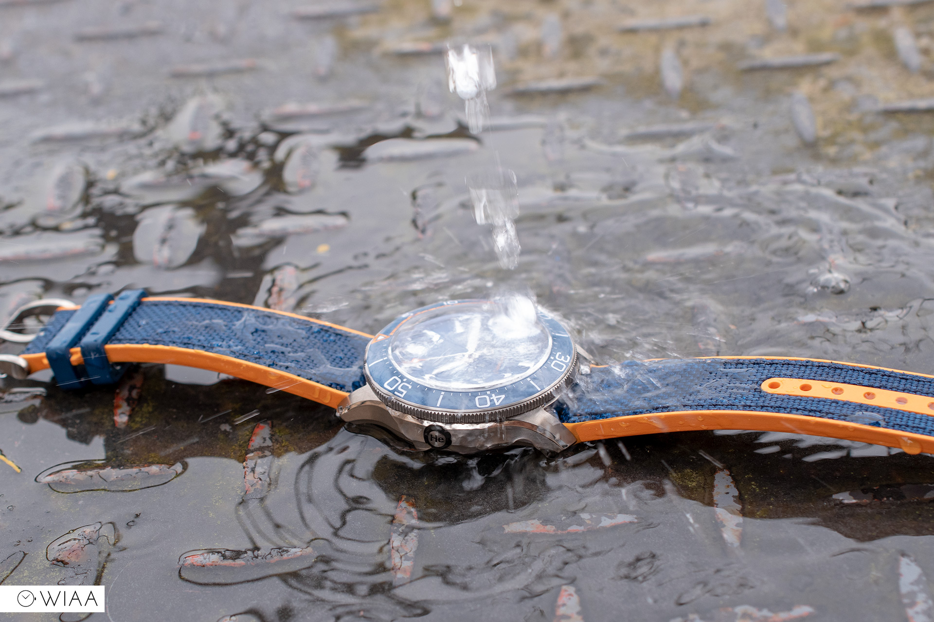
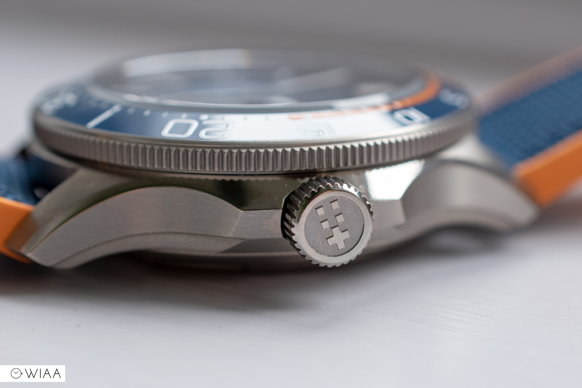
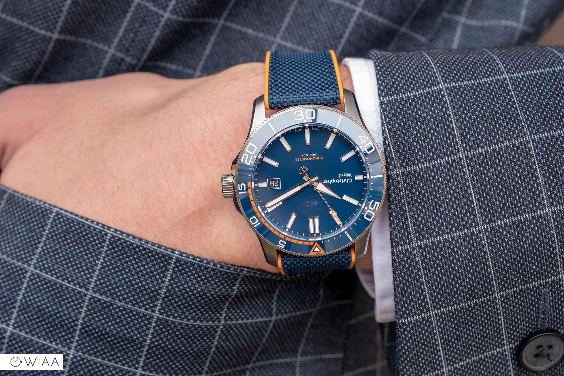
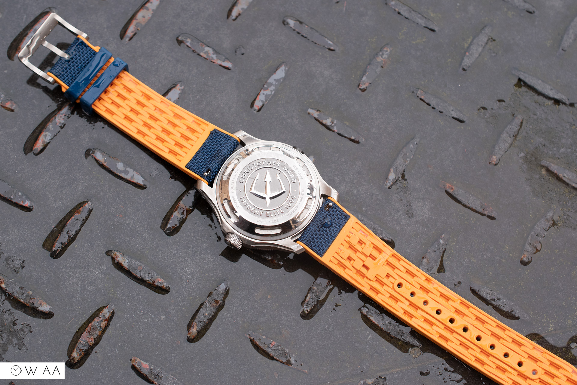
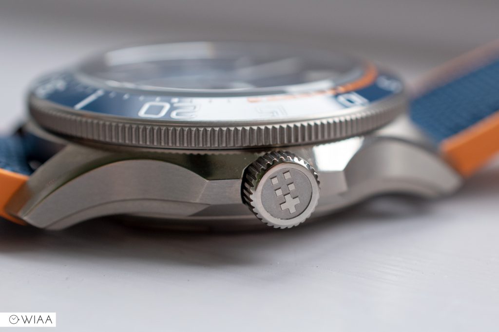
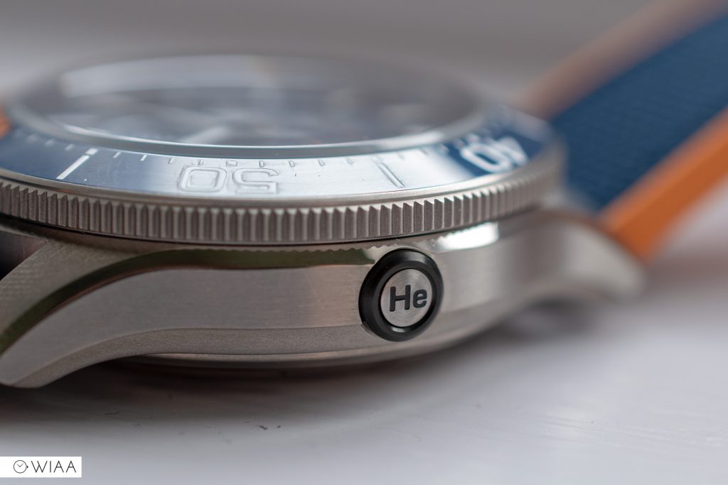
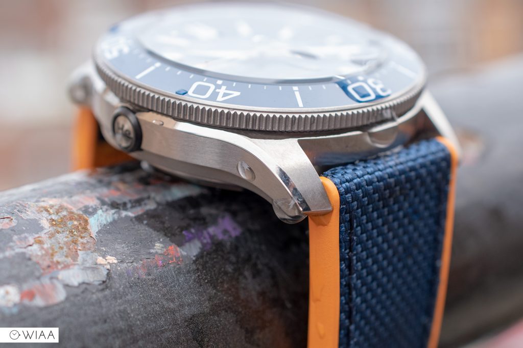
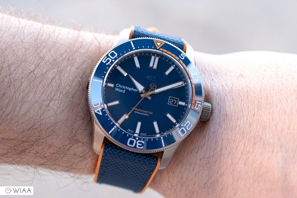
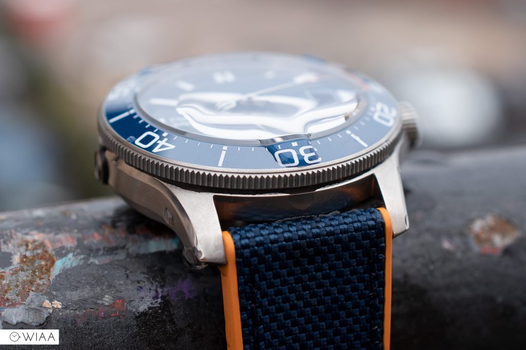
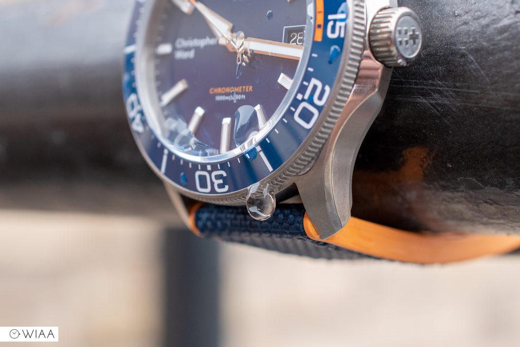
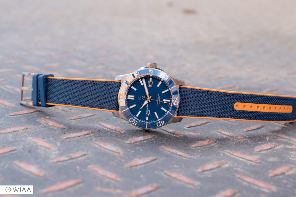
What’s the difference? In this iteration, the Elite, the case is constructed from Titanium grade 2 and features a helium release valve at 9. Rather surprisingly, the colour is more like steel than titanium, so unless you know – you couldn’t tell.
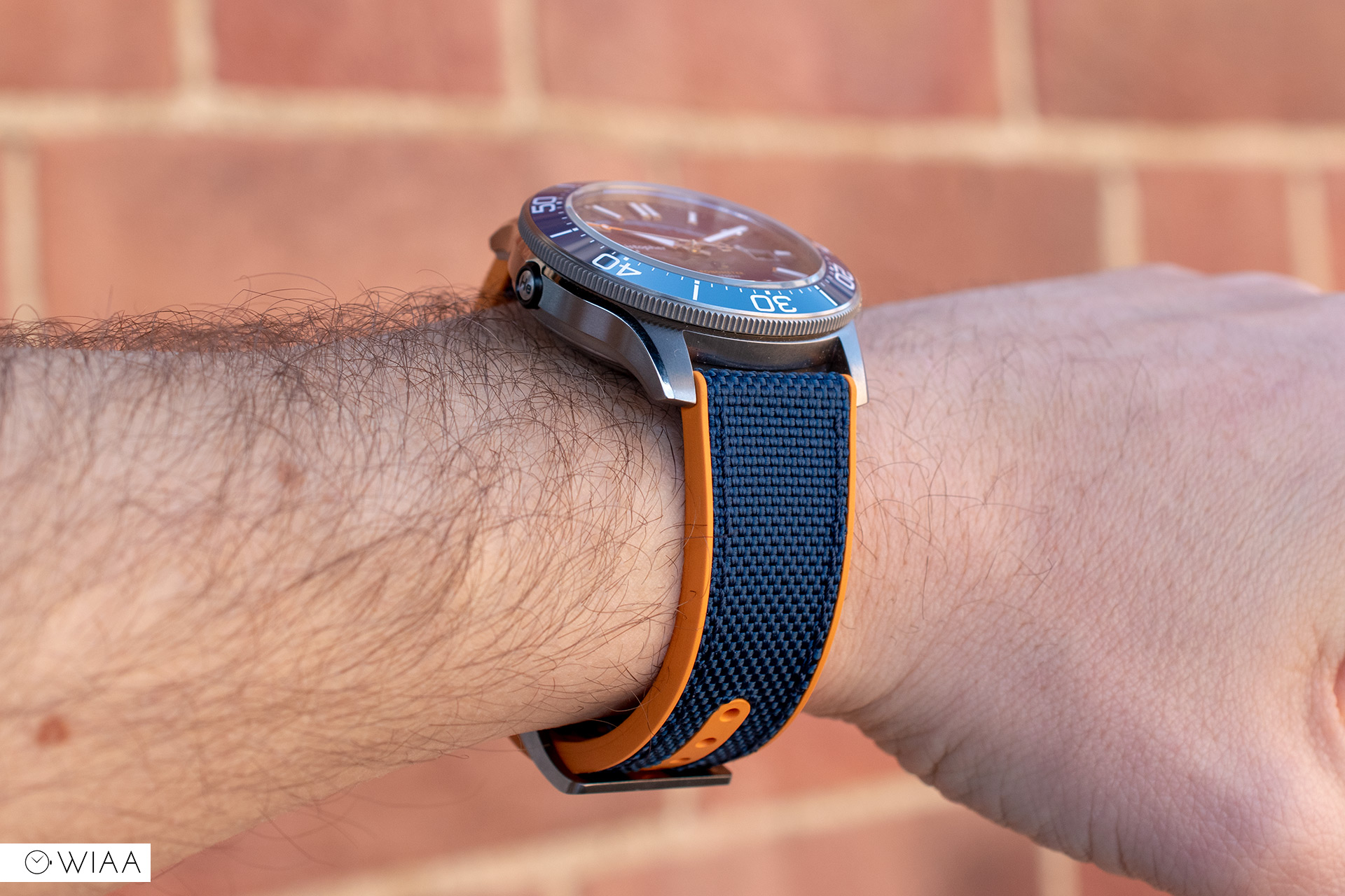
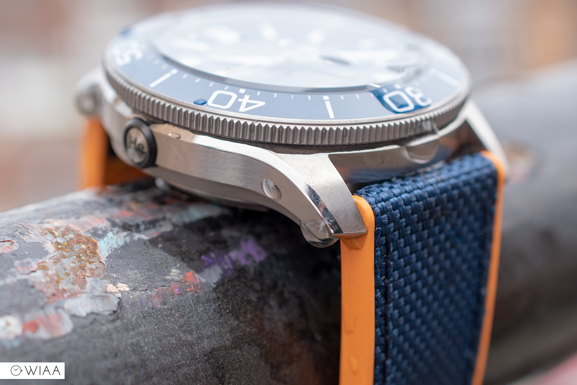

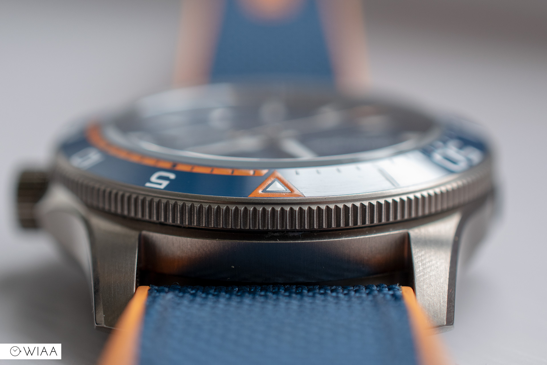
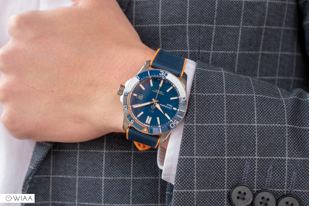
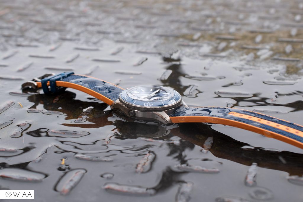
The Mk3 Trident utilises Christopher Ward’s new style “light-catcher” case, which is being rolled out more and more across all the ranges. The flowing lines create a slimmer profile despite the 15mm depth on this model, and it is so much more interesting than the usual slab barrel case. I love the array of finishes and the curvaceous lines – it’s a work of art at every angle.
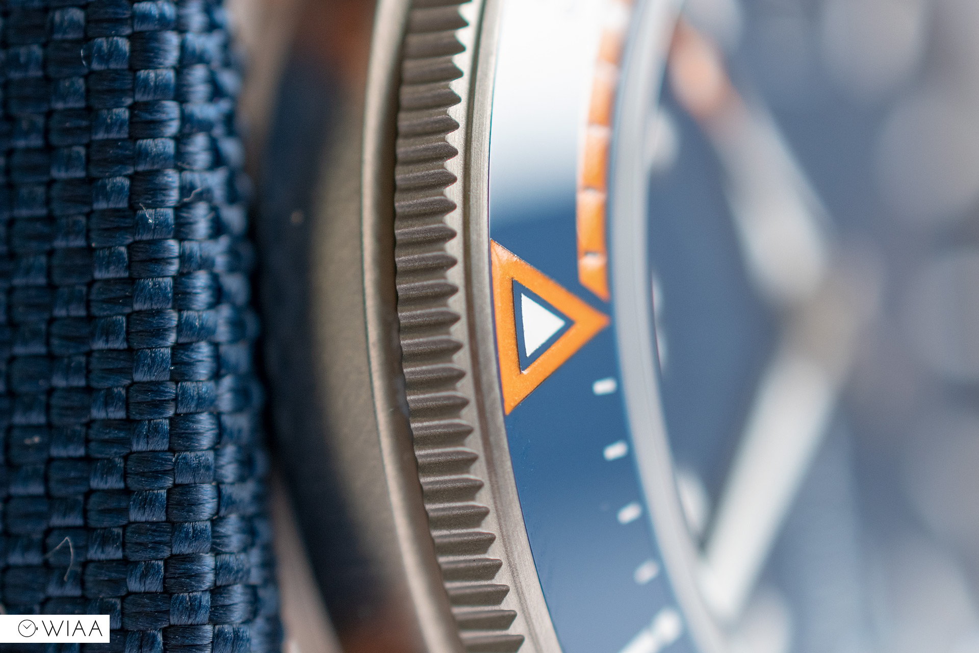
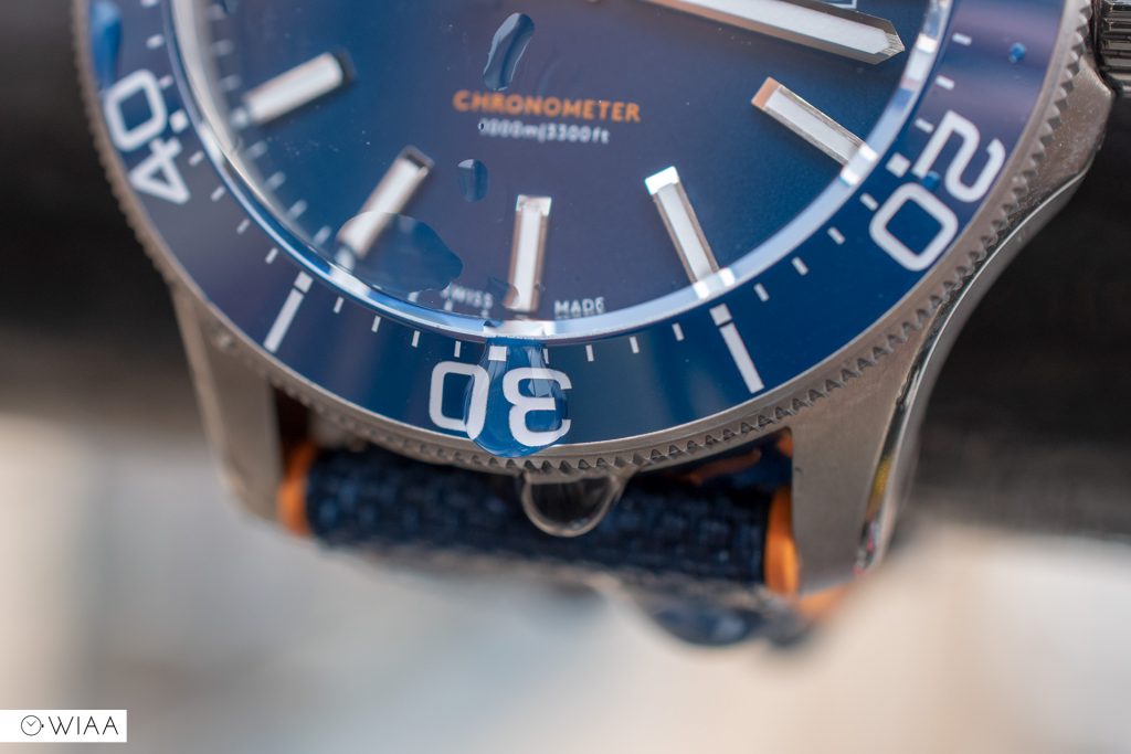
Christopher Ward has paid special attention to the noise of the bezel mechanism; it’s also beautifully smooth in use. At a get-together in Manchester, they boldly stated that the action is one of the best going, second only to Rolex. I don’t handle Rolexes too often so I can’t say for sure, but I can attest to the action on the Trident being excellent. It has a polished ceramic insert, with no pip which is a plus – the whole bezel is nice and smooth creating a streamlined look. The blue and orange are eye-catching, and the lume is strong and plentiful. The toothed grip is delicate but very easy to use thanks to the buttery action.

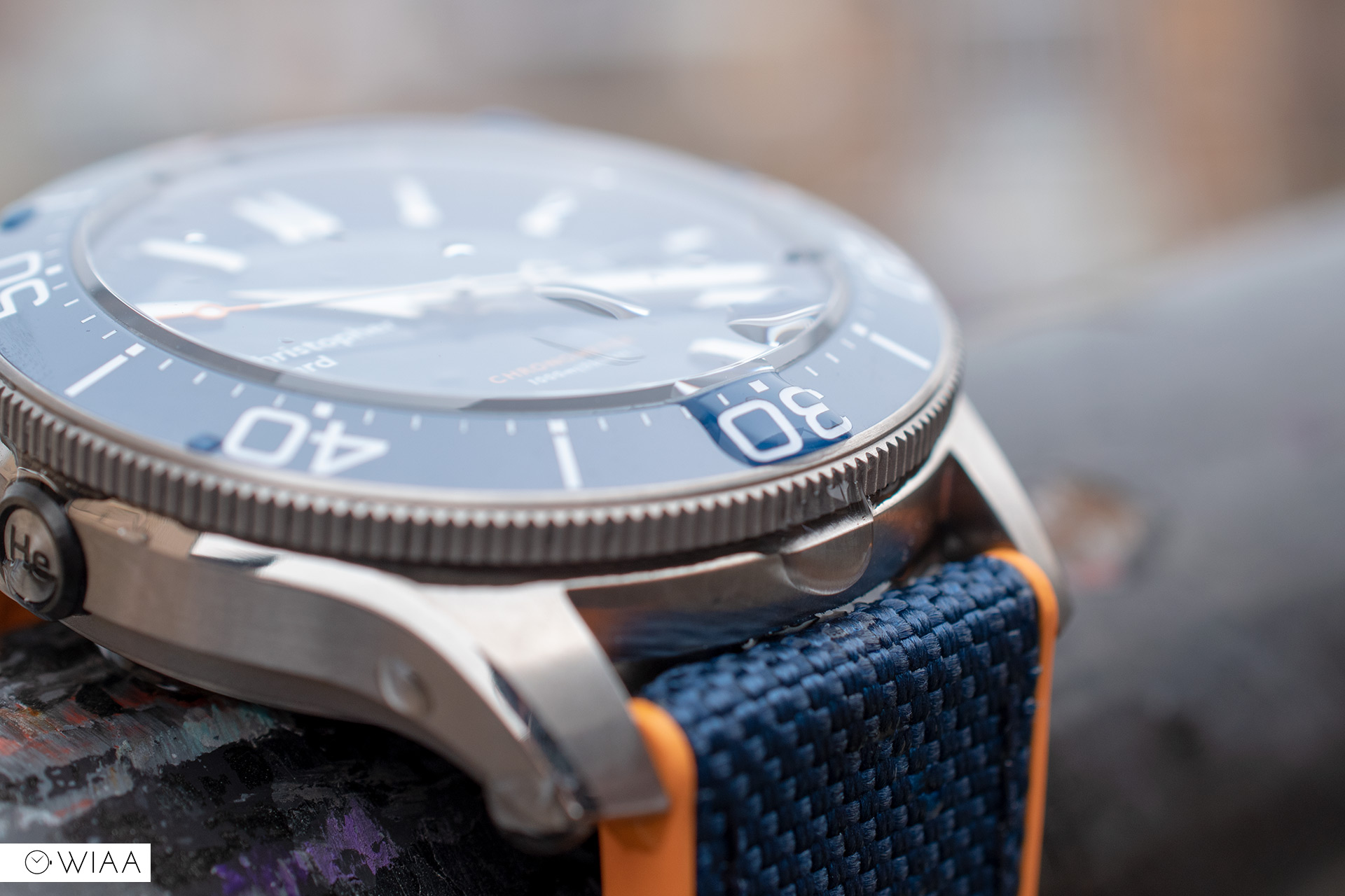
The threading for the crown has been reworked and enhanced for smooth engagement. That doesn’t necessarily mean that the logo on the crown will line up perfectly once it’s fully screwed in though – you have to give it quite a tighten to do that. The twin flags logo is accurately detailed against a frosted finish; the grip is gentle yet effective.
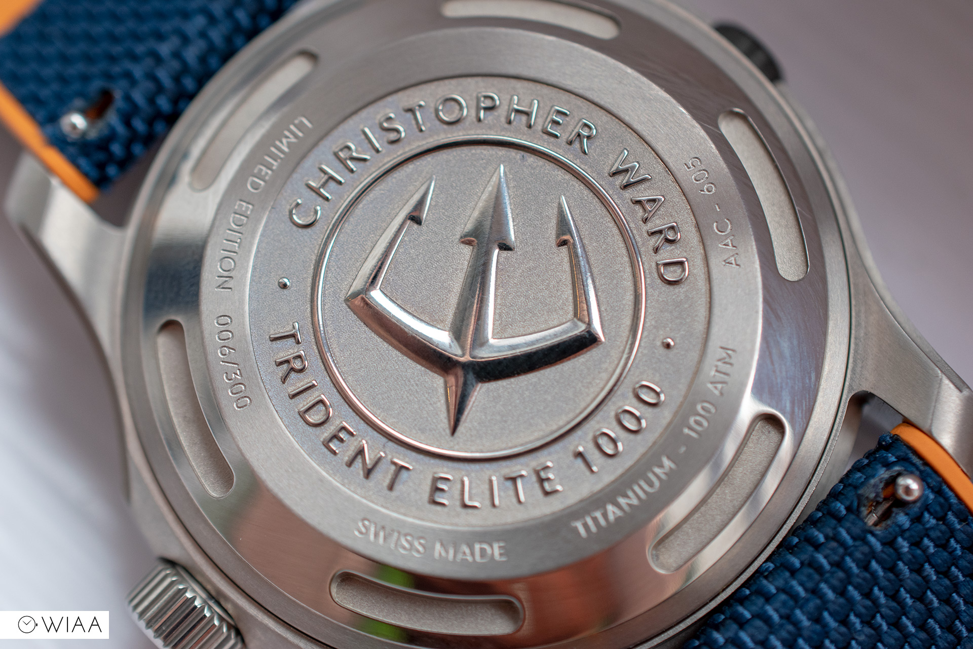
The caseback is very similar to before, with the Trident deep-stamped in the centre. The Trident itself has been redesigned, with a more aggressive and masculine tweak – not that it’s that obvious. The indents for the caseback removal tool imitate a diving regulator.
The flat, raised sapphire crystal seems like it has an upgrade too; there’s a definite and rather effective anti-reflective coating that works really well and provides a blue splash at certain angles.
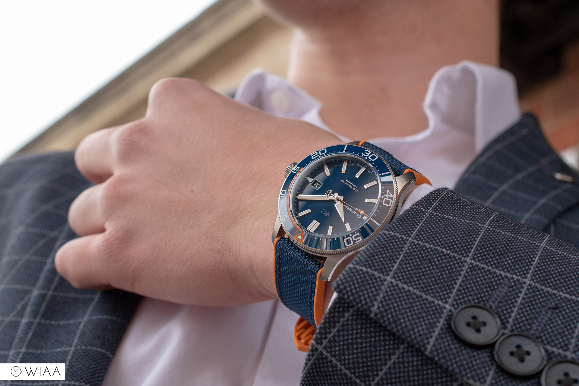
The dial
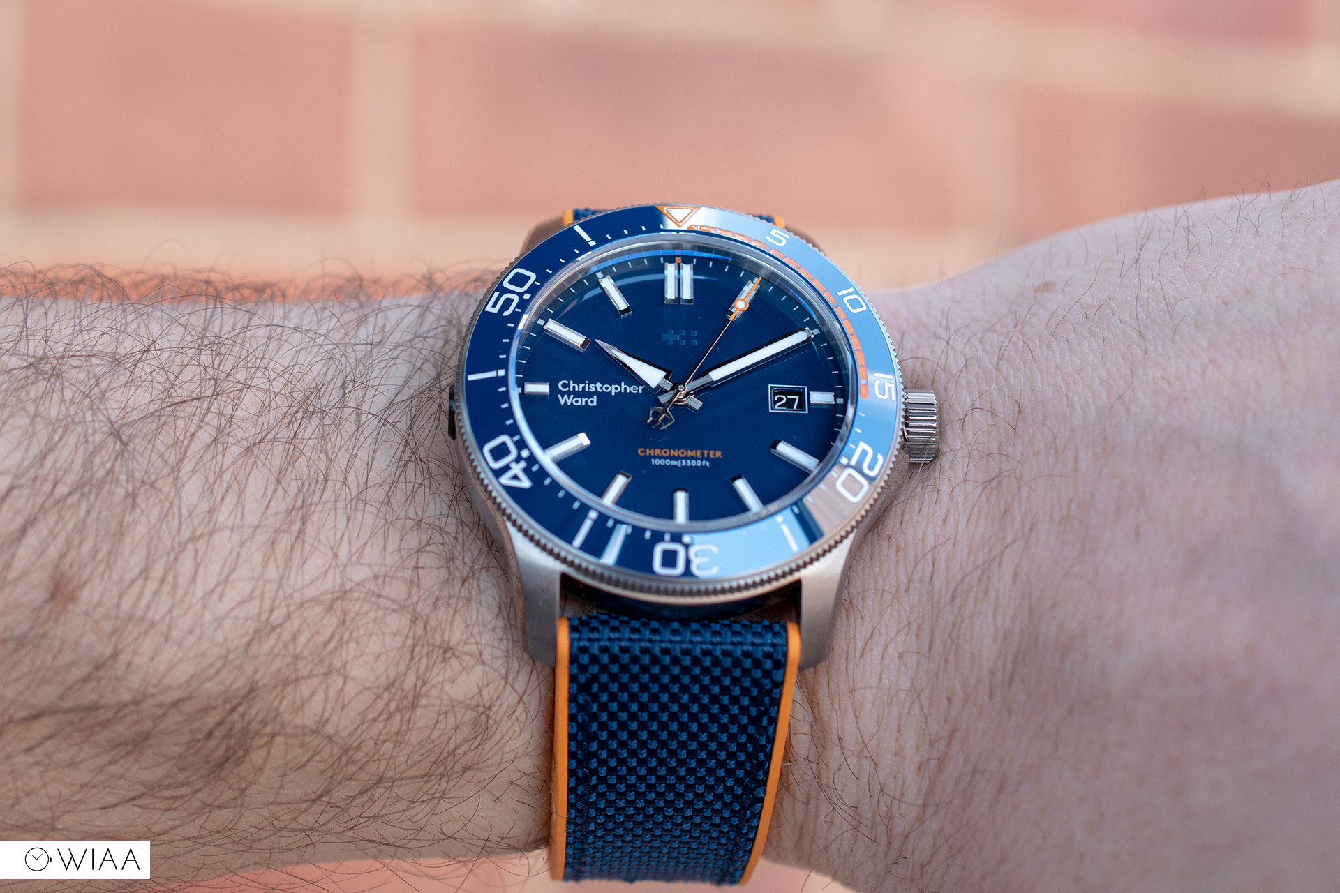
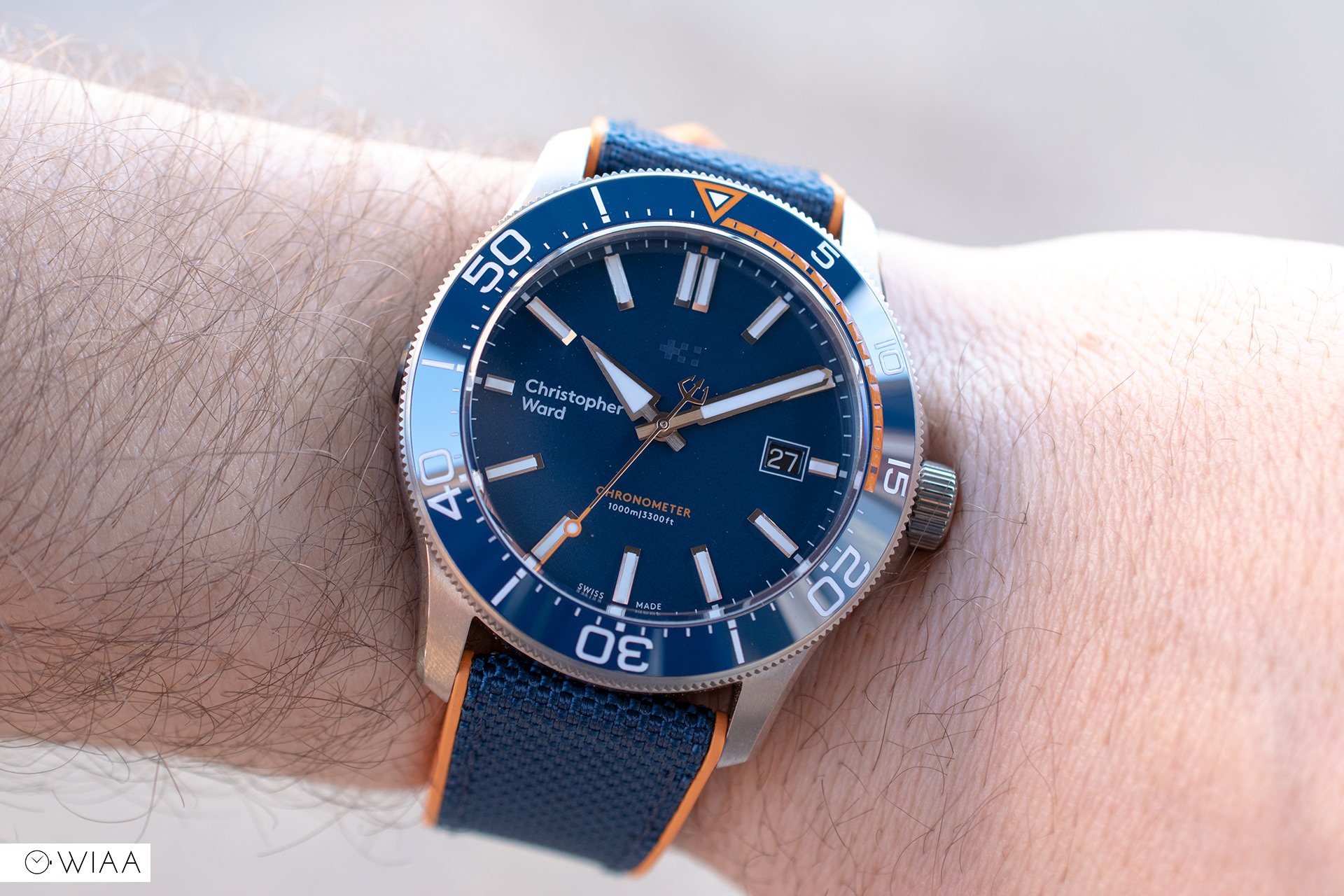
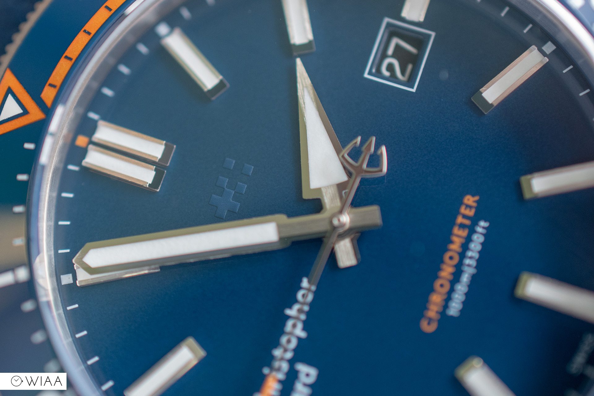
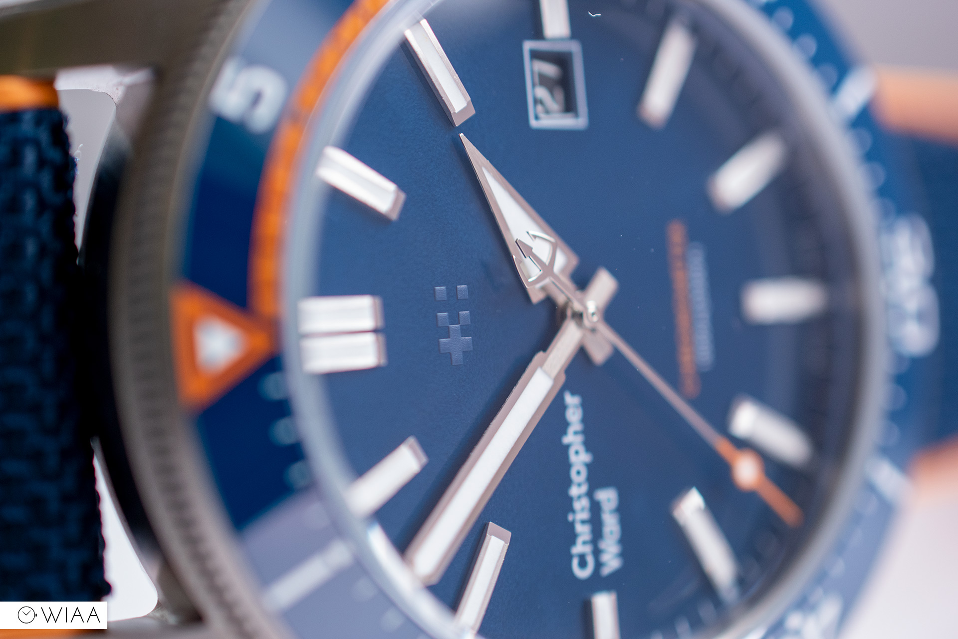
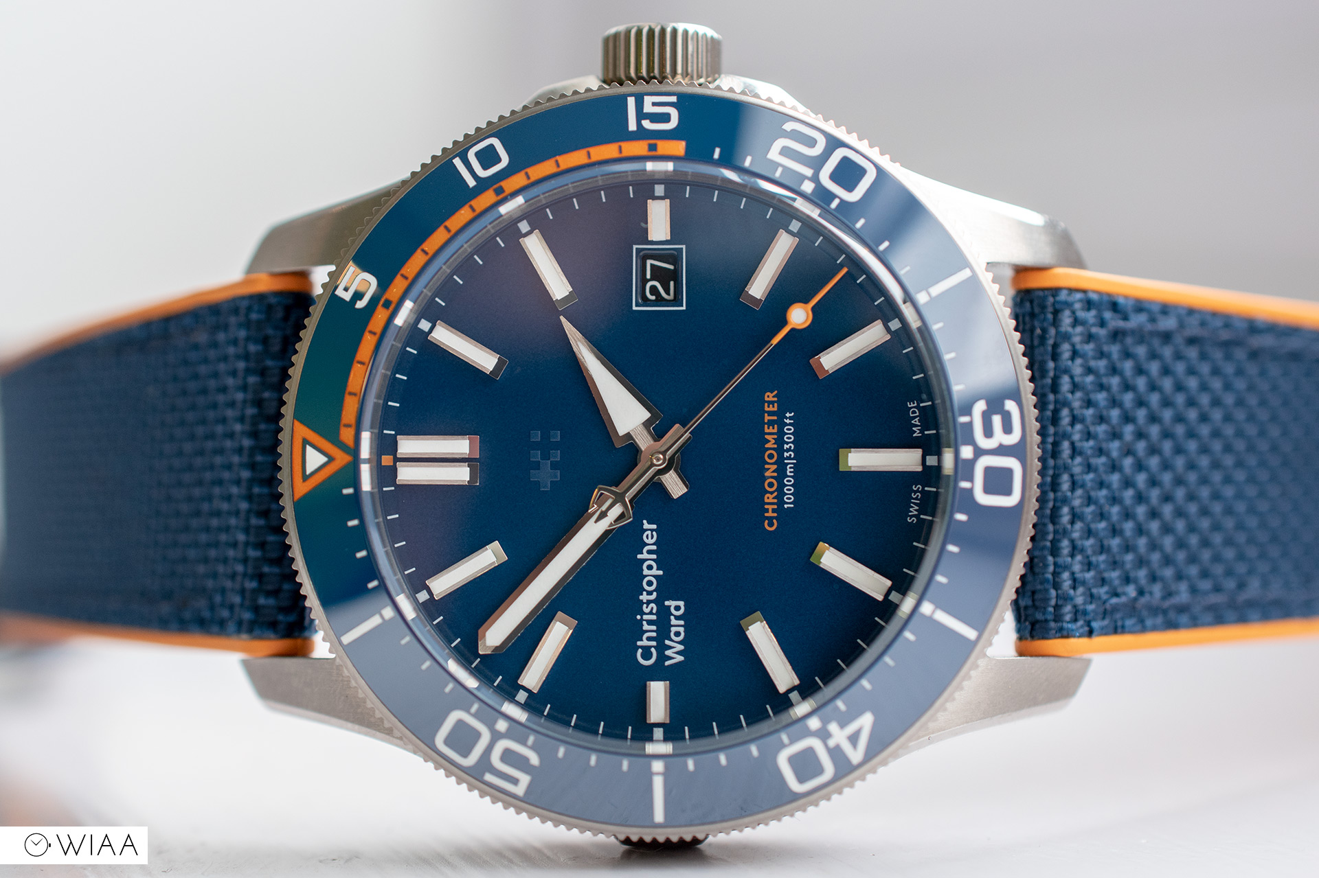
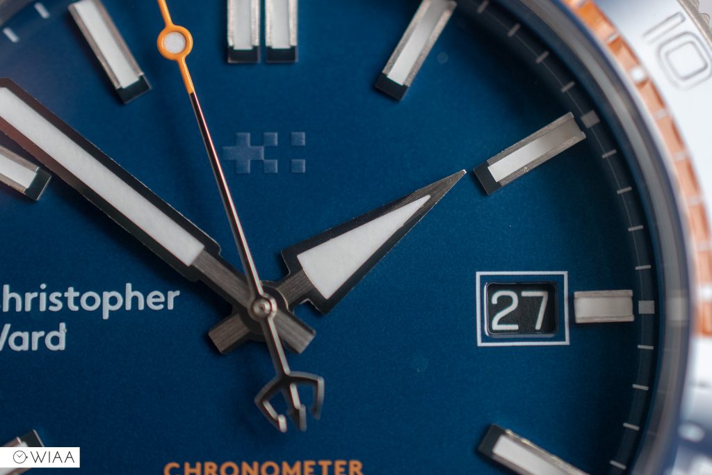
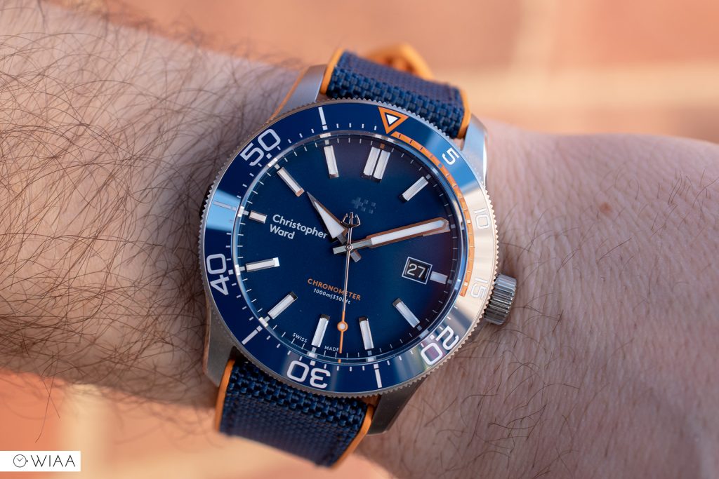
For me, the dial is the key and most noticeable difference to the latest iteration of the Trident; namely the hands and dial base.
The previous hands certainly were distinctive; the onion hour and sword minute hands were elegant and the highlight for many. It’s natural then, that changing something so distinguished will create quite the stir. So yes, whilst I do miss the old hands, the new hands are distinctive in their own right; in particular the bold and directional triangular hour hand. The hands are spotlessly hand-finished, with a brushed central channel and polished sides.
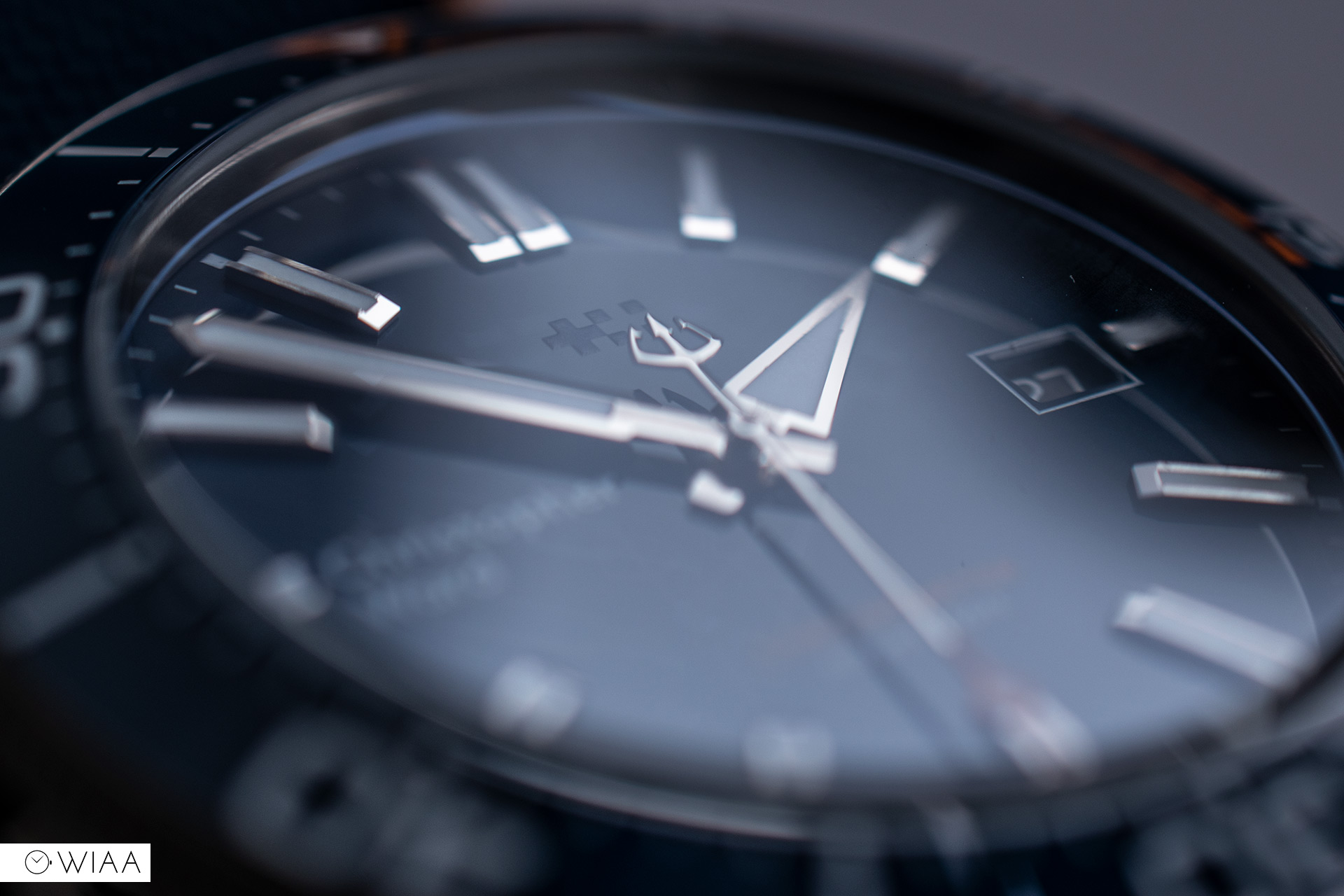
The seconds hand is lovely, with the Trident counterweight and orange tip with a lumed disc near the top. I also really like the minute hand, a wide syringe style. The hour hand, though, is what it’s all about – and I have a feeling heads are going to roll about it. It’s certainly bold – an oversized triangle – but could it be a bit unbalanced visually? I’m undecided, and it’s most definitely a personal preference if you dig it or not. I also believe it’s a grower, so if at first, you don’t like it, give it time.
The other primary alteration is the dial base. What would have been a wave texture à la the Omega Seamaster, is now a smooth polished dial. This is obviously the blue option, but it’s also available in black. Christopher Ward says that this change is primarily for enhanced legibility, but I wonder if it’s to increase perceived value and “make it look more expensive” – it certainly has a modern Omega feel to it. It really does look beautiful – I’m a big fan of reflective dials, and I’ve seen a number of manufacturers use ceramic or enamel dials recently which do really catch the eye.
The logo. The one thing that has caused quite a controversy in recent years for Christopher Ward. On the Trident Mk3, the logo remains at 9, however, we also have the twin flags motif located at 12. For me, it’s a much better balance now with this addition, and the flags are painted and raised on the dial which makes it noticeable. I haven’t seen the black version, but in this instance, I like the subtle colour difference between the ink used for the flags and the blue dial base.
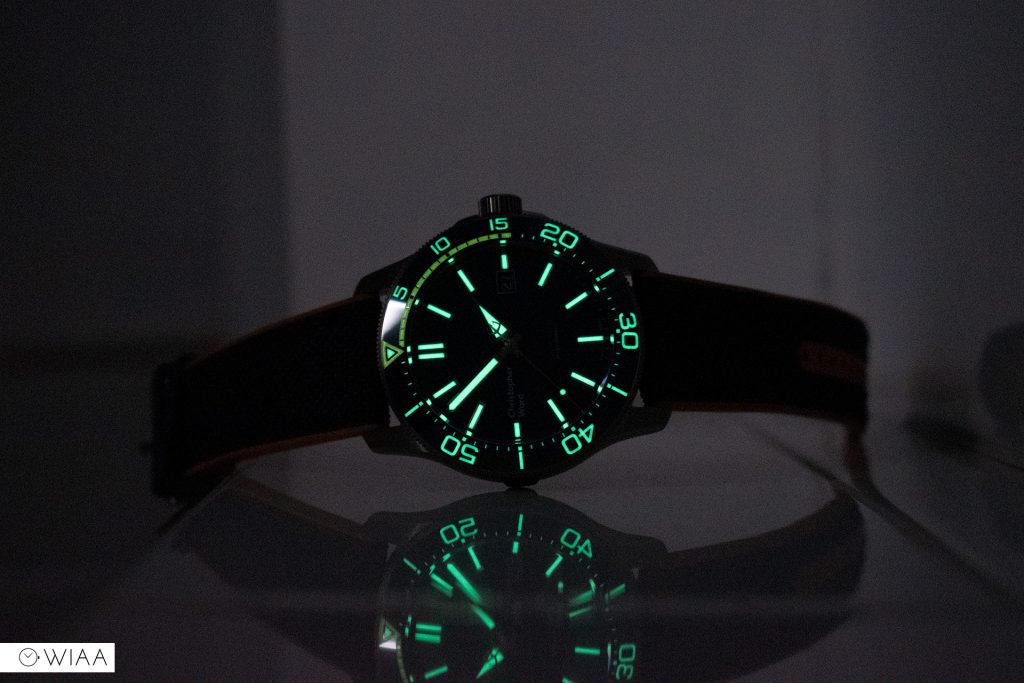
Since I can remember, Christopher Ward has struggled to make an impression when it comes to lume strength. They were focused on improving that with the Mk3, so they doubled the amount of lume, but also used better lume too – upgrading to SuperLumiNova Grade X1 GL C1. In order to double the amount, they’ve had to redesign the indexes to be able to contain the increased volume of lume paint.
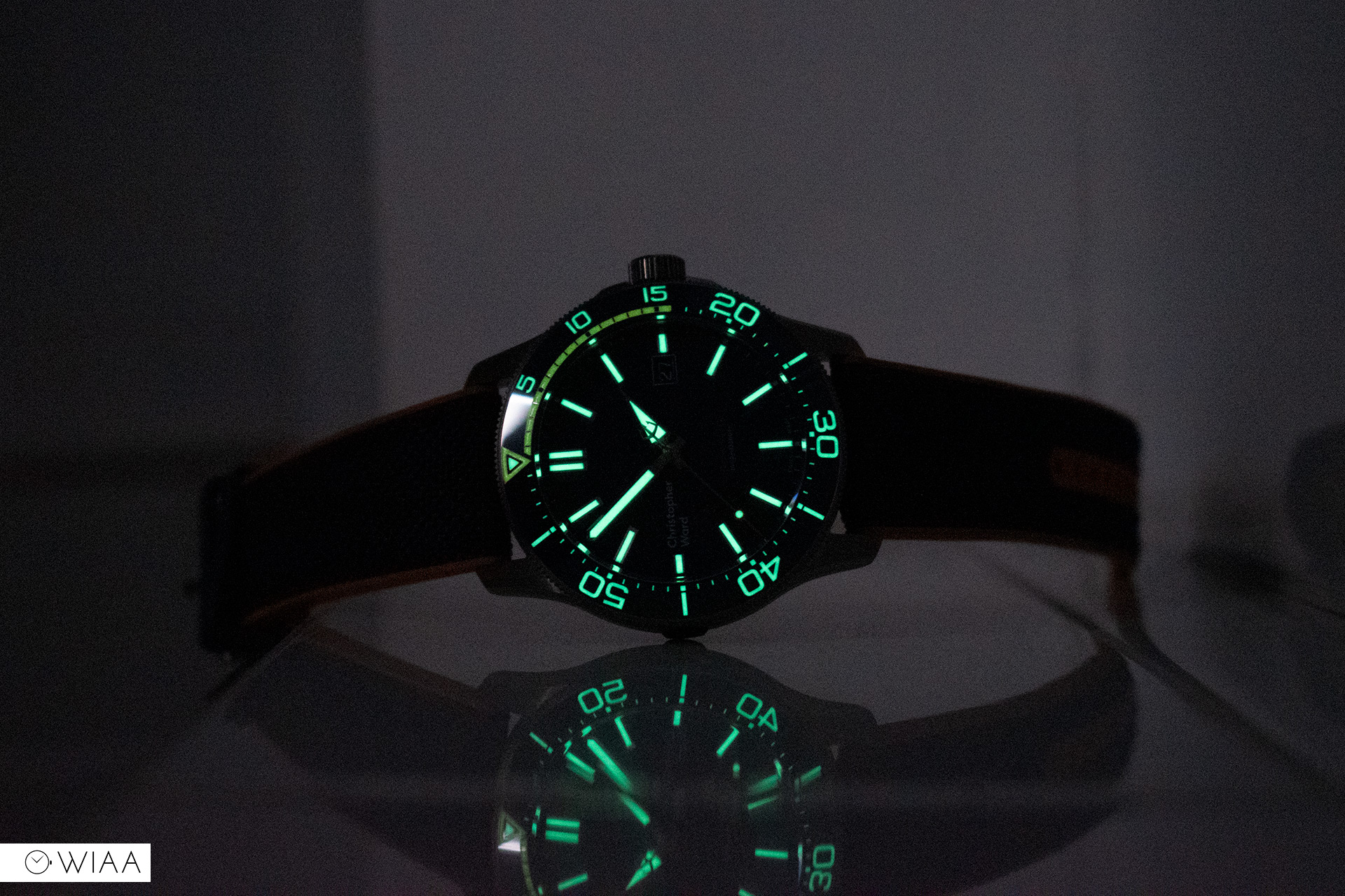
The applied hour indices are deep (which I love) to house the lume. They have brushed sides and a polished ramp at the base, creating a pleasing collection of reflections based on the angle of the light.

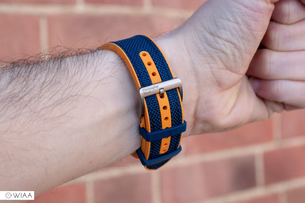
The strap
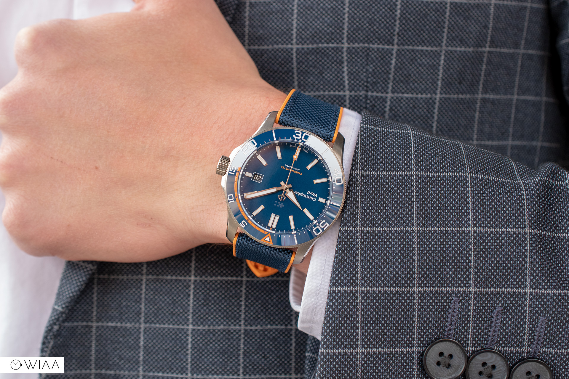
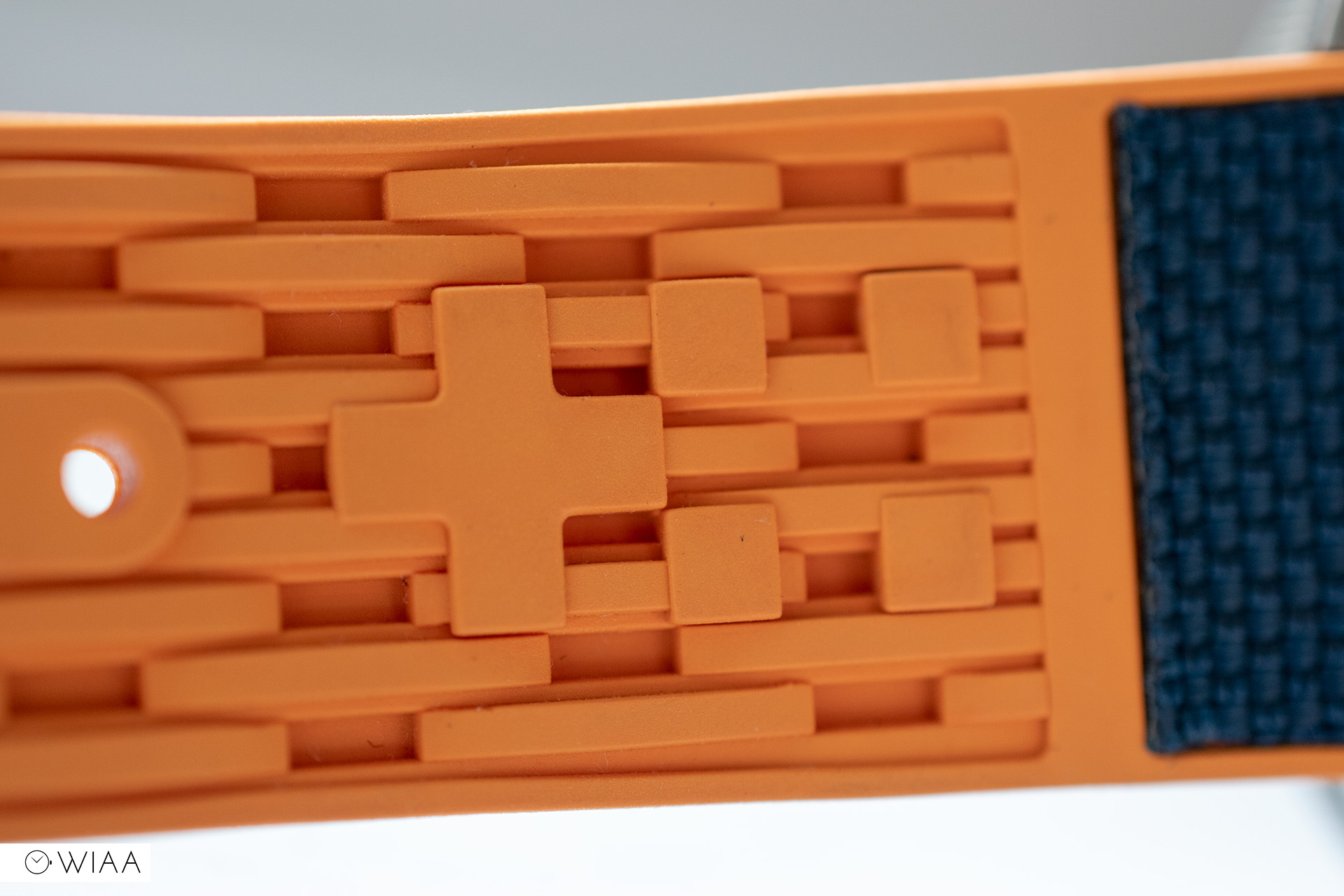
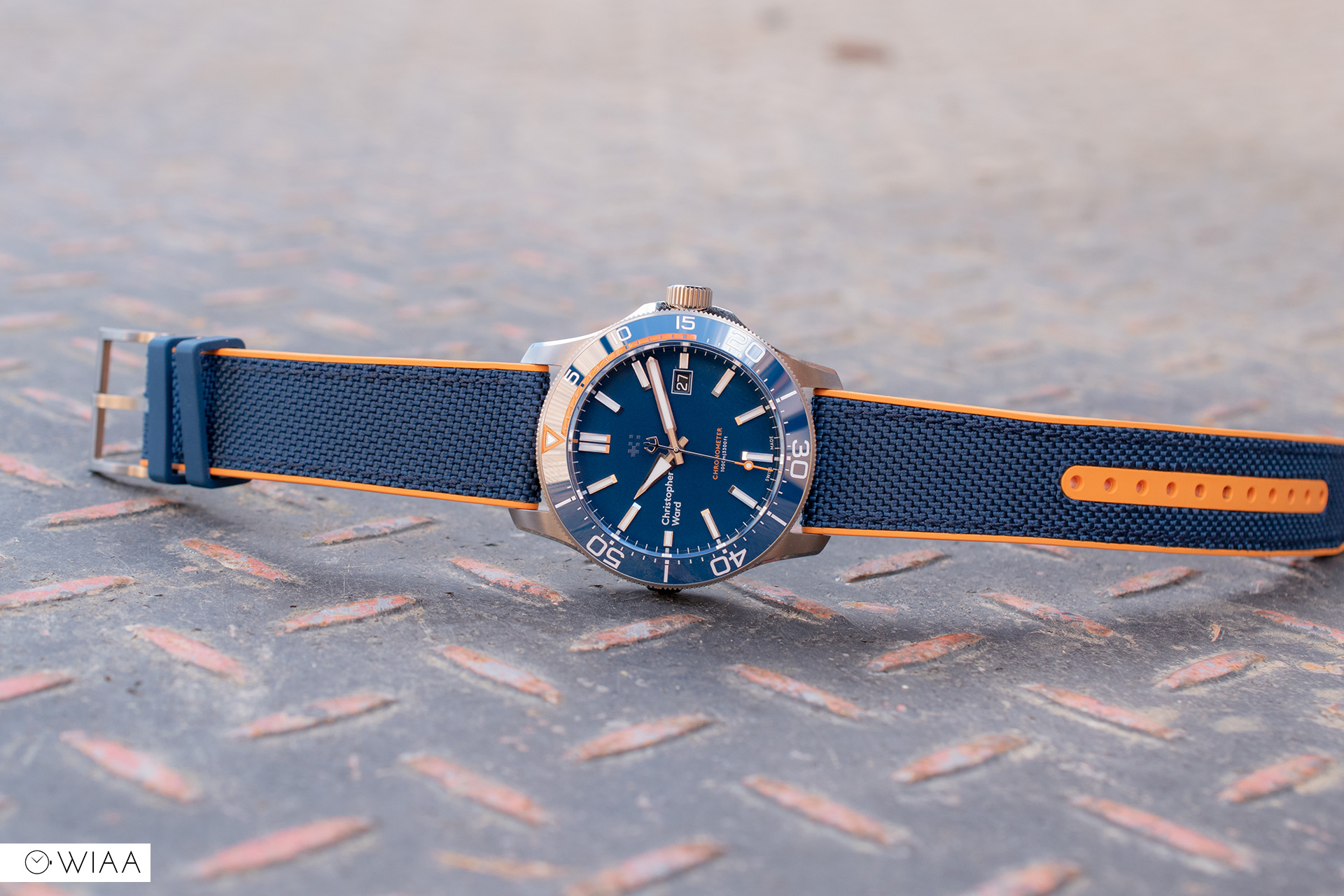
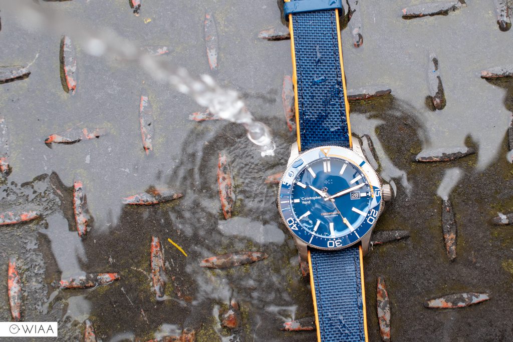
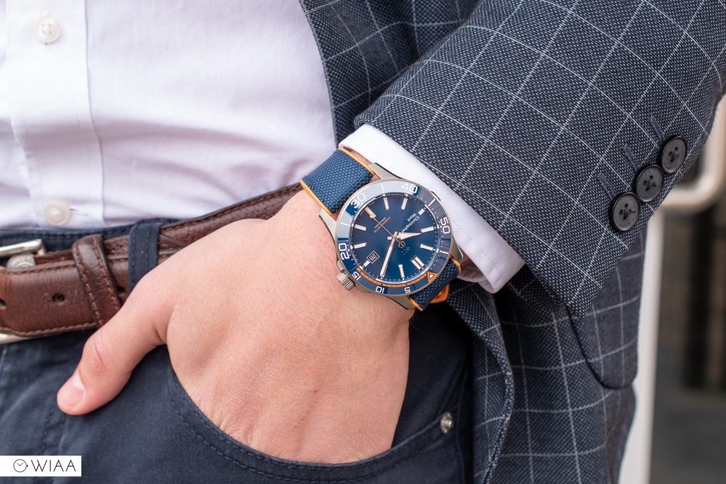
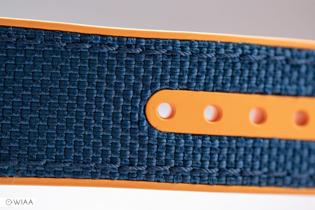
The strap on this Elite is their new hybrid sports strap, crafted from fully waterproof Cordura and premium FKM rubber. I’ve tested it, and yes it’s waterproof alright and is also pretty hard wearing. Throwing the ball into the nearby river right on the edge of it for my dog to have a swim, I slipped and landed hard on my butt – and got the strap pretty wet and muddy in the process. I dipped the watch in the water, gave the strap a good scrub, and it’s back to looking as good as new.
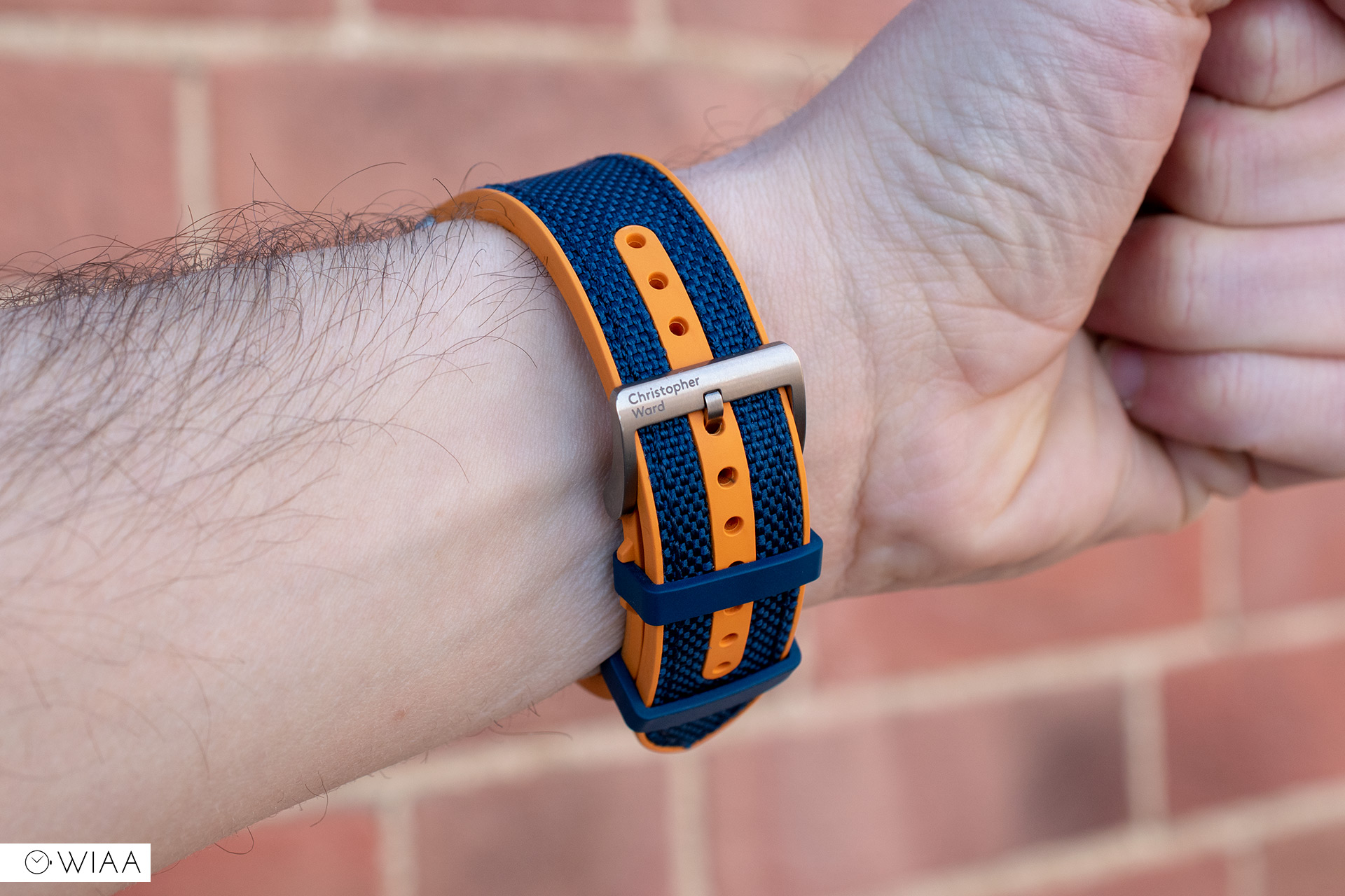

The orange and blue colourway obviously works so well with the dial and bezel theme. The first keeper loop has a little holder either side to keep it in place, which is a nice touch and surprisingly handy. The underside has an interesting and comfortable texture to it, with the thin flags motif inlaid within.
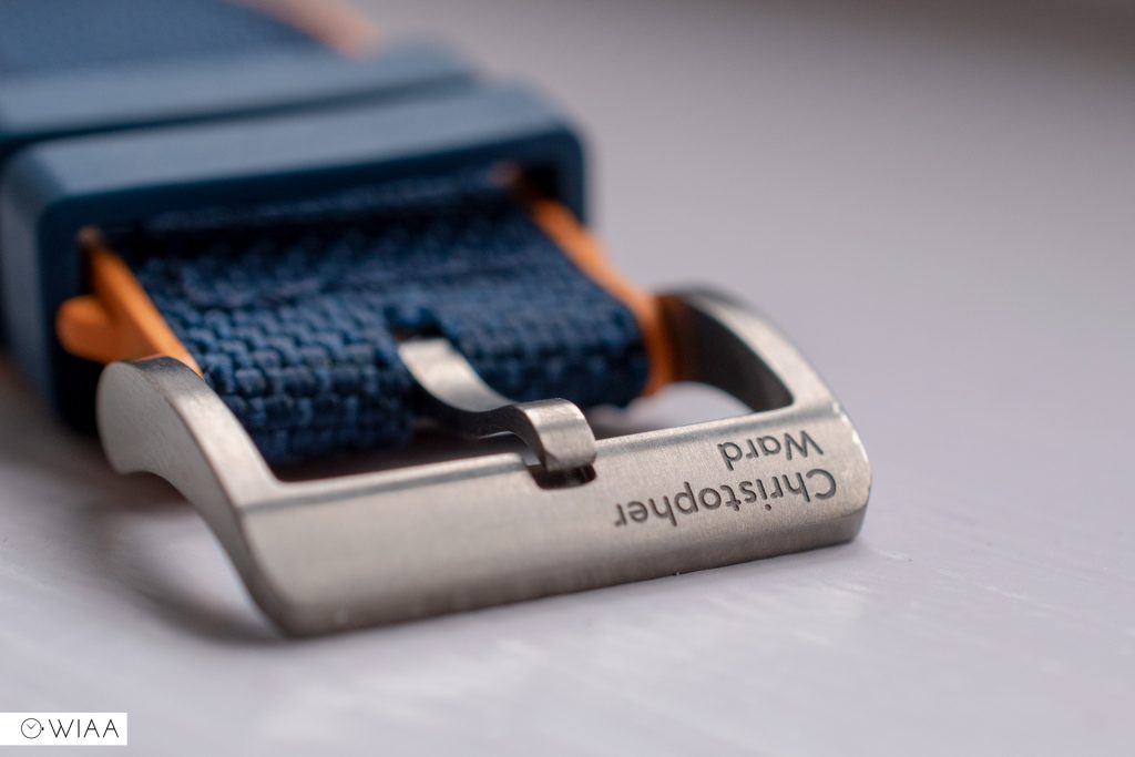
The tang buckle is simple yet shapely and is fully brushed which should last well against wear and tear. The Christopher Ward logo is left aligned on the top bar, which is neatly and deeply engraved.

Unfortunately, I’ve not been able to get my hands on the bracelet, but the great news about that is that it features quick release pins. Bracelets are notoriously difficult to exchange so that’ll be quite revolutionary.
The movement
I’ve thought to myself, why not use their in-house SH21 movement? It seems a surprise to me not to, but the SH21 would increase the price even more (CWs with it in tend to start at £1500), so maybe it’s a case if they don’t want to outprice themselves at launch. Whatever the reason, I’m hoping they do eventually release a Trident with one in as it’ll be serious competition for other higher end brands with in-house movements such as Tudor, and even perhaps Breitling and Omega.
The movement that has been used is the Sellita SW200, and in the case of the Elite, it’s COSC certified. As this is a press loaner, it’s not been tested, hence the wild -19.5 sec/day accuracy. If you do go for one, however, don’t worry about that as you’ll get a COSC certificate proving it has been rigorously tested.
Final comments
There’s no doubt about it; in terms of quality, this is miles better than the previous generations of Trident. Everything has been rebuilt for the better: the case, the dial, the bezel, the lume, the strap/bracelet. And in reality, the fact that the standard “Pro” version is only £35 more than the Mk2 is pretty amazing.
With the Mk3, they’ve certainly made a statement: they’re toe to toe with the big boys and are offering a staggering package for the price. The Pro in particular – the quality is of such that it easily matches a watch worth double: think the likes of Oris or Tag Heuer.
I’ve no doubt that it’ll create a lot of “waves”; no doubt primarily about the new hands which I think some will be happy with, but some will hate with a never-ending passion. We’re a passionate bunch, watch enthusiasts, and when a timepiece like the Trident creates a furore that it does, you know it’s going to be a success.


Mark Muddimer
30 April, 2019 at 9:24 pm
Fantastic review and photos Josh. I’m really liking the look of the new trident. I currently have three C60s, maybe if I sell two…
N Pitt
1 May, 2019 at 5:04 am
Great review I like the new case design I have hated the new hour hand in all the leaked shots I think what makes it look so bad is the lumed area shape looks fine, but the tip is not Lumed and makes it look odd and uneven. P.S breitling use Tudor movements in their latest divers.
Mark Voutt
1 May, 2019 at 7:21 am
Another great review Josh. I love the new MK3 and in particular the new arrow hour hand! The GMT version is definitely on my list as a future purchase.
Joshua Clare-Flagg
1 May, 2019 at 7:50 am
Thanks! It’s a great choice which you’ll love.
Michael Blythe
6 May, 2019 at 9:42 am
Great review and stunning photos! I think it’s a big improvement over the previous model. Never was a fan of the onion hour hand and the wavvy dial pattern. This looks more clean and sporty. You can see they put a lot of attention into the case too. Some great details there. Well done Chris Ward!
Hugo
13 May, 2019 at 8:39 pm
Wow ! Excellent review of a fantastic watch. To me, it looks way better now. Love the new hands, the case design, the bracelet, the clean dial. The GMT will be mine soon.
Gilles
2 July, 2019 at 6:51 pm
I just got my c60 mk 111 red the case looks beter morefine than rolex but on the. Rubber bracelet it shud of been like omega all around the case i got the metal bracelets its perfect