I don’t know about you, but I’ve been getting pretty frustrated with Instagram this year. The platform seems to be going through something of an identity crisis and has introduced several new features and changes to the algorithm in order to compete with Tik Tok. However, these changes have been less than popular with Instagram’s users, who have seen both a substantial decrease in interaction with their own content and an increase in irrelevant content on their feeds.
Whilst Instagram has acknowledged these issues, they seem to have done little to actually fix them and restore users’ confidence in the app. Which has left many people searching for alternative platforms, and earlier in the year I was among the many on Instagram who began the search for an alternative platform on which to talk about watches.
What is WatchCrunch?
My search for a new platform led me to WatchCrunch, a website designed specifically for users to talk about everything watch-related. If you aren’t familiar with WatchCrunch, I think it’s best described as a mix between Instagram and a traditional forum like Watchuseek. The layout of the site is pretty straightforward, with a main feed on the homepage whose content is determined by a range of topics selected by the user.
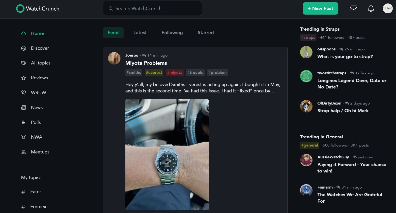
There are also separate feeds for a variety of specific topics such as reviews, new watch alerts, and a discovery page. Like any other social media platform, you can like posts and comment on them with your own thoughts.
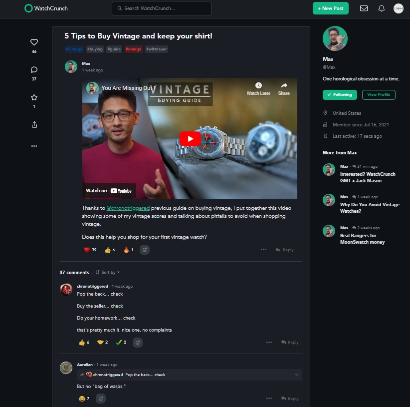
Whilst this is very similar to Instagram, what sets WatchCrunch apart from that platform is the variety of post types you get in one feed. It could be text, an image, a link, or a poll, which makes the content much closer to that of Watchuseek. It’s all very easy to use too. The menu for the various feeds is clear and self-explanatory, and the feeds themselves are clean and easy to navigate. The conversation on an individual post is just as straightforward. Users simply leave a comment and can respond to another’s comment as they would on a traditional forum.
What Type Of Content Can You Make On WatchCrunch?
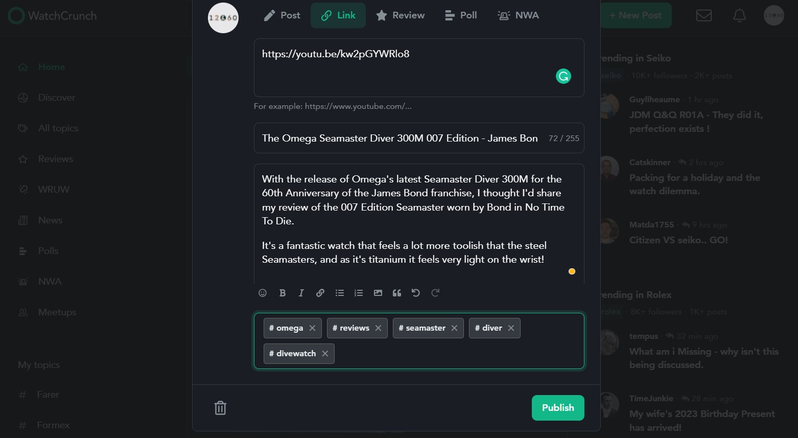
Creating a post yourself is simple. You obviously start by clicking on the “New Post” button on the top right of the screen, which opens the “blank post” pop-up. You can then choose the type of post you want, and there are five options to choose from. First, there’s the standard image and text post, where you just upload an image, write something, give it a title, and select some topics (in the form of hashtags) so that the post appears where you want it to. It’s a simple setup that’s very intuitive. Building off this, you can also post a poll, a link, a “new watch alert” post, and a review. The review post in particular is a great idea as it provides you with a template that allows you to provide paragraphs of text alongside lists of pros and cons and 5-star ratings for different areas of the watch. This means that you can quickly and easily convey your thoughts on a watch to others in a manner that’s consistent with other WatchCrunch users, and easy for others to read through.
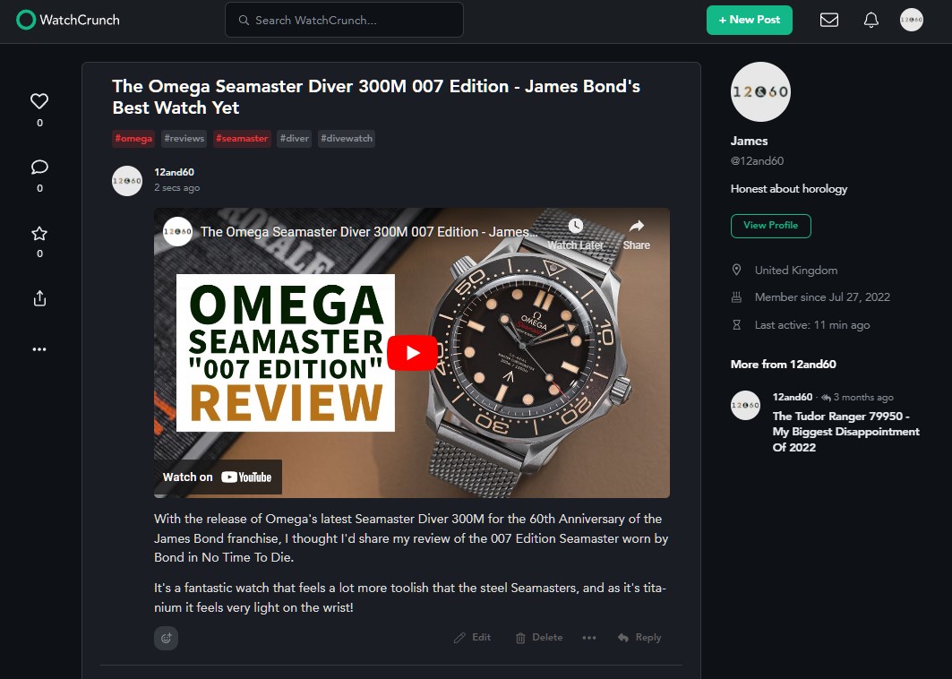
On a personal note, I’m also a fan of the fact that I can post a link to the 12&60 site or YouTube channel, without it being taken down because I’m not a site sponsor. I understand other forums rely on sponsors to generate revenue, but it can be rather frustrating to not be allowed to link to an article that would otherwise be okay, simply because it’s one I wrote. But fortunately, WatchCrunch doesn’t mind what you post, as long as it’s watch-related content that will be of interest to others, and I really appreciate that openness.
Other Reasons To Try WatchCrunch
When it comes to how people find your posts, there’s no frustrating algorithm, and no finicky hashtags, required in order for your posts to be seen. They’ll appear in the topic feeds they’re tagged in and people can interact with them as they like.
Another thing I really like about WatchCrunch is the lack of adverts. Again, I appreciate that other forums need to generate revenue somehow, but it’s nice to use a social platform that isn’t cluttered with sponsored content and adverts. (Though I am aware that there is an irony in me saying that in a sponsored article for WatchCrunch!)
Like any good forum or social platform, WatchCrunch has something for everyone within its chosen subject. It doesn’t matter if you’re into Rolex or Timex, you’re welcome to share your thoughts and contribute to the community. And this lack of snobbishness is one of the reasons that WatchCrunch is such a good place to go and chat about watches on. It also means you’ll find all sorts of watch enthusiasts on the site, from simple aficionados to writers and content creators, to vintage collectors, to name but a few.
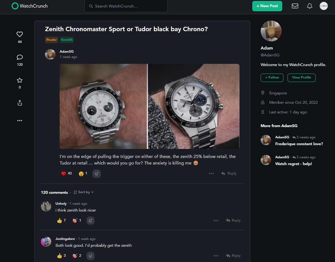
This open approach leads to a good variety of content across the site. For example, two of the most popular threads are Controversial Watch Opinions and this post which compares the Tudor Black Bay Chrono vs Zenith Chronomaster Sport.
Final Thoughts
Hopefully all of the above gives you an idea of what WatchCrunch is like to use. Personally, I think that it’s a really accessible platform that’s very intuitive and easy to use, as well as providing an opportunity to have much more in-depth conversations around watches.
It makes for a refreshing change from mainstream social media, which simply encourages you to leave a like and move on to the next post so that you stay hooked on the platform for as long as possible.
In fact, the only thing that’s holding WatchCrunch back from being a superior social platform to Instagram is the fact it has fewer users. If more of us make the leap from Instagram to WatchCrunch then there will really be no watch-related reason for the watch community to remain on the former platform.
So, if like me, you’re tired of Instagram, make sure to follow 12&60 on WatchCrunch! on the website here.


Paul Davies
30 November, 2022 at 9:24 pm
Thanks for the introduction to this site , spending more time on it than any other