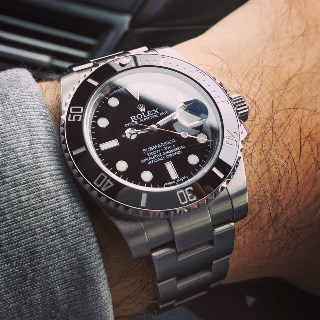
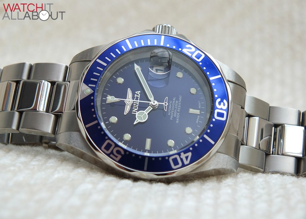
Were you like me and thought “Mercedes” hands were named so because of the logo of the car manufacturer? Well, we’re wrong.
It’s actually a nod to the famous Mercedes Gleitz, who swam the English Channel and tested a Rolex Oyster around her neck in the 20s.

How did the design come about? Well, it has nothing to do with the car logo.

A few reasons are believed to be the source of inspiration behind the hour hand. But, none are officially confirmed so it’s all hearsay.
Firstly, lume. This is believed to be the most plausible reason. Without the three lines, the disc would have been hollow / skeletonised. During the manufacturing process, the lume would have been painted as a big blog from underneath. But, blobbing a blob of lume that large wouldn’t have been easy. So, they tried to divide the disc to allow a frame and basis for the lume to grip to.
Secondly, legibility. It’s believed the design makes it easier to read, with a directional divide pointing to the tip of the hand. It also provides distinction between the hour hand and the disc hour markers.
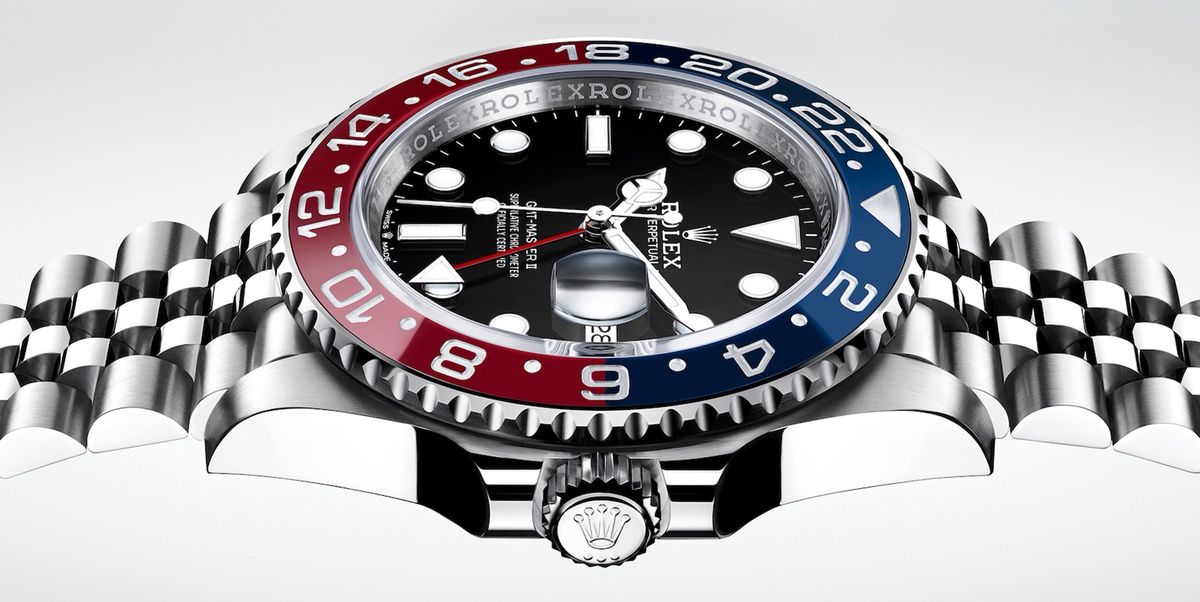
Thirdly, it’s thought that it could be a three-pointed star, with each third representing a different category the hands would be present on: sea (Submariner), land (Explorer) and air (GMT-Master).
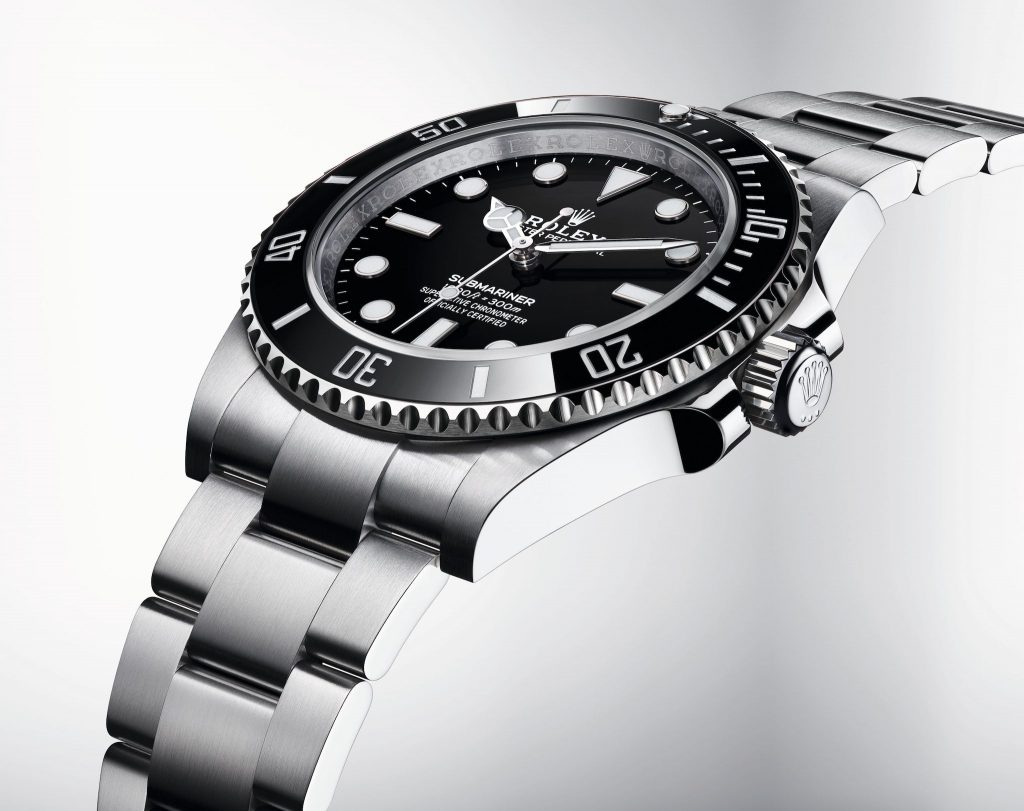


And no, the Submariner wasn’t the first watch to officially don the most recognisable hands in their modern way on any watch. It was the Explorer 6150 from 1953!
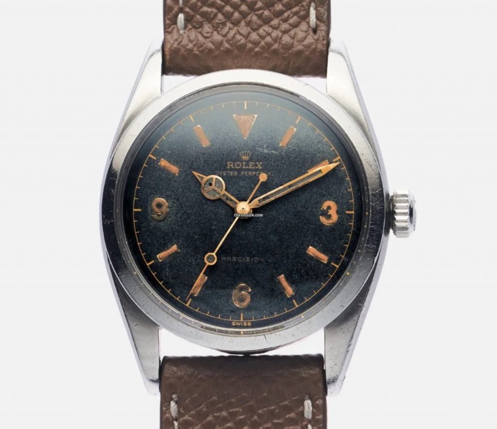
I asked Phillip Plimmer, a professional watch designer for his thoughts on this timeless handset from a design perspective. His website is https://aspectdesigning.com/

The iconic hour hand of Rolex, strongly differentiated from the minute hand, it uses sections of luminova in its’ defining circle, naturally if you want strength and longevity the filling material needs to be framed, for me the shape presented in this circle gives direction, using a stroke that points to the center of the movement, then opposite this a 120 degree radar splaying out or becoming wider to home-in on the index or number it’s reaching, with more focus when required for the eye to travel down the hand and pinpoint the exact reference of the time.
A large amount of Rolex owners discuss the appearance of this detail to be equal to a Mercedes Benz logo, which for me has no context, the three-pointed star has more defined angles and not parallel lines, and the distinctive hand of Rolex only has this reference of a Mercedes Benz logo when its travelling past the two, six and ten o’clock position. As Rolex’s hour hand is constantly moving it could never be a static emblem that is significant to a Mercedes Benz logo but more symbolic to one of its racing cars steering wheel.
Who knew that this simple handset design has so much history and mystery behind it? It’s quite simply one of the greatest examples of timeless design EVER created – nearly 70 years on, on billions of watches – the Mercedes hands still look great today.
Watch this article instead:
