CATEGORY – Watch I’ve been loaned for Review
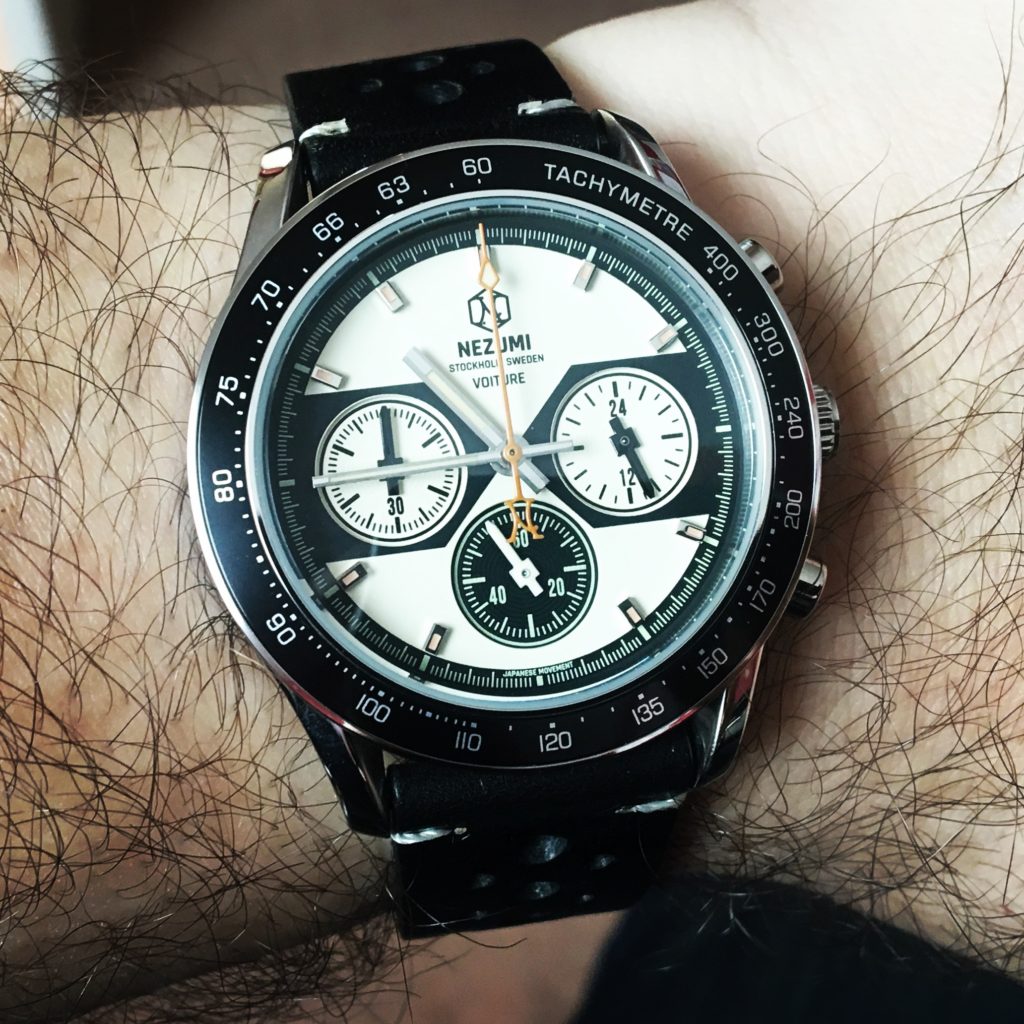
The Scandinavians are known for their design flair. I always fancied an Arne Jacobsen “Egg” chair.
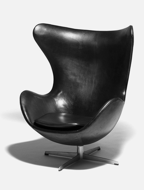
Volvos. Maybe not always beautiful, but they’re never anonymous.
Minimalist and clever are usually what it’s all about.
Heck, Ikea built an empire on the back of this ethos.
So what’s this got to do with a retro inspired Chrono?
“What’s this? Tony Villa reviewing a retro chronograph? Again? Nooooo, that’s not like him. That’s not his comfort zone :-D”
Back in October 2015 Nezumi, based in Sweden, successfully launched their first (and at this time only) watch on Kickstarter. The Voiture.
I’ll let them use their own words to describe the watch (I’ve edited some of their typos though):
“THE NEZUMI ® VOITURE IS A TRUE CLASSIC CHRONOGRAPH INSPIRED BY THE 60’S AND 70’S RACING ERA.
The Voiture is powered by a mechanical-quartz movement made by Seiko. This reliable hybrid movement combines quartz accuracy with a mechanical chronograph beating at 1/5th of a second giving the chrono-hand a nice sweep. When the chrono-hand is reset it instantly snaps back to 12 o’clock. The pushers also have a very genuine mechanical feel to them.”
SPECIFICATIONS:
- Each Nezumi watch is delivered with our black perforated leather racing strap with a branded stainless steel buckle. We use vegetable tanned leather from Swedish Tärnsjö Tannery.
- The Voiture watch case is made of 316L stainless steel and measures 40mm wide excluding the crown, 47mm lug tip to lug tip, 20mm lug width and it is 11,5mm thick including the domed sapphire crystal.
- The domed sapphire crystal has ( AR ) anti reflective coating.
- The case has brushed and polished surfaces.
- Powered by a Seiko VK63 mechanical-quartz movement.
- The dial is what is called a sandwich dial and has 2 layers, the 3 sub dials being on the lower layer. The top layer has a slightly matte finish and the sub dials are gloss.
- The 3 sub dials all have a circular texture.
- The dial has applied polished bevelled stainless steel indices except for at 3, 6 and 9. All indices have Swiss vintage color luminova.
- The minute and hour hands are polished/brushed bevelled stainless steel with inserted Swiss vintage color luminova.
- The moulded crown is branded with our trade-mark N logo and is a push down crown.
- The screw on moulded case back is branded with our logo and also features information about the watch.
- This watch is water resistant to 50 meters ( 5 ATM ).
So in my words, what have we got here?
Well, we have a very appealing looking, retro inspired chronograph. It uses probably my favourite, non mechanical, chrono movement; the Seiko VK63 with its quartz accuracy combined with the mechanical like stopwatch function. No date, but I guess that would have spoiled the face symmetry, but it would have looked nice with a silver framed window at 6.
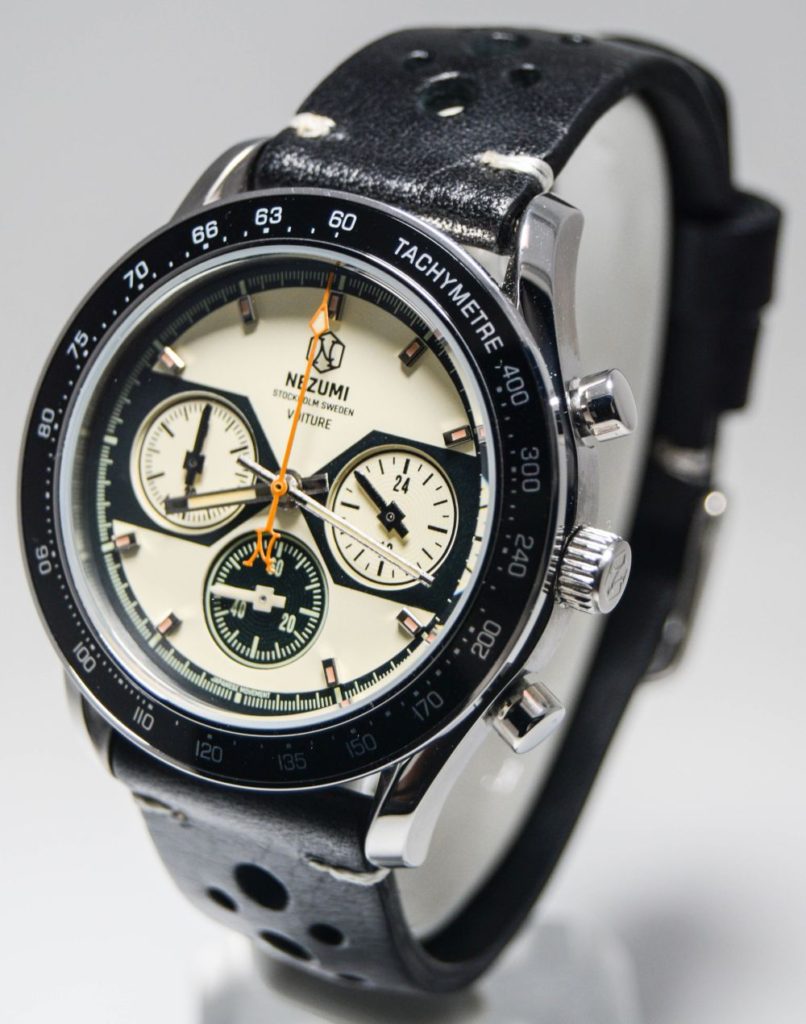
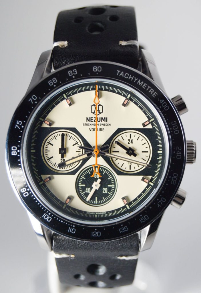
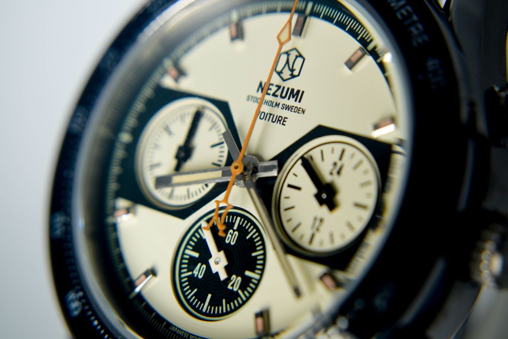
There are 3 available variations at the moment, blue, black / white & white / black. I’ve been loaned the “white” version…which is actually more cream / grey as if time and the sun has faded it.
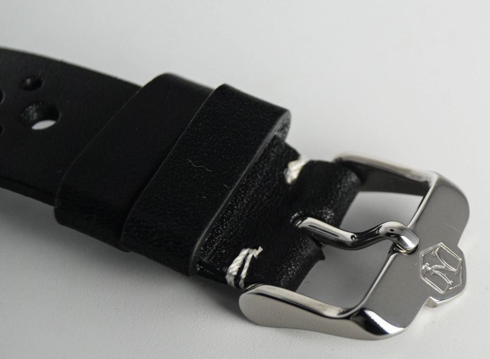
Now, as a change, I didn’t immediately take the supplied strap off the watch, like I do with most. This is actually a really nice leather. Supple, nice signed buckle, tastefully done “rallye” perforations, stitched top and an almost weathered look. Even though it’s brand new. It also doesn’t have the smell of petrochemicals that many “leather” straps supplied with watches seem to have. Yeah, I’ll leave it on this as it really suits it and is a lovely strap in it’s own right.
It seems the sapphire is a “double dome” as it doesn’t distort at angles. There’s a slight gap between it and the bezel and it is a bit proud. I like that.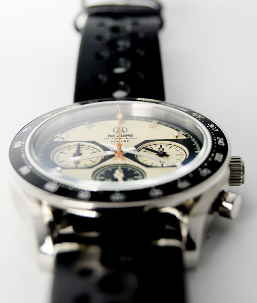
The AR is very subtle, I can’t say I noticed it and the face does reflect but AR isn’t for every watch, especially those with some colour to the face, as if it’s strong, it can distort the true colours.
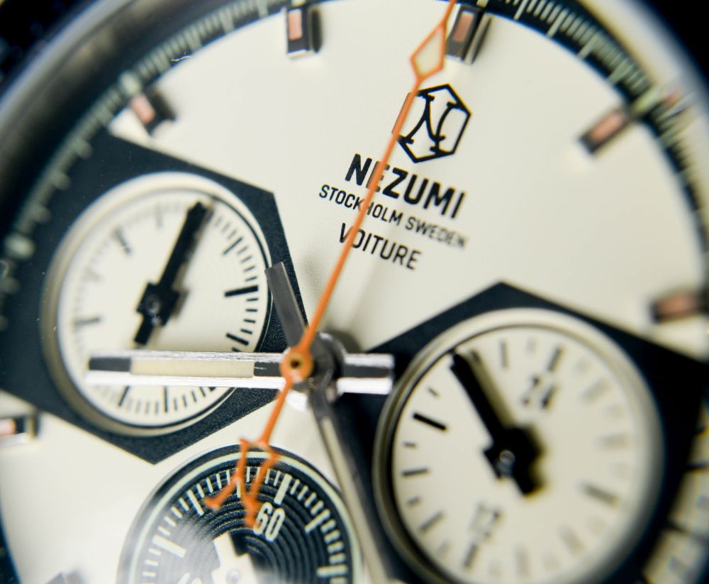
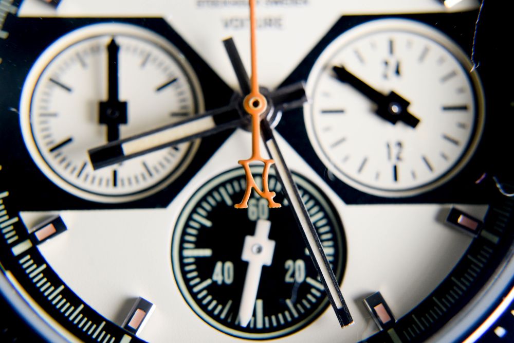
The face is a lovely design, you can see that it’s a sandwich dial by the way the subdials are recessed, with subtle striping up the sides.
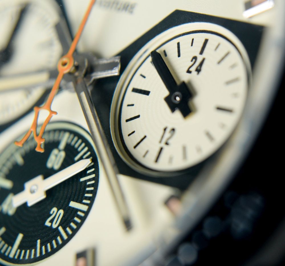
I like the subdials and the way we have 2 black on white and one white on black. Very pleasing to the eye and I can’t think of many other chronos that look quite like this. They show the time seconds, chrono minutes and 24 hours.
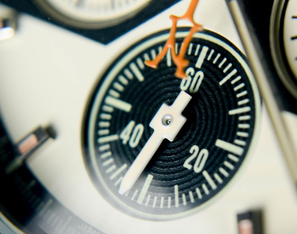
The black outer minute marker ring adds to the contrast, but makes the dial look a bit smaller than it is. Maybe that’s a good thing?
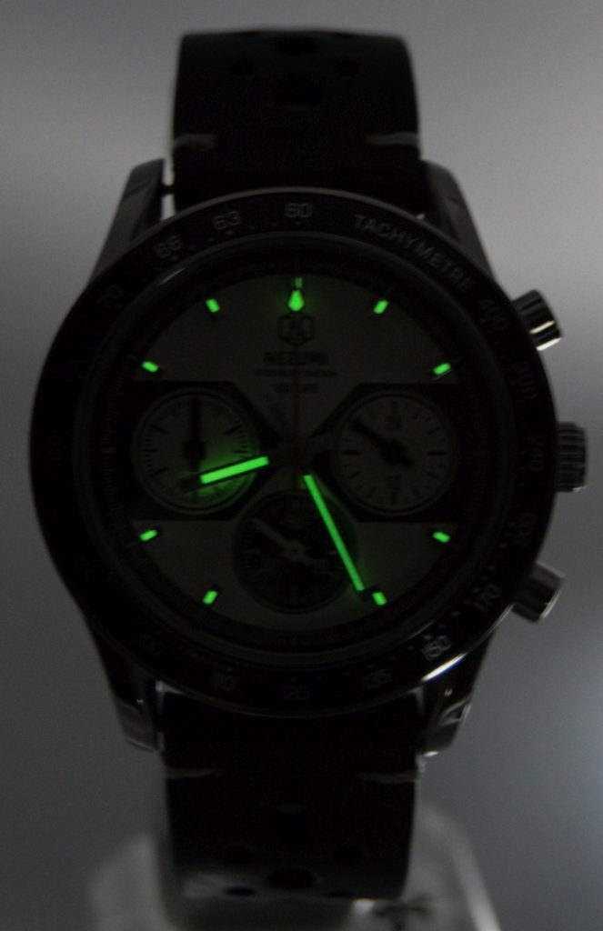
The markers are applied and have “vintage” lume in them, i.e. mustard yellow in normal light, as do the hands. There might not be much of it, but it’s bright and lasts a decent amount of time. Really good for a chrono actually.
Now the hour and minute hands. They’re straight, not remarkable, with a sliver of lume. Thing is that I actually had to focus on them when trying to read the time as they’re not very distinct. However the orange chrono hand is a nice touch, especially with the little Nezumi logo as the counter balance.
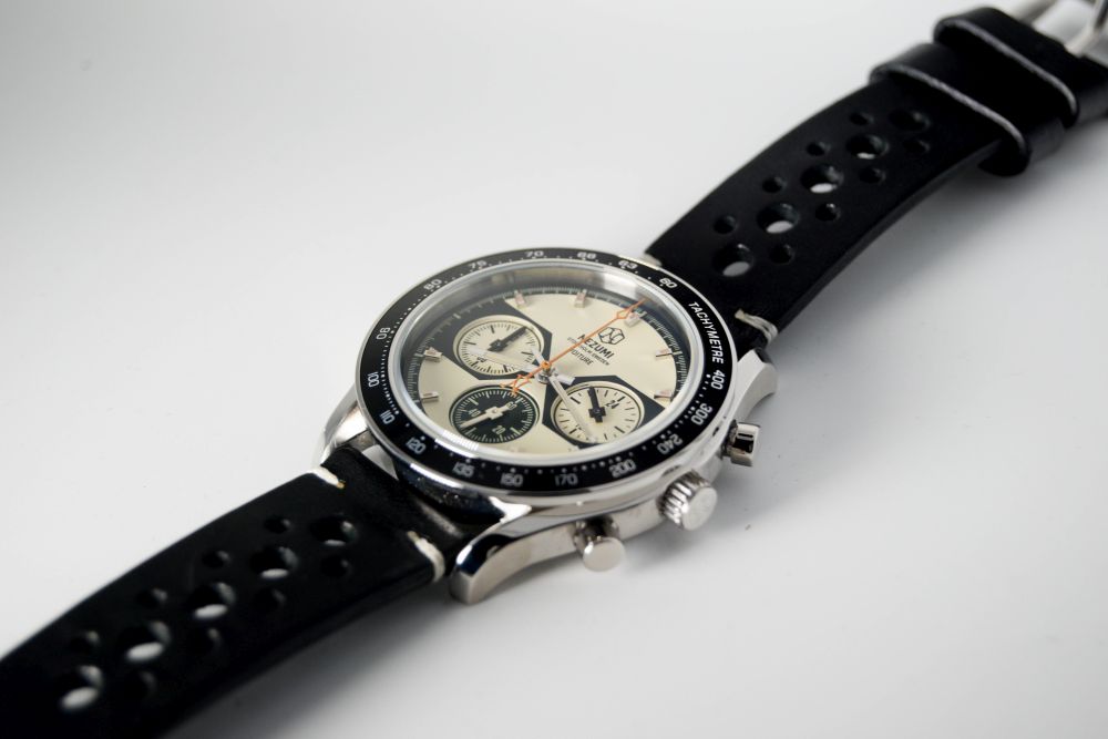
Now, the case. This is sort of like a “brushed sandwich” The bottom, in which you can see the case back is polished, the bulk of the case is brushed, you then have an indent which goes to the polished bezel. The lugs curve down, which helps with making the case look smaller.
The pushers are ordinary, the crown, though signed, is pretty average again and doesn’t screw down. But the case is a very appealing “sandwich”, it’s all notches and polishing from the side and the bezel is really nice. It makes it look like it’s almost “home made”, the low tech way of a vintage watch, rather than being rendered up in CAD. I like that too.

The bezel insert is just a simple Speedmaster-esque aluminium insert, maybe that’s the point, but it is what it is without really being standout.
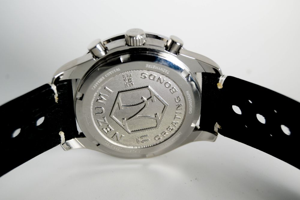
The caseback is nicely done, as you know I’m not a caseback man, but this is moulded and has a nice texture to it. I’m not sure what “Creating Bonds” has to do with the watch, though. Maybe their next business venture is counterfeiting 😀
Initially, like the Dan Henry 1939, I thought this watch is all about the face, replace it with a “normal” white on black face and it wouldn’t stand out in a crowd. However you have to wear it a while to appreciate it, the way the case is built is lovely, the recessed sub dials with sword hands on the face and the orange chrono hand with the logo at the bottom all grown on you more and more.
So, how does it compare to its peers? Well, there are quite a few that compete here, Dan Henry with his 1939 and 1963s and the Straton Syncro & Curve are ones that I have and can compare and contrast with.
I don’t want to go on about price, as ultimately if you like the watch enough, the price is irrelevant, but the Stratons are around the same price, with similar specs. The Straton cases are different and feel more substantial and less mainstream than the Voiture, especially with one with an internal rotating bezel and the other with the lumed sapphire domed one.
The Dan Henrys are substantially cheaper, they don’t have sapphires, they don’t use as nice a movement as the Nezumi, their straps are not as nice either. But I think their faces are just as good, the cases are not a million miles away but not as nice. And the 1963 has that awesome SR71 case back.
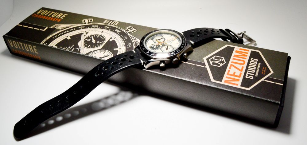
The watch roll that Dan Henrys come with is better than the cardboard box that the Nezumi comes in, even though it does smack of Vintage Heuer and is kind of nice.
So would I buy the Nezumi? No. But there are reasons.
I have a 7 3/4″ wrist. This watch looks small on me. But if it didn’t then this would cease to be an issue. If you have a smaller wrist, this 40mm is a classic size. If this was 44mm, it would be a different story. Just a personal preference.
At the KS price, it was a good buy, but now, I don’t know if it is worth the €395 being asked. I know that I say price is immaterial if you love the watch, but I guess I don’t love it enough for this not to be at the back of my mind.
But it is well made, attractive, faithfully retro and not common. If it visually appeals to you enough then you won’t feel let down with the finished watch. Again, you can read all you like, but it’s not until you strap it on your wrist that you can really gauge if it’s for you.
It could be all the retro chrono YOU want…

SWM
18 August, 2017 at 3:33 pm
I have the same white face model, which I ordered during the 2nd batch preordering period. From end of last year when I got it, I would say I love it the most of my small chronograph collection, till Dan Henry 1963 come along … 🙂