CATEGORY: Watch I have been loaned for review
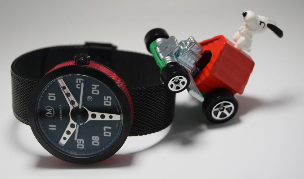
You see it a lot in the world of watches. There’s nothing new under the sun. There’s only so many ways to slice a pizza.
Look at Baselworld this year. The big boys are churning out remakes / homages / copies / whatever, of watches from the past.
Seiko with their overpriced 62MAS remake. Omega with their Speedmaster / Seamaster / Railmaster triple box set. 60s style, handwound, Speedmaster? It’s coming.
When I launched my Ensigns original renders, I got lots of “Can’t you make anything original?” “Looks like X Y Z” comments.
And these comments are still there. You launch a watch and someone is going to say “It’s nothing more than a rip-off of X Y Z”.
And to be fair, most of the comments are valid.
The bottom line is, you make a watch that looks like an aspirational, well recognised, luxury watch, or remake of a desirable vintage watch, you’re going to find customers. You can change the aesthetics a bit, but people will see it and will want it in their desire for the original.
There’s nothing wrong with that, well, unless its basically a copy with a different logo on it.
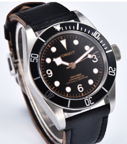
Yeah, I’m sure this is an officially certified chronometer…
And these watches sell, the same people who ask for something original will usually pounce on a slightly tuned Submariner copy.
Now, Kickstarter. It’s become just another marketing platform, in fact the best for the “creators”. Take your money, get their profit straight away. If they don’t deliver what they promised, boo hoo, you can slag them off on social media but you really haven’t got a legal leg to stand on. And Kickstarter doesn’t care, they’ve made their 10%…anyway…
There’s very little innovation on there any more. The idea was that someone with a dream, but no money, could generate enough money to make it a reality through crowdfunding. Now, we see some well established companies launching all their watches on Kickstarter when they could easily make them and then sell them direct, but why would they? This method averts their risk of making a watch that won’t sell. I’m not having a go at them, they’re only using the platform to the best advantage for them, but it seems so wrong to me that now, a platform for a person with a dream but no money, needs tens of thousands spent in marketing to stand a chance of funding.
So it’s saddening that when something original DOES come along, that hasn’t had tens of thousands spent on it, it doesn’t stand a chance of funding.
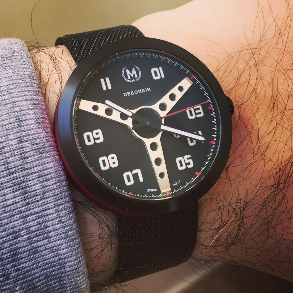
And this seems to be the case with the Marchand Debonair. I’ve followed this watches progress. I bagged an early bird. I asked to be sent a prototype for review. I want to see it succeed.
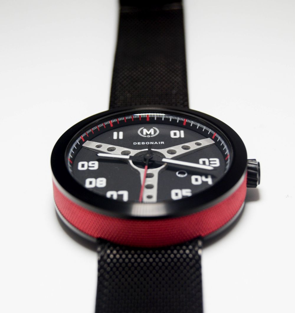
Why? Because this watch IS different and beautiful. The creator, Dan Brigham, HAS made something avant garde here…and it’s being ignored. I want to do my bit to help, as yet another derivative bronze diver, cheap minimalist watch or a watch that’s “challenging / disrupting” funds; this stunning, original, well made watch looks like it’s going to fail, and this is making a mockery of the whole KS “system”.

So let’s start at the basics, here are the specs:
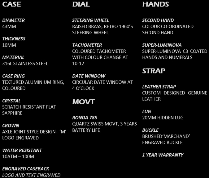
Now, you have to bear in mind that I’m reviewing a prototype. The whole point of making prototypes is so that any problems can be ironed out before production and this proto isn’t perfect. Remember this, if you fancy funding a watch on Indiegogo that is based just on renders…the production batch could well be of prototype quality.
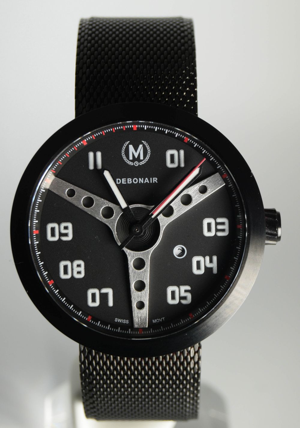
This prototype has a perfectly circular, 40mm case and takes 20mm straps. The production watch is going to be 43mm with 20mm straps. As it’s circular, with no bezel or lugs, it is very elegant in proportion and doesn’t look thick at all. People with smaller wrists shouldn’t be put off by the production versions size.
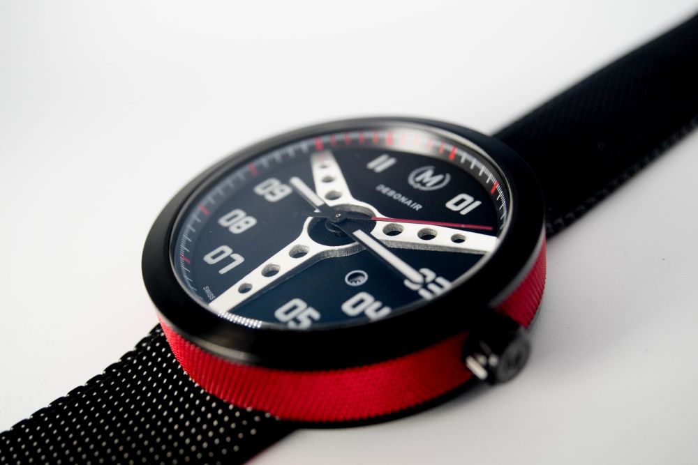
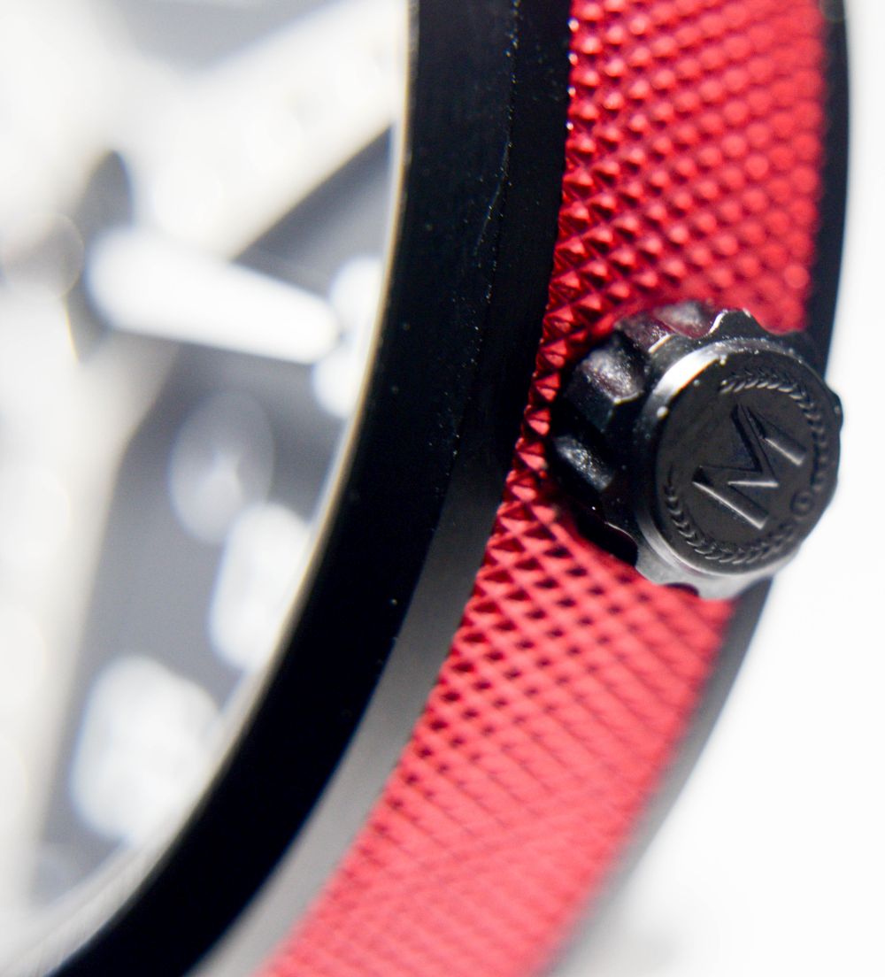
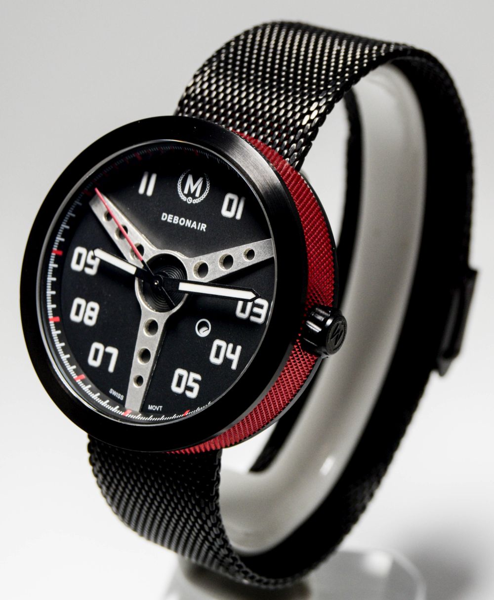
I have the PVD version and the black case with flat sapphire looks great with the red, machined, sides. I really like these machined sides, my personal preference would be the steel with the orange side with either the black or blue face, but this PVD version is not one I’d complain about having.
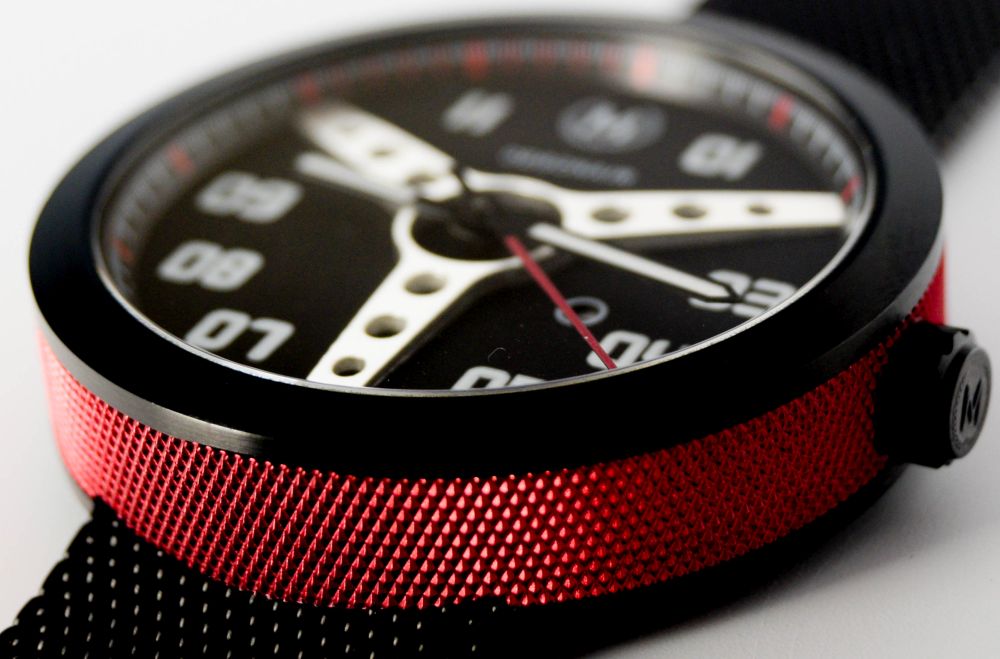
I’d worry about scratching the side, but as this isn’t something I’d do yard work in, I don’t think it will happen.
The case, I want to say, is almost “dainty”. It looks great on my wifes wrist, but with shrinking case sizes (on the whole) this really is a unisex watch, whether the production version will be as dainty, I can’t say, but again, I can’t see it being much more of a brute.
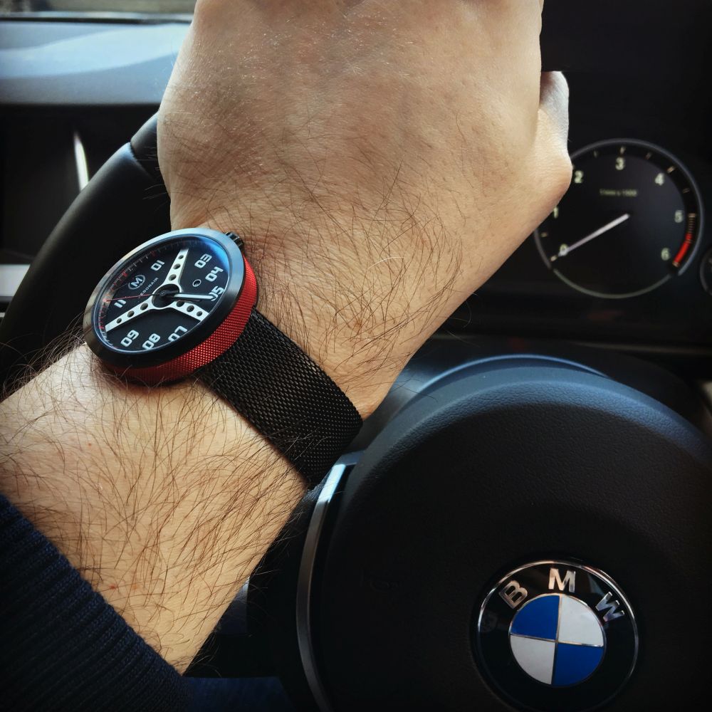
The rev counter is showing no revs, I was parked when I took this 🙂
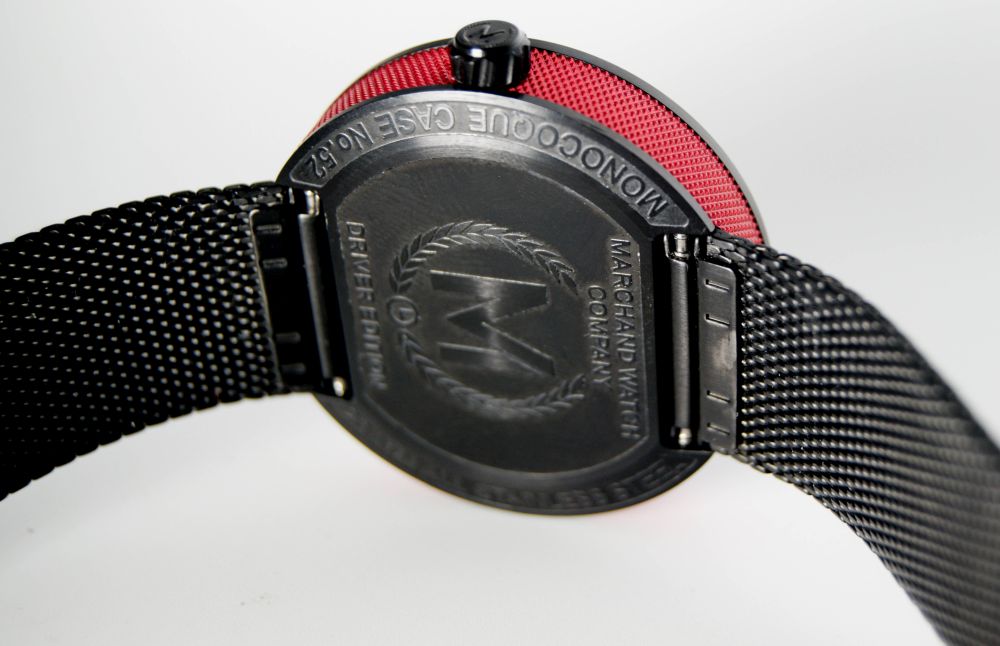
The back is nicely done. Informative. It says 20ATM on this prototype, but the production version will be 10ATM. Why? Because this prototype has a one piece case, hence the “Monocoque Case” scribing on the back. This is quite a bold move for a watch at this price. Only usually “serious” divers have one piece cases, but they’re usually automatics. The problem with it, in the Debonairs case, is that to change the battery, you’d have to remove the bezel, the crystal and take everything out from the front. The production version will have a removable caseback, held on with 4 screws, and because of this and the non screwdown crown, the WR will be dropped to 10ATM. I think this is the right move.
The face is nicely done. When I first saw it, I thought BRM, as the wheel design reminds me of the hands on BRM watches, which are also “inspired” by vintage steering wheel spokes.
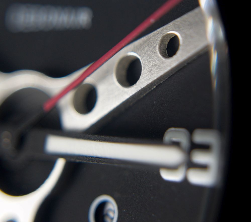
The wheel spokes are applied and not simply printed on. It’s the centrepiece and it’s well done. On the production version, this will be flatter as sometimes the second hand rubs along the crystal.
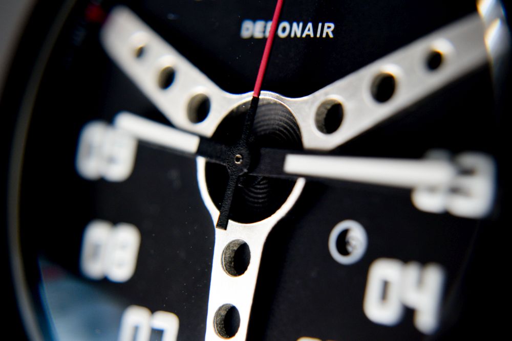
The hands are simple affairs. Their black outlines meld with the black of the face, so only the C3 lume is visible. The second hand is a simple affair, but it reaches the bezel. Functional and non challenging is what I’d say.
The indices are printed C3 done in the style of a car speedometer. They look right in place and suit the watch well.
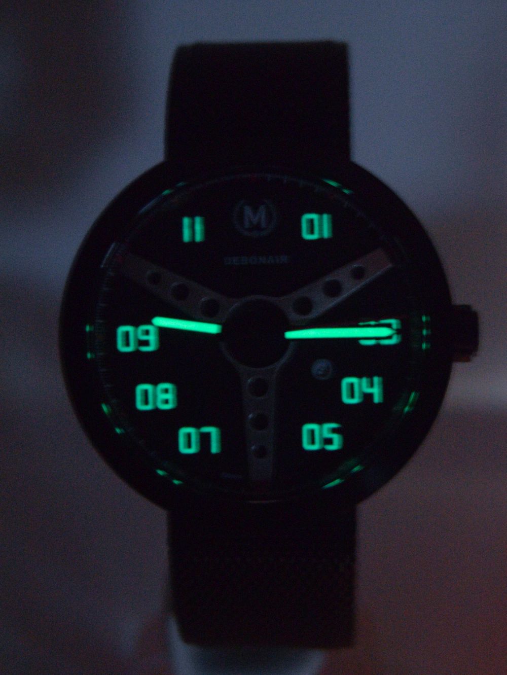
No, I’ve yet to master the art of taking lume shots
The date window is simple and not really intrusive. Would it look better without it? Probably, but I’m glad its there. It is rather small, but this will be made bigger on the production version.
The Marchand logo at 12 is a very racing inspired logo, with the laurel wreath and the name written underneath and it looks well.
I don’t like the “Swiss Movt” text at 6. This watch doesn’t need to try that hard and this smacks of “fashion watch”.
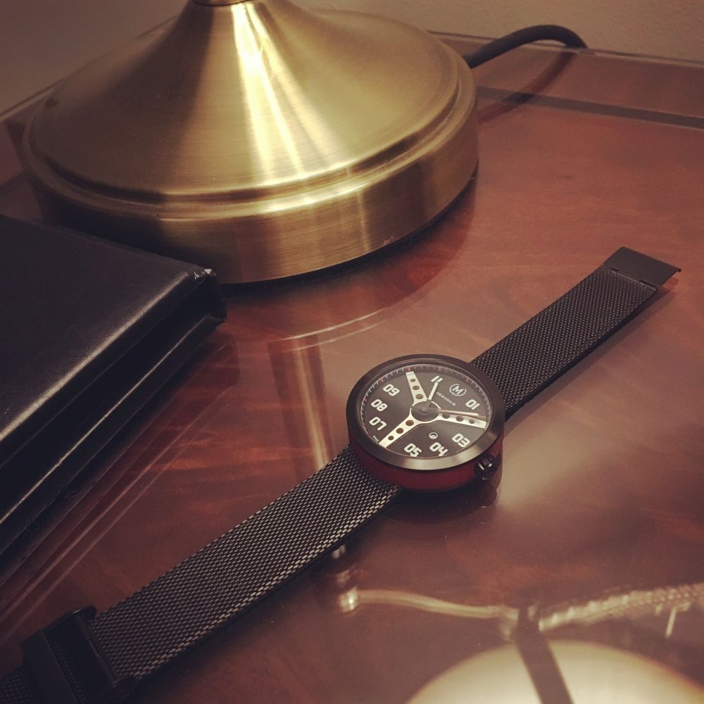
The supplied PVD mesh is thin, flexible and suits it. The leathers in the campaign look like they will suit the watch well.
This watch honestly makes me think of something Benetton or Swatch would have made in the 80s, but of much better quality. “Bang per buck” people, note it has a Sapphire, C3 and a Swiss Movement for £179 (early bird price)
Yes, it’s a quartz. Yes it would sell more as an auto, but I like the fact a lot of people won’t entertain quartz. I don’t have a dislike of any type of movement (except unreliable ones) but it means fantastic quartz watches can be had at bargain prices as less people want them, so they have to be sold cheaper. Keep it up boys, those of us who realise a watch is more than just the movement thank you for making non mechanicals cheaper for us! I’d rather spend 5 minutes and £1 replacing a battery every 3 years than the pain and expense that is servicing an auto.
Marchand talk about a tachometer around the edge, but there’s no speeds marked on it, so it’s essentially not a feature at all and certainly can’t be used as a tachometer. The minute markings need to be there, but need to be represented as the minute scale it is, and not as a tachometer in their blurb.
Also, the crown seems short. There’s only one notch on this, to set the time. When it’s all the way in, the date can be set by rotating the crown, which isn’t as it should be. I’ve been assured this will not be the case on the production version. The crown does not screw down, but is signed with the Marchand “M”
But that detailed face, that puck like case and the colours make something special as a whole. I wore this recently on a night out. It was a short sleeve affair and EVERYONE I was with made a comment on this watch. It had to be taken off the wrist and passed round for their closer inspection. The feedback was good. Hopefully a couple pledged like they said they would. Yes, wear your watches for you, but let’s be honest, everyone likes it when our watch is noticed and we can talk about it for a bit. I talked about the Debonair a LOT. The ladies especially liked it.
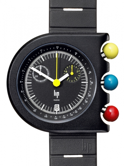
This isn’t an everyday watch. This isn’t a “traditional” looking watch. This watch doesn’t go with everything. I don’t think it was designed to. Like the Roger Tallon designed Lip Mach 2000, it’s something special that looks odd at first, but then lets you know it’s special.
Some of you will love it, some really won’t, if you don’t like the pictures, it’s not going to sway you in the flesh. But I do. I want this in my collection as on the right day, with the right clothes, this looks epic on the wrist, it says “I’m not a sheep” and is built well enough to back that up. I think the improvements to the production version, and its slightly bigger size will help too, in my eyes.
We don’t wear our dinner jackets everyday, and that makes us feel even more special when we do.
I hope this funds, as I will really miss it if it doesn’t. You’ve got 7 days…
https://www.kickstarter.com/projects/1167936196/marchand-watch-company-presents-the-debonair-colle-0
UPDATE:
And 7 days after this review was published, the Debonair funded on Kickstarter…

G Collier
9 April, 2017 at 9:31 am
A great looking watch. Mine is on on the way.